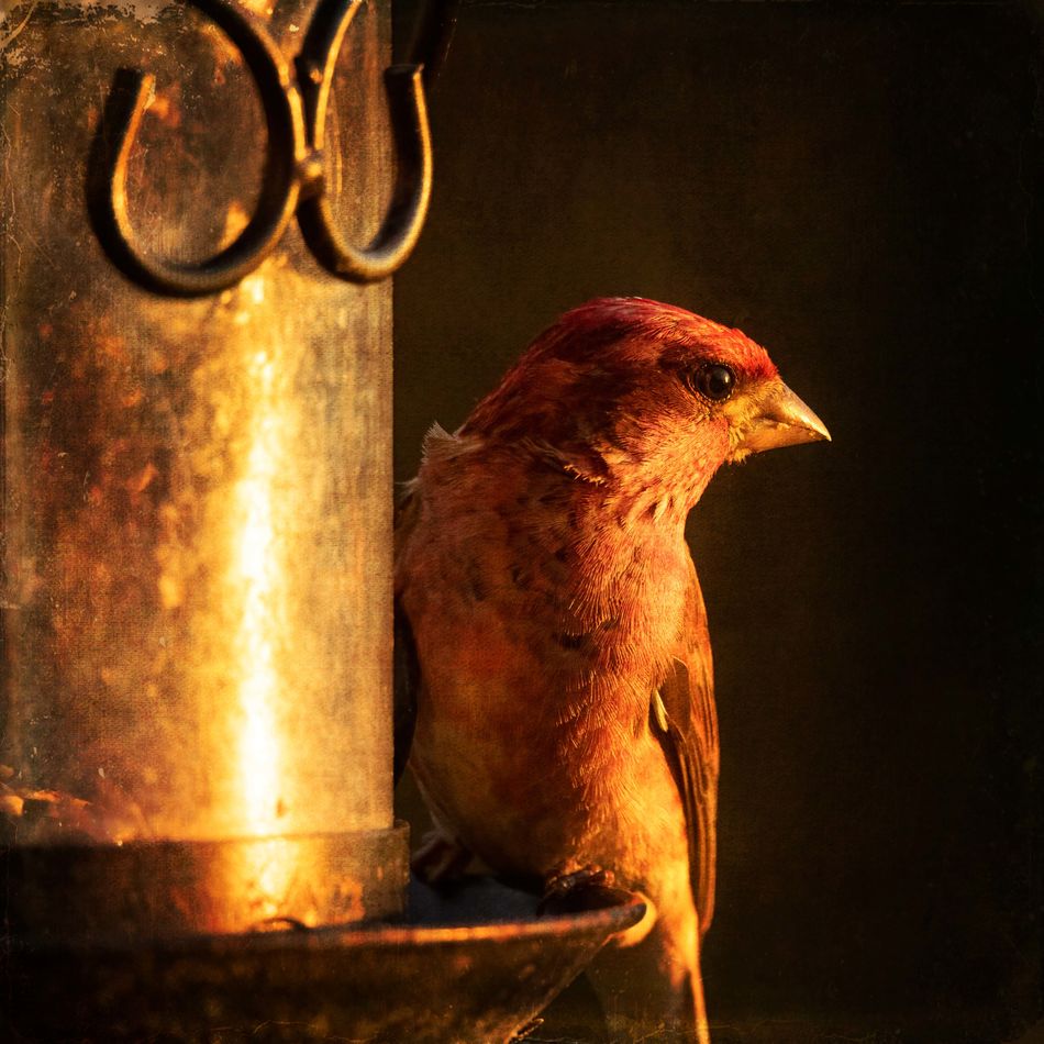
purple finch
Jun 16, 2022 19:30:49 #
Jun 16, 2022 19:50:09 #

Jun 16, 2022 20:32:07 #
Jun 17, 2022 05:44:10 #

Jun 17, 2022 07:24:01 #
Jun 17, 2022 08:21:34 #

Great profile and another use of great light. Piet, remember the threads we used to enjoy (and the trolls we didn't  ) with discussion and examples of light: color, direction, intensity, shooting into the sun. So much inspiration!
) with discussion and examples of light: color, direction, intensity, shooting into the sun. So much inspiration!Jun 17, 2022 16:00:15 #
Linda From Maine wrote:
Great profile and another use of great light. Piet, remember the threads we used to enjoy (and the trolls we didn't ) with discussion and examples of light: color, direction, intensity, shooting into the sun. So much inspiration!
) with discussion and examples of light: color, direction, intensity, shooting into the sun. So much inspiration!thanks Linda, we have nice evening light, and things seemed to line up nicely.
Jun 17, 2022 16:58:16 #

Jun 17, 2022 17:15:29 #
NJFrank wrote:
Nice warm colors, very calming.
thanks Frank, I was a little worried that it was too hot/warm, but that was the way the light was.
Jun 17, 2022 17:29:44 #
Linda From Maine wrote:
Great profile and another use of great light. Piet, remember the threads we used to enjoy (and the trolls we didn't ) with discussion and examples of light: color, direction, intensity, shooting into the sun. So much inspiration!
) with discussion and examples of light: color, direction, intensity, shooting into the sun. So much inspiration!one editing technique that I have been using a LOT lately that sometimes adds depth and form. Most figures/forms have three types of lighting intermixing - that is:
1) You have an area that the light hits strongly and brightly. For this area, I like to a) shift the color to a (perhaps) cooler feel, b) reduce texture, c) reduce contrast
2) You have an area that is in shadow. For this area, I like to a) shift the color to a warmer feel, b) reduce texture, c) reduce contrast
3) You have an area where the form turns away from the light. For this area I like to a) go a little cooler, b) Increase Texture, and c)Increase Contrast, d) Increase Sharpness.
The areas that turn away from the light (for me) look best when you give them the greater contrast/texture/sharpness when compared to the light areas and the dark areas. And the image seems to look more interesting if you handle the three areas differently.
Jun 17, 2022 18:09:02 #
Thanks so much, Piet! I will try something this weekend.
pfrancke wrote:
one editing technique that I have been using a LOT... (show quote)
Jun 17, 2022 18:40:16 #
Linda From Maine wrote:
Thanks so much, Piet! I will try something this weekend.
good luck and have fun, Also think about other things like Saturation. Perhaps the bright areas would be less saturated, the dark areas a touch more saturated, and the Turn areas the most saturated.
Jun 18, 2022 07:39:16 #
pfrancke wrote:
Will do good luck and have fun, Also think about other things like Saturation. Perhaps the bright areas would be less saturated, the dark areas a touch more saturated, and the Turn areas the most saturated.

Jun 25, 2022 22:23:30 #
If you want to reply, then register here. Registration is free and your account is created instantly, so you can post right away.