Honest comments only please
Jan 27, 2022 22:21:39 #
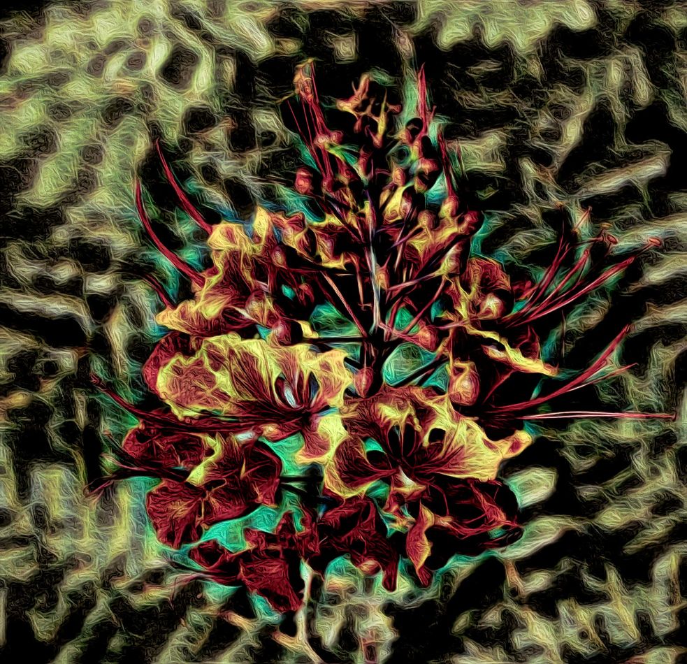
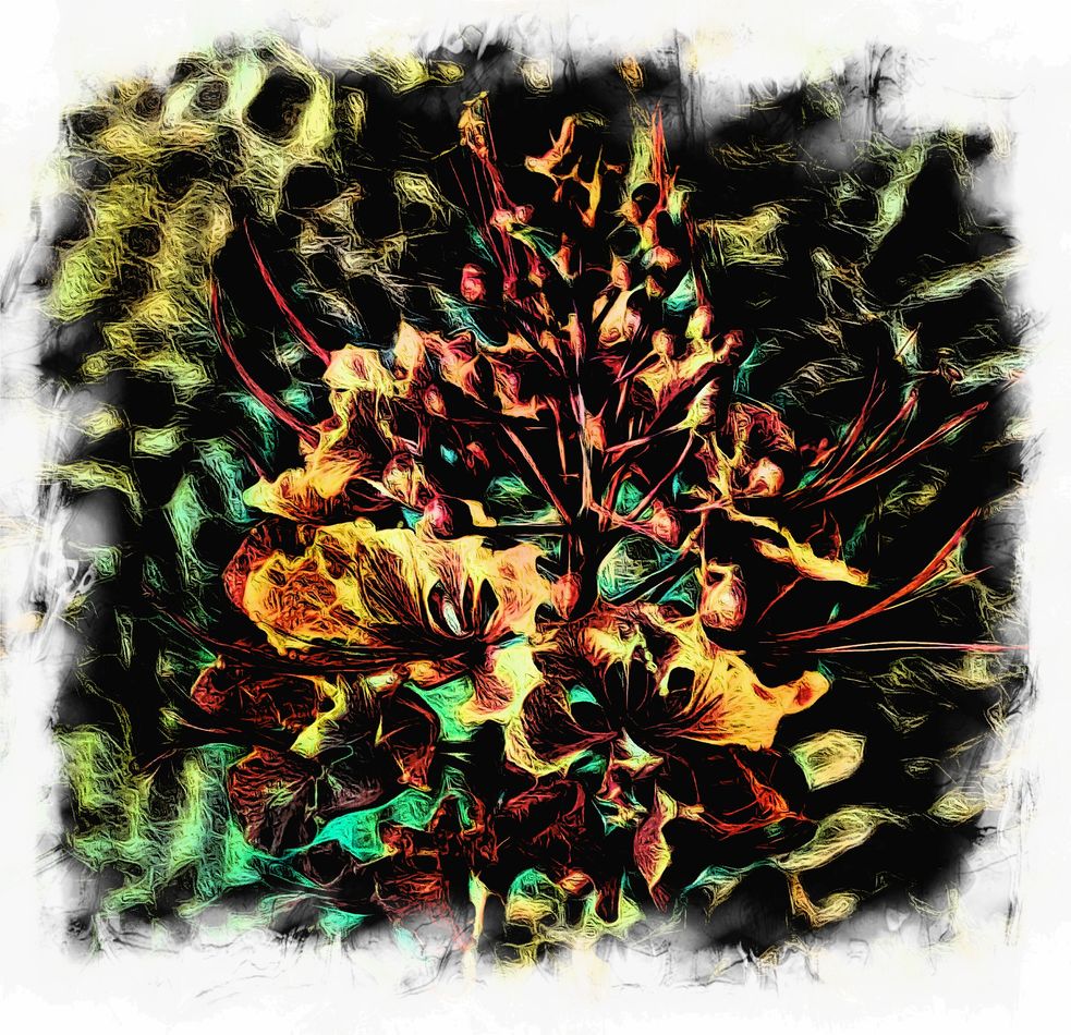
Simple to make in Topaz Studio 2. I find it pleasing and considering an 8x10 print. What do you think
Jan 27, 2022 23:32:49 #
Jan 27, 2022 23:38:05 #
Jan 28, 2022 05:51:42 #

It's going to be your print so it's your opinion that matters. Personally I don't care for the effect but I might like it a bit more if it was softened a little.
Jan 28, 2022 06:19:42 #
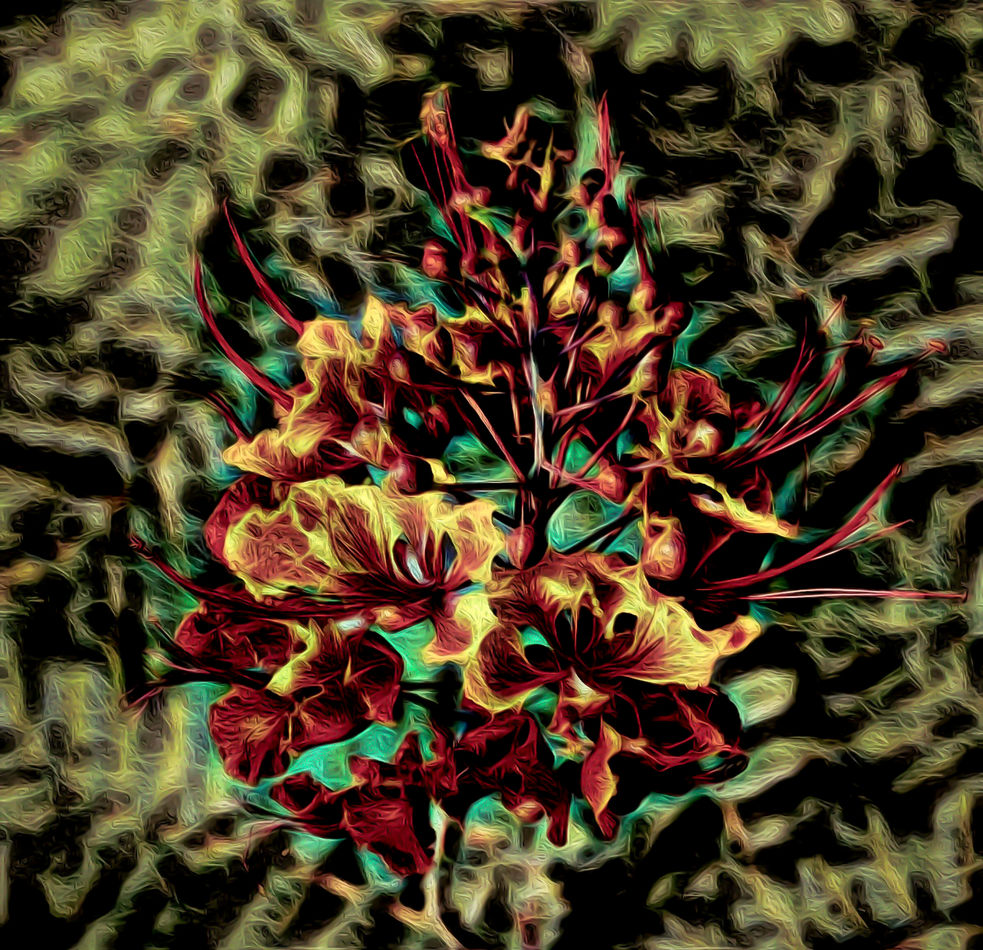
I see you invite edits so I'll post what I was envisaging. Apart from some overall softening using denoise and a touch of negative Clarity I gave the periphery some extra adjustments using an adjustments brush and a slight vignette.
I also used some slight WB and Tint shifting as well as some slight split toning (amber for the highlights and blue for the shadows). Globally I shifted WB slightly towards yellow and Tint slightly towards magenta, and via the same brush as before I gave the periphery a slight WB shift towards blue and a Tint shift towards green. I also increased global Brightness slightly and reduced (darkened) both the Whites and the Blacks. And to counteract the global softening I gave it some edge-based sharpening to maintain the main edges.
.
Jan 28, 2022 06:39:21 #

I like your composition, a good balance of color and black space. Nicely done.
Jan 28, 2022 06:43:19 #

Curmudgeon wrote:
Simple to make in Topaz Studio 2. I find it pleasing and considering an 8x10 print. What do you think
Very good - but I reckon it needs a 16x20.

Jan 28, 2022 07:44:53 #
I like the subject but my eye was immediately taken to the upper left corner of the image due to the brightness and fine detail in that area and then out of the frame. Maybe a vignette would help
Jan 28, 2022 07:50:45 #
Jan 28, 2022 08:05:51 #
Jan 28, 2022 08:09:05 #
The only person that has to like the image is you and anyone who has to live with it.
Personally, I find it too disconcerting.
Personally, I find it too disconcerting.
Jan 28, 2022 08:39:22 #
Jan 28, 2022 09:13:01 #
R.G. wrote:
I see you invite edits so I'll post what I was env... (show quote)
I Luv It!
 - how about the attached version by Smart Edit - having read the previous? A 16"x16" square?
The download makes for easier viewing without scrolling.
Jan 28, 2022 09:56:50 #
BushDog
Loc: San Antonio, TX
I like it. It appears to me that a square print would eliminate the need to crop off part of what’s shown in the posted image.
Jan 28, 2022 12:27:04 #
If you want to reply, then register here. Registration is free and your account is created instantly, so you can post right away.