Check out Film Photography section of our forum.
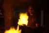
Boudoir Shot
May 10, 2021 10:38:41 #

May 10, 2021 10:44:59 #
May 10, 2021 11:03:06 #

Fotoartist wrote:
I thought I would get snide comments about the size of the logo. But I hope everyone realizes the necessity.
Absolutely.
Check out AI Artistry and Creation section of our forum.
May 10, 2021 11:39:16 #
azted
Loc: Las Vegas, NV.
Lovely model, perfectly shot, and colors balance. Why the background? Is that part of the message?
May 10, 2021 17:48:34 #
May 10, 2021 19:22:18 #

May 10, 2021 20:34:48 #
Check out Traditional Street and Architectural Photography section of our forum.
May 10, 2021 20:52:50 #
Fotoartist wrote:
I may have posted this before, it's been awhile. I like the way the logo works with the pic.
Boudoir?
May 11, 2021 13:40:31 #

WOW she is beautiful and you made a great shot!! Keep it up we want more!
May 11, 2021 16:26:31 #
Fotoartist wrote:
I may have posted this before, it's been awhile. I like the way the logo works with the pic.
The presentation works well and is well done.
There are several ways the shot can be cropped and it will still retain the pizzazz in all ways. This is a good sign of great workmanship.
One would be to bring up the lower line up to where the "V" of the cleavage starts. The result would be a presentation that could be tantalizing while being "G" rated. Extend a white area to the right of the shot for the business card style, for the address and other information.
One adjustment I would do is to center her head on the frame behind her a little bit. Move the trademark over to the right so that it does not seem like she is dodging it.

May 12, 2021 16:46:44 #
Fotoartist wrote:
I may have posted this before, it's been awhile. I like the way the logo works with the pic.
Very nice
Check out Landscape Photography section of our forum.
May 13, 2021 17:32:33 #
What a sweetheart! I actually think the logo is distracting where it is, so close to her face. Maybe down below? Great eye contact, smile, exposure is spot on.
May 15, 2021 10:25:51 #

May 17, 2021 18:53:28 #
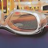
Bold, almost surrealistic color. Generally speaking I like the image and the model, but maybe just a bit too much depth of field. I'm not a fan of the logo, too competitive and prominent, I think.
May 18, 2021 16:40:53 #

Fotoartist wrote:
I may have posted this before, it's been awhile. I like the way the logo works with the pic.
A logo

If you want to reply, then register here. Registration is free and your account is created instantly, so you can post right away.
Check out Printers and Color Printing Forum section of our forum.