Check out Bridge Camera Show Case section of our forum.
Any advice/praise?
Oct 15, 2012 10:21:36 #
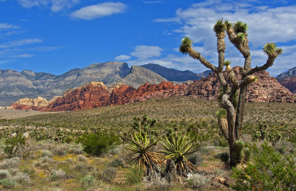
A few pics I think are really good (for me). But I'm just a guy with a camera, not a photographer. Tell me what you think.
Thank you
MW
Thank you
MW


Oct 15, 2012 10:29:36 #
Oct 15, 2012 10:36:58 #
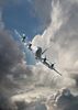
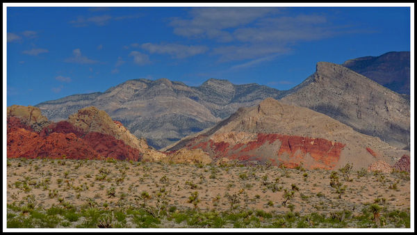
The first two look like they could stand some tweaking. IMHO Increase the contrast and shadows and adjust the Levels. It really brings out the reds and the blue sky. And #3 would really pop with just a little tone mapping.Great scenes BTW!
MWojton wrote:
A few pics I think are really good (for me). But I'm just a guy with a camera, not a photographer. Tell me what you think.
Thank you
MW
Thank you
MW
Oct 15, 2012 10:46:17 #

Oct 15, 2012 13:02:25 #

Country's Mama wrote:
I like the composition in #2 the best.
I agree with Country's Mama. #2 for sure.
Oct 16, 2012 07:26:06 #
Oct 16, 2012 07:32:21 #

I think an increase in contrast would bring up the colours dramatically in all three.
Check out Digital Artistry section of our forum.
Oct 16, 2012 07:38:46 #
Oct 16, 2012 11:43:25 #
What is tone mapping, and how do I do it ( I have PE10)?
Thanks for the input.
Thanks for the input.
Oct 16, 2012 12:13:46 #
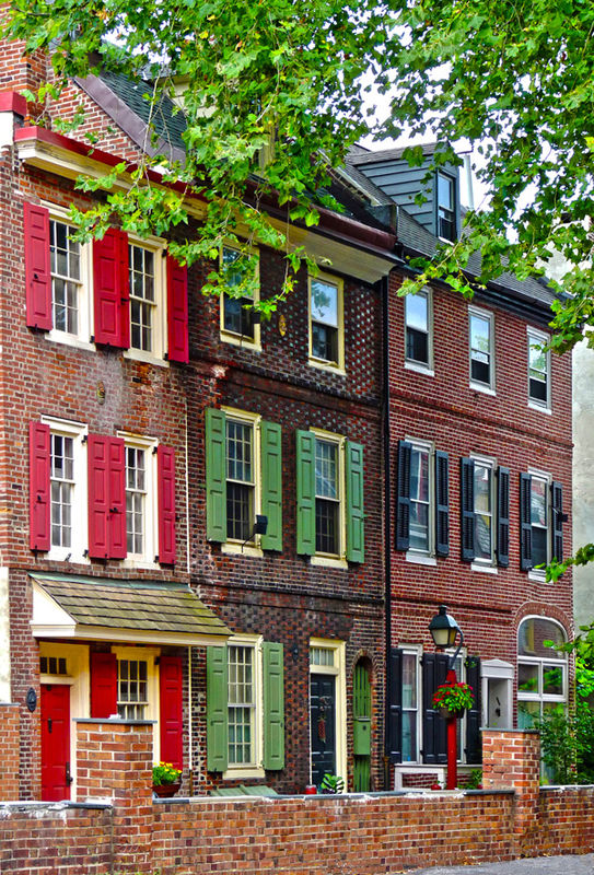
Composition Ok in 1 & 2 but overexposed. Easily adjusted in Photoshop Elements as shown.
Try bracketing the exposure of your shots if your camera has this facility, most do.
Try bracketing the exposure of your shots if your camera has this facility, most do.
Oct 16, 2012 15:34:25 #

Ditto!
littlebiddle wrote:
The first two look like they could stand some tweaking. IMHO Increase the contrast and shadows and adjust the Levels. It really brings out the reds and the blue sky. And #3 would really pop with just a little tone mapping.Great scenes BTW!
MWojton wrote:
A few pics I think are really good (for me). But I'm just a guy with a camera, not a photographer. Tell me what you think.
Thank you
MW
Thank you
MW
Check out Infrared Photography section of our forum.
Oct 16, 2012 16:23:12 #
It is similar to HDR But less drastic. I can show you what it would look like if you like! I edited a shot the other day without asking and was told to ask first.
MWojton wrote:
What is tone mapping, and how do I do it ( I have PE10)?
Thanks for the input.
Thanks for the input.
Oct 17, 2012 08:59:20 #
littlebiddle wrote:
It is similar to HDR But less drastic. I can show you what it would look like if you like! I edited a shot the other day without asking and was told to ask first.
MWojton wrote:
What is tone mapping, and how do I do it ( I have PE10)?
Thanks for the input.
Thanks for the input.
Yes, you don't need my permission. Show me the final result and tell me what/how you did it.
Thanks
Oct 17, 2012 10:52:34 #
I think PSE !0 has some of the same features a PS/CS5but not sure. The mountain scene I just up the contrast, lowered the shadows and increased the highlights. Then adjusted the levels with the slider by bringing in bothe the light and dark and centering the middle slider. It made the colors pop IMHO> The buildings was much easier as the contrast was spot on. So all I did was go to image/adjustments and HDR Toning. I made very slight adjustments to it to bring out the colors and detail. They are both great shots BTW!
MWojton wrote:
Yes, you don't need my permission. Show me the final result and tell me what/how you did it.
Thanks
littlebiddle wrote:
It is similar to HDR But less drastic. I can show you what it would look like if you like! I edited a shot the other day without asking and was told to ask first.
MWojton wrote:
What is tone mapping, and how do I do it ( I have PE10)?
Thanks for the input.
Thanks for the input.
Yes, you don't need my permission. Show me the final result and tell me what/how you did it.
Thanks
Contrast and Levels Adjustments
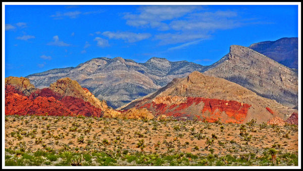
HDR Toning
Oct 17, 2012 16:46:59 #
littlebiddle wrote:
I think PSE !0 has some of the same features a PS/... (show quote)
Wow! They look great. Now I have more work to do. Thanks so much for responding.
MW
If you want to reply, then register here. Registration is free and your account is created instantly, so you can post right away.
Check out Panorama section of our forum.