BW editing
Dec 6, 2020 14:03:24 #
Chicflat
Loc: Tulsa, Ok,
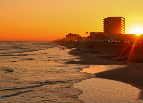
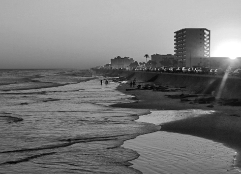
So, I have been working on improving my skills. Below is an edited image of the beach at Galveston, Tx. The second image is my BW conversion that I have developed so far. What I hope to discover are there techniques, editing tools, adjustments, or whatever I am not aware of that might bring into the BW version aspects or details that are in the color version that aren't seen in the BW. Please be as specific as possible; For example. in the little polygon of illuminated water to the right side of the image ( just below the tall building ) i I did a little burning to transition the water reflections which I had thought a little to contrasty in the image.
Thank you
David
Thank you
David
Dec 6, 2020 14:19:03 #

David, this will be a terrific topic for discussion; thank you! However...😊
The photos you posted are tiny, even smaller than normal UHH thumbnails. Can you upload larger sized copies, with "store original" box checked prior to clicking attach, so that we can view more closely? Thanks much! (just add to this thread, and I'll replace them in your opening)
The photos you posted are tiny, even smaller than normal UHH thumbnails. Can you upload larger sized copies, with "store original" box checked prior to clicking attach, so that we can view more closely? Thanks much! (just add to this thread, and I'll replace them in your opening)
Dec 6, 2020 14:36:25 #

It would also help if you at least give a hint about your tools and workflow.
Dec 6, 2020 15:17:33 #
Dec 7, 2020 08:11:04 #

bleirer wrote:
Color is one of the most interesting things about that original, in my opinion.
I agree with the choice of the color image. The B&W does little for me, but the intense morning color makes a strong statement of the dominance of the sun.
Chicflat, you will find that a plugin as Topaz B&W2, is not just B&W, but has many variations. With experimentation and imagination, we grow as creative artistic storytelling photographers.
Dec 7, 2020 09:46:37 #

bleirer wrote:
Color is one of the most interesting things about that original, in my opinion.
That'd be lesson #1 - choose suitable subjects. Unless you're on a nostalgia trip where anything B&W reminds you of the good ol' days, some things are better in B&W but some are better in colour. B&W can be better in cases where colour would be a distraction, but as this example shows, colour can be a strong part of the storytelling. There's no edgy drama to be brought out, the structure and geometry of the buildings aren't sufficiently prominent to be considered a main subject and the textures are too distant to be discernible.
The main "tools" in B&W are contrast, sharpness and lighting, which can all be used to draw the viewer's attention to the desired parts of the image. Leading lines and the like take on a greater significance with B&W because the process of leading the viewer's attention has greater significance. A common reason for that is because storytelling is often more of a thing with B&W. Intense storytelling is often referred to as drama.
That's my (very) quick summary - attention directors and attractors are typically even more relevant in B&W than they are with colour. Brightness and vividness (i.e. contrast and sharpness) can be used to draw attention to the relevant parts of the scene, where storytelling is just one factor that can impart relevance. Other possibilities are shape, pattern, structure, texture (there's probably lots more but that's what comes to mind just now).
Dec 7, 2020 12:57:14 #
Same image but two entirely different pictures. I, of course, like the B&W version and think there is much more that can be done with it.
Dec 7, 2020 16:54:18 #
Chicflat
Loc: Tulsa, Ok,
Sorry that I haven't been back sooner. More importantly, thank you all for your kind remarks. Looking again at the strenght of the color version that you (plural) have mentioned, I think I may have abeeter grip on the differences required to make a better conversion to BW.
If you want to reply, then register here. Registration is free and your account is created instantly, so you can post right away.