Fall Abstraction
Sep 26, 2020 21:53:05 #

Sep 26, 2020 23:18:17 #

Sep 26, 2020 23:54:05 #


Sep 27, 2020 07:50:58 #

Very appealing. I love how the negative space works here to help draw my eye to the colors and light.
Sep 27, 2020 10:41:29 #
Sep 27, 2020 10:42:31 #
Sep 27, 2020 10:42:59 #
Linda From Maine wrote:
Very appealing. I love how the negative space works here to help draw my eye to the colors and light.
Thank you, Linda.
Sep 27, 2020 12:31:45 #

The lighting for me is very appealing. I also think the dark background works well on this shot.
Sep 27, 2020 12:33:48 #
NJFrank wrote:
The lighting for me is very appealing. I also think the dark background works well on this shot.
Thank you, NJFrank.
Sep 27, 2020 18:35:32 #

Sep 27, 2020 22:06:37 #
Sep 28, 2020 10:00:52 #
edrobinsonjr wrote:
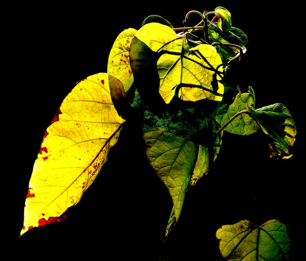
A volunteer catalpa plant in the yard. Sun going down.
The backlighting contrasting with the pure black background makes this feel like an abstraction. As presented, the plant seems to be floating in a sea of black. That works really well for the abstraction. I think, however, that the leaf on the lower right is more of a distraction than something that enhances your composition. It makes me move my eye from what I think is your main subject. The flow seems to be a diagonal from the lower left to the upper right. Then I notice the leaf on the right bottom and the flow is interrupted. I don't think it is a deal breaker by any means since the main subject is a very strong subject; but I do see that extra leaf as a bit of a distraction.
Erich
Sep 28, 2020 11:12:12 #
ebrunner wrote:
The backlighting contrasting with the pure black b... (show quote)
Thanks for your comments, Erich. I felt that the leaf kind of carried the lines around.
I'll do an edit and repost later today to see.
Sep 28, 2020 14:11:29 #
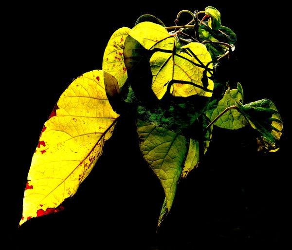
This version is for Erich. Removed the leaf in the lower right corner.
While I still prefer the original, I must agree that there is no longer anything to draw the eye away from the main body of the image. After staring at it for a while I feel it is better balanced as well.
Thanks again for your analysis, Erich.
Ed
While I still prefer the original, I must agree that there is no longer anything to draw the eye away from the main body of the image. After staring at it for a while I feel it is better balanced as well.
Thanks again for your analysis, Erich.
Ed
Sep 28, 2020 17:06:51 #
edrobinsonjr wrote:
This version is for Erich. Removed the leaf in the lower right corner.
While I still prefer the original, I must agree that there is no longer anything to draw the eye away from the main body of the image. After staring at it for a while I feel it is better balanced as well.
Thanks again for your analysis, Erich.
Ed
While I still prefer the original, I must agree that there is no longer anything to draw the eye away from the main body of the image. After staring at it for a while I feel it is better balanced as well.
Thanks again for your analysis, Erich.
Ed
OOOH! I really like that version. It is, of course, your photo, so your preferences are the ones that count.
erich
If you want to reply, then register here. Registration is free and your account is created instantly, so you can post right away.