Minimalism
Sep 23, 2020 10:08:09 #

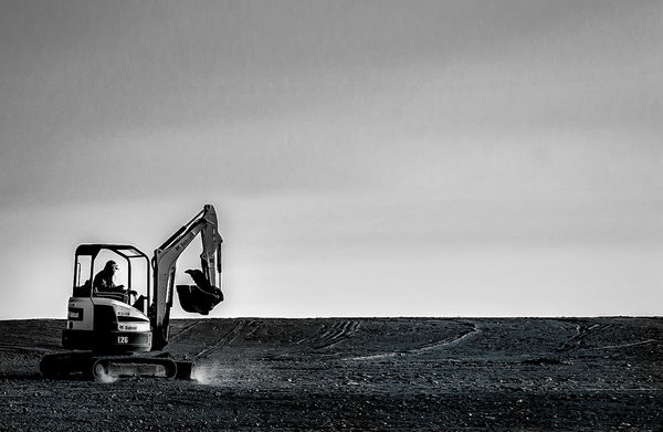
#1 engages my interest and I can perceive some sort of statement within it - something like "This is a digger and an expanse of what it works with".
I think with minimalism we need to have something to identify and attach meaning to - a recognisable subject and/or a recognisable story. If we go beyond that into the realms of the abstract we need something in the form of visual interest to make up for the loss of intellectual interest. Without that the observer's inner dialogue will be something like "What is it?... Don't know. What does it mean?... Don't know. Is there anything else of interest? No. Ho hum....". I think #3 falls into that category. Obscurity works only if there's something to engage our interest and/or curiosity.
I think with minimalism we need to have something to identify and attach meaning to - a recognisable subject and/or a recognisable story. If we go beyond that into the realms of the abstract we need something in the form of visual interest to make up for the loss of intellectual interest. Without that the observer's inner dialogue will be something like "What is it?... Don't know. What does it mean?... Don't know. Is there anything else of interest? No. Ho hum....". I think #3 falls into that category. Obscurity works only if there's something to engage our interest and/or curiosity.
Sep 23, 2020 10:15:38 #

R.G. wrote:
Thank you very much for your comments, R.G. Your checklist for #3 is something I'll copy/paste for next attempt. Concise and valuable!#1 engages my interest and I can perceive some sor... (show quote)
Sep 23, 2020 10:22:32 #

I like what you did with no. 1. It give a sense of motion. I feel he is racing forward with all that open space to cover.
Sep 23, 2020 10:34:48 #

It was interesting to see what you did with #1. Just looking at the image, I would have had no idea! Very well done. It looks very natural - even to the distant cloud.
Sep 23, 2020 13:16:49 #
Cwilson341 wrote:
Thanks very much, Carol! I was pleased to see that I caught the bucket just above the horizon line. I only took one shot because he turned around right after and I was in a somewhat precarious spot with my car I like what you did with no. 1. It give a sense of motion. I feel he is racing forward with all that open space to cover.

Sep 23, 2020 13:18:02 #
AzPicLady wrote:
Thanks so much, Kathy. I was surprised how relatively seamless the result was - and surprised that it even occurred to me to perform that "solution" to the lack of space in the original It was interesting to see what you did with #1. Just looking at the image, I would have had no idea! Very well done. It looks very natural - even to the distant cloud.

Sep 23, 2020 13:24:00 #

Linda From Maine wrote:
Attempting to tell stories with minimal elements, ... (show quote)
 I've covered up a lot of sunlit dust specks. Will do more if I keep this. Would you crop? In what way?


-------------------------------------
Linda
I’m here to comment on the first image only.
I would do nothing to it. Cropping it in from the right, in my estimation, removes the expansive feel that it has as posted. I tried that crop and didn’t like it one bit. As is… you feel what the worker is up against.
The only thing I don’t like about it… and I don’t believe you could have done anything about it… is the (what must be) buildings on the right where the ground meets the sky. But over all, I thing the uncropped simplicity of the image isoutstantding.
You did not suggest this… but I’d like to add a new dimension to it. That would be black and white. I have my feelings about many of the b&w postings we see here.
Many people seem to love black and white. I do and I don’t. I believe that too many post images transformed to b&w… because that can with the touch of a button. Some are good and some are bad. I have come to the conclusion that the more there is to see in an image… the less satisfactory that image will finally be as a b&w. THAT IS A GENERALITY AND NOT ALWAYS TRUE.
Images that do not have much contrasting tonal elements… to my mind… often fail in b&w. The image that you posted… in its simplicity, absence of a lot of ‘stuff’ to look at, and sharp tonal contrasts… it becomes a first class candidate for b&w. (my B&W try… posted below.)
Again… I’m generalizing. That is the conclusion I have come to. Many may differ. And sometimes I will differ with myself. And that’s fine. IMHO
Barry
Sep 23, 2020 13:29:43 #
bbrowner wrote:
Thank you very much for your time and detailed comments, Barry. I like your b&w! I did one version per SalvageDiver's comments, but it is for a different reason (more minimalist with fewer details). You've inspired me to try another.------------------------------------- br br Linda... (show quote)
Your comment re buildings on the horizon line: it's just bits of vegetation. The distance is very short, but I'm delighted you see it as far away. That was one reason I added real estate to the original shot. More info on that aspect here: https://www.uglyhedgehog.com/t-665672-1.html#11592750
Thanks again for your input!
Sep 23, 2020 14:56:59 #
Wow I feel like I'm jumping into the deep end of the swimming pool. All those insightful comments leave me struggling to understand what I am looking at.
For the first one the addition of "real estate" is technically well done but otherwise it's just a back hoe on dirt. I know I'm missing something here but I have no idea what it is.
The second one is wonderful. It is something I would hang on my wall if I had any wall space left.
I don't even understand what the the third one is.
Sep 23, 2020 15:09:45 #
Curmudgeon wrote:
Wow I feel like I'm jumping into the deep end of t... (show quote)
----------------------
You're right. It's partially a back-hoe on dirt. Beyond that... it's photograph of a back-hoe on dirt. Just a photograph. It doesn't have to be anything profound beyond a photo of what it is. Need not tell a story. Need not be anything beyond what you see. What puts this photo in the "interesting" category is how it is handled.
It's kinda like the never-ending necessity to put a catchy caption (sometimes stupid) on every photo. We should not be told what to think. We should be allowed to see (or hear, in case of music) it for what it s. To let it stand on its own two feet. Don't you all want to be allowed to think, see, and feel for yourself ?
Barry
Sep 23, 2020 15:27:15 #
Here only the lines of the bottle that reflect a bit of light are visible. I think this is just on the border between minimalism and abstraction. You can still tell that it is a bottle standing on a flat surface that has some reflection in it. Done indoors with the camera on a tripod. When I'm doing minimalist photos, I often use black and white.
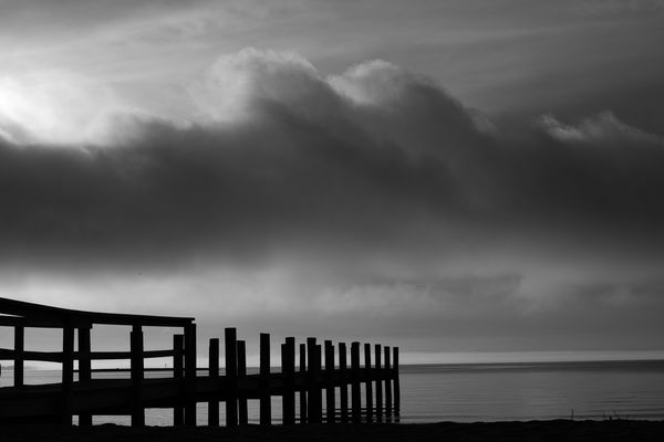
Another, not so stark example, is the bay with a silhouetted dock and some morning clouds. Again, tripod was used.
Examples added to thread with OP permission.
Erich
Another, not so stark example, is the bay with a silhouetted dock and some morning clouds. Again, tripod was used.
Examples added to thread with OP permission.
Erich
Linda From Maine wrote:
Attempting to tell stories with minimal elements, ... (show quote)

Sep 23, 2020 15:50:55 #
Linda From Maine wrote:
Thank you Peter! I have a few other compositions o... (show quote)
Nicely done.
Sep 23, 2020 15:58:50 #
Curmudgeon wrote:
The great gift of honest and friendly feedback is for the OP to be able to view their image through someone else's eyes. As we know from any UHH topic that requests a choice or opinion, it's rare to see a consensus. I very much appreciate your time and comments, Jack!Wow I feel like I'm jumping into the deep end of t... (show quote)
Sep 23, 2020 16:00:47 #
ebrunner wrote:
Did you post the bottle previously, Erich? I think I remember it and I love, love, love it!Here only the lines of the bottle that reflect a b... (show quote)
Many thanks for the inspiration.
Sep 23, 2020 16:01:18 #
If you want to reply, then register here. Registration is free and your account is created instantly, so you can post right away.