best color for a backdrop?
Jul 18, 2020 06:41:24 #

I agree with Haydon, grey is very versatile...
Haydon wrote:
Grey is the most versatile. You can light it to stay grey or shades of white, remove light to have it go black or gel it to go any other color.
Joe Ederman a 40 year portrait vet has a comprehensive YT video regarding this topic.
https://www.youtube.com/watch?v=fgtssUAjygA
Joe Ederman a 40 year portrait vet has a comprehensive YT video regarding this topic.
https://www.youtube.com/watch?v=fgtssUAjygA
Jul 18, 2020 07:32:26 #
billnikon
Loc: Pennsylvania/Ohio/Florida/Maui/Oregon/Vermont
rjrbigdog wrote:
white, black or grey. want to use in post processing. and any recommendations on what to buy and where? thanks
https://www.bhphotovideo.com/c/search?Ntt=savage%20background%20paper&N=0&InitialSearch=yes&sts=ps
Jul 18, 2020 08:15:48 #
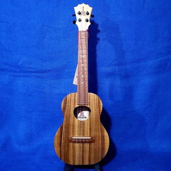
I would look in a fabric store. Joan Fabric near me lets you order online and then have curb-side pickup. That would probably be less expensive than buying a special photography product. The cost is so low that you could buy several colors. A popular ukulele dealer uses blue. I bought a green screen and stand for it from Amazon. Of course, a green screen is used for special effects, rather than a background, but the stand can be used for any fabric.
https://smile.amazon.com/Linco-Lincostore-Portable-Background-Backdrop/dp/B071G51NRP/ref=sxts_b2b_sx_reorder?cv_ct_cx=green+screen+stand&dchild=1&keywords=green+screen+stand&pd_rd_i=B071G51NRP&pd_rd_r=5a969da9-1280-42ed-b375-c1dc39bc2605&pd_rd_w=d5bcA&pd_rd_wg=hK9HB&pf_rd_p=55e3f870-f610-46d5-a6bd-2adc9a5c4c7c&pf_rd_r=6TJRVNXTV2KDZNFPXRS5&qid=1595074426&sr=1-1-f5ebfd8e-82c1-4b4e-97d5-2aa47aa18b69
And better still -
https://smile.amazon.com/Julius-Studio-Background-Photography-JSAG283/dp/B072BCNRTY/ref=sr_1_1_sspa?dchild=1&keywords=green+screen+stand&qid=1595074460&sr=8-1-spons&psc=1&spLa=ZW5jcnlwdGVkUXVhbGlmaWVyPUEyTFJOR1g4TE9OMlVKJmVuY3J5cHRlZElkPUEwOTU2Nzk0MVBONUROODhPTkRGWiZlbmNyeXB0ZWRBZElkPUEwMjQxMTY4MjBCM09SRjhDV0ZaTyZ3aWRnZXROYW1lPXNwX2F0ZiZhY3Rpb249Y2xpY2tSZWRpcmVjdCZkb05vdExvZ0NsaWNrPXRydWU=
Jul 18, 2020 08:36:55 #
Ny5y
Loc: Mississippi
Go to Harbor Freight, Lowes, or Home Depot and get either a cheap colored tarp or a painters (construction) canvas ! Either works well and you can dye the canvas!
Jul 18, 2020 10:29:09 #

Jul 18, 2020 10:42:42 #

Haydon wrote:
Grey is the most versatile. You can light it to stay grey or shades of white, remove light to have it go black or gel it to go any other color.
Joe Ederman a 40 year portrait vet has a comprehensive YT video regarding this topic.
https://www.youtube.com/watch?v=fgtssUAjygA
Joe Ederman a 40 year portrait vet has a comprehensive YT video regarding this topic.
https://www.youtube.com/watch?v=fgtssUAjygA
----------------------------------------------
Nice Info Joe......... Very Instructional for sure
Cheers
GeoVz
Jul 18, 2020 11:37:46 #
Jul 18, 2020 11:45:28 #
rjrbigdog wrote:
white, black or grey. want to use in post processing. and any recommendations on what to buy and where? thanks
Studio Grey, you can throw any color gel on a background light and that will be the color of the background.
Jul 18, 2020 20:10:00 #

rjrbigdog wrote:
white, black or grey. want to use in post processing. and any recommendations on what to buy and where? thanks
There is no best color. It depends on your creativity. I have black and I have white. Some people us that green-screen color. Others use gray. And still more use printed backdrops. It's up to you.
Jul 18, 2020 20:34:25 #
Jul 18, 2020 21:46:23 #

rjrbigdog wrote:
white, black or grey. want to use in post-processing. and any recommendations on what to buy and where? thanks
What are you shooting- flowers, people, still life? There is no universal background color or shade that is universal for every subject. You need to consider color harmony, key, the illusion of depth, separation, and more.
The best and easiest method of background management is to include the background, of the right color/shade, content, and/or density that is compatible and harmonious with the subject. If you are going to replace or create the background in post-processing, choose the color or shade that makes the process easy and convenient and less tedious and provides enough contrast and delineation so that you can see what you are doing and avoid bleeding.
If you are not shooting large subjects, smaller rolls of seamless background paper are not costly- you can have rolls of white, studio gray, and black.
Jul 18, 2020 22:12:35 #
Jul 19, 2020 04:46:11 #
domcomm
Loc: Denver, CO
If you use gray, be sure it is a pure gray, not tinted with any other color. That way yhou can change the effect by the light you have on it. If you use a brownish gray, or blue-gray, or whatever, you are stuck with it. Also see truthaboutneutrals.weebly.com
I have one wall painted with a pure gray, similar to the old photograhic gray-card. It works great for all kinds of photography, depending on the lighting used.
I have one wall painted with a pure gray, similar to the old photograhic gray-card. It works great for all kinds of photography, depending on the lighting used.
Jul 22, 2020 23:12:43 #
The advantage of using gray is that if you shoot with a colored gel on the background, the color will be much more intense than it would be on white. It rarely shows on black. I do this a lot and it's as if I had a lot more colors of background than I do. Dark gray gives the best saturation, pale gray less. I prefer using gels to changing in post, but I have the gels and others do not have this option.
Jul 22, 2020 23:20:19 #
If you want to reply, then register here. Registration is free and your account is created instantly, so you can post right away.