New photographer going bold
Oct 9, 2019 09:27:08 #

anotherview wrote:
Agree: "the first shot you could have shot from a different angle maybe move to the right a little so you don't get the construction equipment in the shot and maybe a little more view of the water."
Getting an effective composition presents, arguably, the most important element in a worthy photograph.
Lifting the midtones in the first photograph would bring out more information for a more satisfying visual experience for the viewer.
Getting an effective composition presents, arguably, the most important element in a worthy photograph.
Lifting the midtones in the first photograph would bring out more information for a more satisfying visual experience for the viewer.
Could you please give me a little more info on lifting the midtones. Still trying to get it right in Lightroom. Thanks.
Oct 9, 2019 09:33:38 #

We could provide better feedback if you had stored the originals and we could open and see both images in their full-screen glory.

Oct 9, 2019 09:43:26 #

Keep studying composition as a direct means of achieving the most effective outcome of a given photograph. Composition functions as a foundation for an image.
Jermes80 wrote:
WOW! Thanks so much. Appreciate all your comments. I agree on moving to the right for the first one. I was as far as I could go since I was standing on a boardwalk. Interesting comments on the tight crop. I will give that a try. I am trying to fill the frame. Afraid of negative space , I guess.
Oct 9, 2019 10:07:54 #

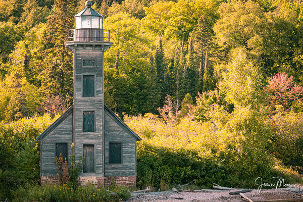
You are off to a good start. Your second picture has a better visual design than the first one. I agree entirely with the gentleman that suggested shooting that first image from a different angle. Always remember that each subject usually has a 360 degrees from where we can look at it. Our first sight of the subject is not necessarily the best view.
Oct 9, 2019 10:22:08 #

Jermes80 wrote:
Greetings all! Diving head first into serious photography after "piddling" for years. I am submitting some photos for critique primarily for composition and anything else constructive you think might help. I am tender but I promise I won't get my feelers hurt. This is my first post by the way. Thanks in advance
Welcome and I love light houses and have never seen a bad picture of one....Ever , as I am so biased.
I too have piddled & diddled around for many decades and have yet to post any work of my own , so I applaud your courage and wish you success.
I think most here are objective & kind in their critiques of member's submissions and we all need validation and a sense of community in our daily existence with our passions bare and exposed.
Good luck to you, and you'll be fine.

Oct 9, 2019 10:33:44 #

Oct 9, 2019 10:37:52 #

Welcome aboard. Remember "less is more", so don't fret over negative space.
Oct 9, 2019 12:21:10 #
ICN3S
Loc: Cave Junction, OR
Photo 2 is slightly leaning to the left.......otherwise they are beautiful and worthy of hanging on your wall!
Oct 9, 2019 12:49:22 #

Nice composition on the second photo. The water mark, I think, should have been placed of the lower right. The first photo would have looked better if the angle was different. Light house more to the left so as to block the construction equipment and just a bit wider. Keep on shooting.
Oct 9, 2019 15:11:17 #
Oct 9, 2019 15:34:55 #
Oct 9, 2019 18:47:42 #

Jermes80 wrote:
Greetings all! Diving head first into serious photography after "piddling" for years. I am submitting some photos for critique primarily for composition and anything else constructive you think might help. I am tender but I promise I won't get my feelers hurt. This is my first post by the way. Thanks in advance
Both are well done.
Oct 9, 2019 19:07:39 #

Aloha Jermes80 and welcome to UHH. Have to agree on #1 comments. #2 is a great shot of this old lighthouse with the capture of fall colors.
Oct 9, 2019 21:17:36 #
First shot would be better with shooting position to the right and offset the lighthouse more in the rule of thirds. Great subject. Second shot is pretty fab. Really like the colors.
Oct 11, 2019 16:10:41 #
If you want to reply, then register here. Registration is free and your account is created instantly, so you can post right away.