Serene . . .
Jul 24, 2019 06:42:19 #

John N wrote:
There's something here I can't quite put my finger on. Too many similar shots like this seem cluttered to me but this provides almost mesmerising viewing.
Thanks much, John.
Jul 24, 2019 06:44:27 #

Jul 24, 2019 07:23:28 #

This is very, very nice, John. I am typically not a big fan of b&w, but this held me. I think your title fits it perfectly.
Jul 24, 2019 07:46:57 #

Very nice setting and portrayal of such.
--Bob
--Bob
jaymatt wrote:
. . . in black and white.
Pleas view the download for sharpness.
Pleas view the download for sharpness.
Jul 24, 2019 08:02:10 #

Jul 24, 2019 08:56:07 #

Jul 24, 2019 09:11:55 #

Jul 24, 2019 09:17:32 #

It's lovely. There's lots of detail to look at. The curve of the water is perfect for leading the eye through the image.
Jul 24, 2019 10:01:36 #
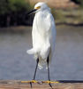
Great image John. The B&W conversion has not trampled on the tonal range of this shot. Nicely done.
Jul 24, 2019 10:27:08 #

It is a great conversion and indeed serene as you have call it. I like to use contrast in my b&w images since those times when I was into the optical darkroom and I guess I continue to do the same.
In this particular case it is my humble opinion that some of that contrast should be cut down but as I said it is only my opinion.
In this particular case it is my humble opinion that some of that contrast should be cut down but as I said it is only my opinion.
Jul 24, 2019 10:34:36 #
Jul 24, 2019 11:21:52 #
Jul 24, 2019 11:33:43 #

Jul 24, 2019 12:16:02 #
Jul 24, 2019 12:20:50 #

If you want to reply, then register here. Registration is free and your account is created instantly, so you can post right away.