Color or monochrome?
Jul 8, 2019 22:38:49 #
SWFeral
Loc: SWNM
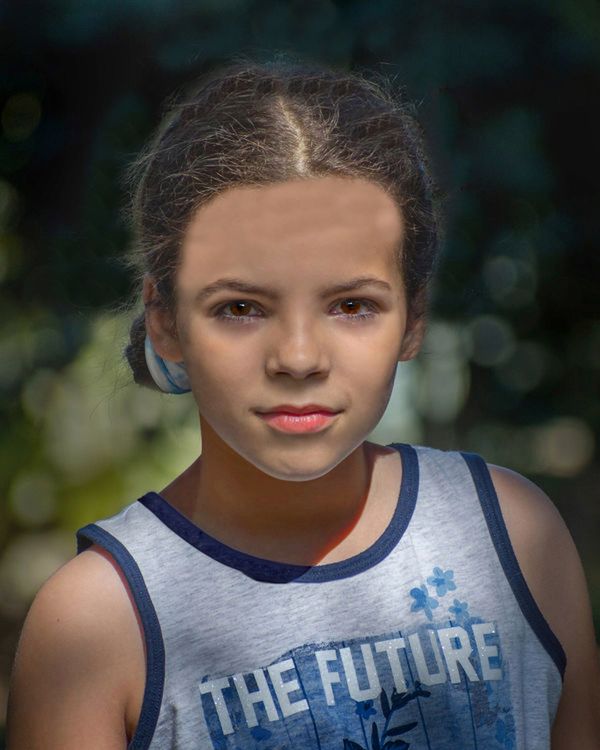
As much as I like B/W, in this case I go for color. Her eyes are too clear and beautiful and warm.
Jul 8, 2019 22:49:02 #
To me the sudden appearance of the light areas around her face serves to wreck the chiaroscuro of the photograph. Chiaroscuro is art history speak for the he arrangement of lights and darks in a painting. Good chiaroscuro is especially important to composition in a monochrome image --even more so in gray scale work.
Jul 9, 2019 07:27:24 #

TylerDurdensReel wrote:
I'm interested in hearing what you feel or see when you look at these images. They are copies of two captures and cropped to 8x10. One of the color copies is cropped more but still for 8x10. Any technical feed back is welcome too.
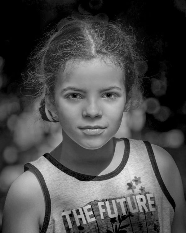
Monochrome does not work for these portraits as the lighting is overhead. As a result, you get shadowing in the eye sockets and the eyelashes cast shadows onto the cheeks also. When you use monochrome, it accentuates this. In the color shots, the portrait is much more natural.
Jul 9, 2019 10:19:52 #

StanMac wrote:
Starting to get some posterization in there ……
Stan
Stan
I’m sure Tyler got the point I was trying to make ....
Jul 9, 2019 10:27:14 #
Jul 9, 2019 13:12:35 #

TylerDurdensReel wrote:
I'm interested in hearing what you feel or see when you look at these images. They are copies of two captures and cropped to 8x10. One of the color copies is cropped more but still for 8x10. Any technical feed back is welcome too.
Tyler - Still prefer the color. Here's my take.

Jul 9, 2019 16:48:03 #

Jul 9, 2019 16:59:37 #

optic wrote:
To me the sudden appearance of the light areas around her face serves to wreck the chiaroscuro of the photograph. Chiaroscuro is art history speak for the he arrangement of lights and darks in a painting. Good chiaroscuro is especially important to composition in a monochrome image --even more so in gray scale work.
The first question we should be asking ourselves is simply, "Is the BW photograph interesting?" In my view, it certainly is. As to Chiaroscuro - or Rembrandt lighting - this refers to high contrast lighting where faces are half in light and half in shadow. Although the subject photograph does not reflect light and dark extremes as defined in the genre, it does have a darker side and a lighter side to the face. Sometimes, a picture doesn't fit into narrow descriptive styles. You either like a style or you don't. I think that often a photographer's different approach is perfectly acceptable. In this case, my version of the image in black and white does work. Beauty is definitely in the eye of the beholder.
Jul 9, 2019 17:07:26 #

Jul 9, 2019 19:56:44 #

Your first photo shows off the beauty of this young girl. The color in her eyes needs to be shown, monochrome will not do this like you did with the color. The first one is also cropped to show just her, not a shirt and a face. The face is the PICTURE. Great photo.
Jul 10, 2019 00:47:30 #
WILLARD98407 wrote:
Tyler - Still prefer the color. Here's my take.
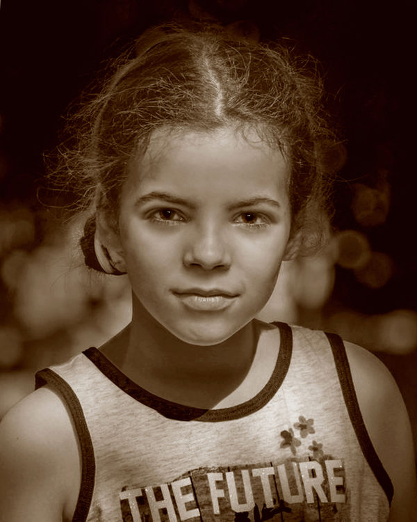
A couple more options. at least the sepia seems to help give her eyes the brown they deserve.
Jul 10, 2019 04:11:31 #
Color all the way ..especially the eyes ..
Jul 13, 2019 16:23:21 #

Jul 13, 2019 19:14:42 #
If you want to reply, then register here. Registration is free and your account is created instantly, so you can post right away.