please give me your honest opinion
Jan 29, 2013 14:03:15 #

Hi all I am looking for your honest opinion on my website and my work please. all I ask is that you take 5 minutes to look at my website and let me know what you think of the site (i.e. is it professional looking) and what you think to my work in the gallery section please. And remember please be honest.
Thanks.
Joe Barton
www.joebartonphotography.co.uk
Thanks.
Joe Barton
www.joebartonphotography.co.uk
Jan 29, 2013 14:17:41 #

Joelbarton87 wrote:
Hi all I am looking for your honest opinion on my website and my work please. all I ask is that you take 5 minutes to look at my website and let me know what you think of the site (i.e. is it professional looking) and what you think to my work in the gallery section please. And remember please be honest.
Thanks.
Joe Barton
www.joebartonphotography.co.uk
Thanks.
Joe Barton
www.joebartonphotography.co.uk
http://www.joebartonphotography.co.uk
Jan 29, 2013 14:20:28 #
St3v3M wrote:
http://www.joebartonphotography.co.uk
Joelbarton87 wrote:
Hi all I am looking for your honest opinion on my website and my work please. all I ask is that you take 5 minutes to look at my website and let me know what you think of the site (i.e. is it professional looking) and what you think to my work in the gallery section please. And remember please be honest.
Thanks.
Joe Barton
www.joebartonphotography.co.uk
Thanks.
Joe Barton
www.joebartonphotography.co.uk
http://www.joebartonphotography.co.uk
thank you St3v3M
Jan 29, 2013 14:23:30 #

nicely laid out site ,easy to navigate just one question is it only people you shot? there seem,s to be rather a lot of picture,s of people that was the first thing i noticed .By and by thou it,s quiet nicely laid out etc so well done from me (just address that point i made if it isnt valid).
Jan 29, 2013 14:28:43 #
photogumbo
Loc: Somerville, NJ
Hi Mr. Barton,
I just viewed your website on my phone, then desktop computer. My initial impression is that it looks as though you have future plans to tweak it & have a good starting point. It is currently easy to navigate & find. It is, however a bit cold or cookie cutter in its "Feel", what one might expect from a professional but something more visual from a photographer.
Also, when I hit the "About Me", it told me about Steve, not Joe Barton. The pix look good, but a creative flair/element/ feel would help. I commend your open-minded approach to welcoming opinions!
Jan 29, 2013 14:29:09 #

The site looks nice and is fairly easy to navigate.
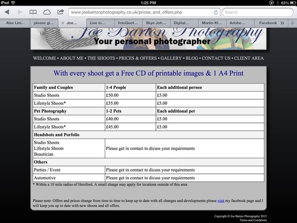
You do need to check your spelling. See that attached screen shot. The word 'discuss' mispelled several times here. Pay close attention to the details, that will show your professionalism.
You do need to check your spelling. See that attached screen shot. The word 'discuss' mispelled several times here. Pay close attention to the details, that will show your professionalism.
Jan 29, 2013 14:39:30 #
treslek wrote:
nicely laid out site ,easy to navigate just one question is it only people you shot? there seem,s to be rather a lot of picture,s of people that was the first thing i noticed .By and by thou it,s quiet nicely laid out etc so well done from me (just address that point i made if it isnt valid).
good point I will upload some pet photography now thanks for your time.
Jan 29, 2013 14:51:07 #
photogumbo wrote:
Hi Mr. Barton, br I just viewed your website on my... (show quote)
Hi photogumbo thanks for your reply. I have been toying with different backgrounds and value your feedback on this. Also please can you tell me where you saw Steve?
Jan 29, 2013 14:51:55 #
haroldross wrote:
The site looks nice and is fairly easy to navigate.
You do need to check your spelling. See that attached screen shot. The word 'discuss' mispelled several times here. Pay close attention to the details, that will show your professionalism.
You do need to check your spelling. See that attached screen shot. The word 'discuss' mispelled several times here. Pay close attention to the details, that will show your professionalism.
Thank you had not spotted this. :)
Jan 29, 2013 14:52:37 #
as someone mentioned check your spelling you have the word either down as ether ,check it then walk away and check it again also ask someone else to check it for you, im the worlds worse for spelling mistake,s and grammar i always ask my missus to check it then moan when she find,s load,s lol.
Jan 29, 2013 14:54:27 #

Not bad....but that home page...or welcome page...the color is almost muted out..put the color back and add more shots if you can. Also get that text up an out of they way...along with that facebook thing...make it smaller if you can and place it in a corner...out of the way.
Jan 29, 2013 15:04:46 #
treslek wrote:
as someone mentioned check your spelling you have the word either down as ether ,check it then walk away and check it again also ask someone else to check it for you, im the worlds worse for spelling mistake,s and grammar i always ask my missus to check it then moan when she find,s load,s lol.
Thank you now sorted
Jan 29, 2013 15:05:05 #

I'll have a look at the website later tonight, when I have more time. For now, just want to comment on the bottom sentence in the screenshot, referring to Facebook having the latest information on your pricing.
I would like to suggest that you make absolutely certain that your website and Facebook show exactly the same prices for the same services. If not, customers will demand the lowest of the two.
EstherP
I would like to suggest that you make absolutely certain that your website and Facebook show exactly the same prices for the same services. If not, customers will demand the lowest of the two.
EstherP
Jan 29, 2013 15:05:42 #
Bret wrote:
Not bad....but that home page...or welcome page...the color is almost muted out..put the color back and add more shots if you can. Also get that text up an out of they way...along with that facebook thing...make it smaller if you can and place it in a corner...out of the way.
Ok good points have made notes of your comments and will action.
Jan 29, 2013 15:07:00 #
EstherP wrote:
I'll have a look at the website later tonight, when I have more time. For now, just want to comment on the bottom sentence in the screenshot, referring to Facebook having the latest information on your pricing.
I would like to suggest that you make absolutely certain that your website and Facebook show exactly the same prices for the same services. If not, customers will demand the lowest of the two.
EstherP
I would like to suggest that you make absolutely certain that your website and Facebook show exactly the same prices for the same services. If not, customers will demand the lowest of the two.
EstherP
Nice point thanks for your time and look forward to reading your comments on my site later.
If you want to reply, then register here. Registration is free and your account is created instantly, so you can post right away.