Where to crop?
Dec 31, 2012 22:27:42 #

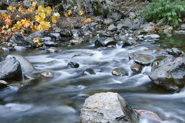
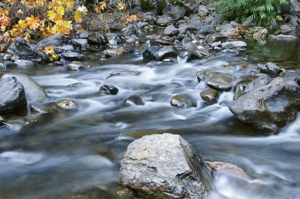
I feel this image needs to be cropped, and in doing so I want to maintain some kind of standard ratio - 2x3, 3x4 or square. Just not sure where to "cut".
South Fork of the Stanilaus River

Dec 31, 2012 22:36:30 #

Tough one. Like the creek and the larger rocks within, not overly enthusiastic with all the vegetation in the background(too busy), but I just don't know.
Dec 31, 2012 22:57:32 #
If you would crop out the vegetation and the FG rock then maybe a 6x18 pana might be the answer. Thanks for your comment.
Dec 31, 2012 23:03:37 #

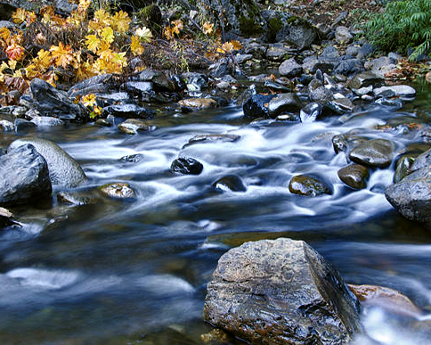
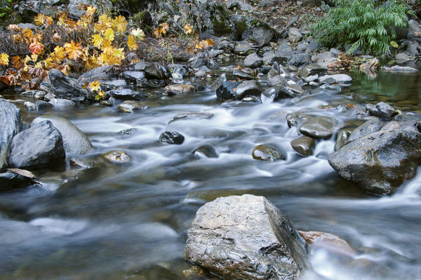
I like your image as is. If cropping is desired, keep it to a minimum, such as below. Same 4x6 format.
Original

Dec 31, 2012 23:46:23 #
fthomas
Loc: Philippines
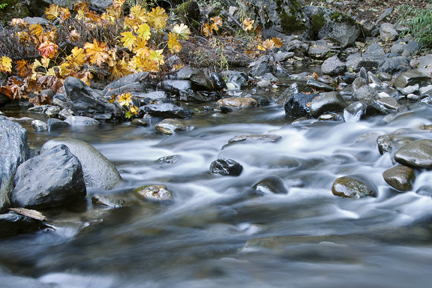
A very nice picture with lots of movement in the stream. I played with the cropping of the image and I will often flip the image 180 degrees and crop it. My minds eye is not seeing what it is any longer and I am looking for line, shape, form and color then exposure.
Here is what I did with all of the above and cropped it ever so lightly. I felt that using the Golden Spiral, which I love because of the ratio of 1.618 which is found in nature and even a womans form from her shoulders to her hip. Natures beauty.
This shot is very pretty and I liked cropping it to have the movement of the stream from the uppper right to the lower left.
You have that large rock in the lower right foreground that is so light colored and bright it brings the eye to it. So I made some adjustments to exposure, contrast and saturation. By darkening the rock and then cropping I tried to bring the image into balance.
I think I would have shot it a little wider leaving yourself more room to work in post processing with the cropping.
Tell me what you think
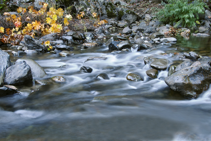
Image Adjusted for Exposure and Saturation then Cropped forming a Triangle with the large rock in the bottom and the others mid left frame. Stream flowing diagonally.

Jan 1, 2013 00:29:06 #

colnago wrote:
I feel this image needs to be cropped, and in doing so I want to maintain some kind of standard ratio - 2x3, 3x4 or square. Just not sure where to "cut".
I believe it's fine as is. The composition "requires" foreground interest, hence the rock stays. The rocks on the left and right help balance the composition. The foliage provides the same function as well. I say, leave it. Saturation and exposure are fine as well, IMHO.
Jan 1, 2013 01:27:35 #
Good point on the FG rock - with it darker cropping is less of an issue - thanks. The triangle is a good point composition - one I'll remember. Also leaving a bet more working room in an image.
Jan 1, 2013 06:23:33 #
colnago wrote:
I feel this image needs to be cropped, and in doing so I want to maintain some kind of standard ratio - 2x3, 3x4 or square. Just not sure where to "cut".
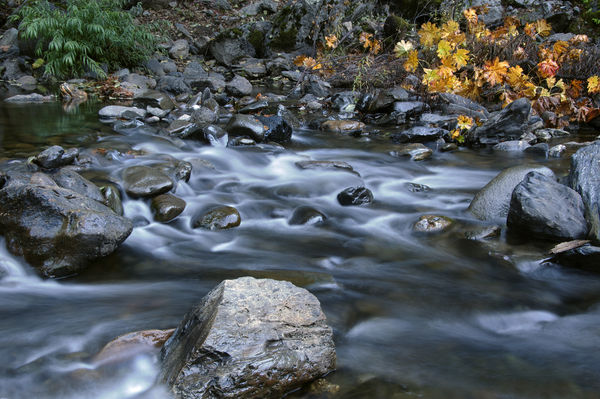
Here are two sugestions. Cheers
Jan 1, 2013 07:37:06 #

LoneRangeFinder wrote:
I believe it's fine as is. The composition "requires" foreground interest, hence the rock stays. The rocks on the left and right help balance the composition. The foliage provides the same function as well. I say, leave it. Saturation and exposure are fine as well, IMHO.
colnago wrote:
I feel this image needs to be cropped, and in doing so I want to maintain some kind of standard ratio - 2x3, 3x4 or square. Just not sure where to "cut".
I believe it's fine as is. The composition "requires" foreground interest, hence the rock stays. The rocks on the left and right help balance the composition. The foliage provides the same function as well. I say, leave it. Saturation and exposure are fine as well, IMHO.
I agree almost entirely, but if you take a little off the LHS it brings the foreground rock closer to the centre. Then just take a little off the top to retain the proportions. The stream is the main subject of the shot, so losing a little vegetation helps preserve focus on the subject.
My results are very similar to the other suggestions except the foreground rock is more central. I couldn't force a ratio, so the proportions won't be exact, but if the printing process forced a ratio, any stretching would be slight and undetectable.
My personal preference is to do the minimum amount of post processing, as most of the others have suggested.
Centred rock
Jan 1, 2013 08:35:30 #

colnago wrote:
I feel this image needs to be cropped, and in doing so I want to maintain some kind of standard ratio - 2x3, 3x4 or square. Just not sure where to "cut".
My 2 cents worth
Stream
Jan 1, 2013 08:37:02 #
ole sarg
Loc: south florida
I dont think I would crop it. It is well composed as it is. Of course you can do what we used to do when I cropped shots for magazines or newspapers. Take the image and play with it. Much easier to do on a computer than with two L shaped pieces of cardboard.
Jan 1, 2013 09:39:38 #
Crop it as is needed to correspond to the desired print format, otherwise leave it as is, it looks fine.
Jan 1, 2013 09:41:18 #

Jan 1, 2013 10:08:57 #

I don't see an obvious crop either.
You might see if you like it flipped as below. I also tried reducing the brightness to reduce distraction from rock now at lower left.
I like it better flipped because the yellow pulls the eye across the image vs. sucking it back to the upper left.
You might see if you like it flipped as below. I also tried reducing the brightness to reduce distraction from rock now at lower left.
I like it better flipped because the yellow pulls the eye across the image vs. sucking it back to the upper left.
Jan 1, 2013 10:33:21 #
Have you hit on something there, MtnMan? Is it better to have water flow from L to R? Do we have a natural tendency to percieve movement in that direction, because it's the way we read?
If you want to reply, then register here. Registration is free and your account is created instantly, so you can post right away.