color seems wrong what did I do?
Nov 30, 2012 09:30:16 #

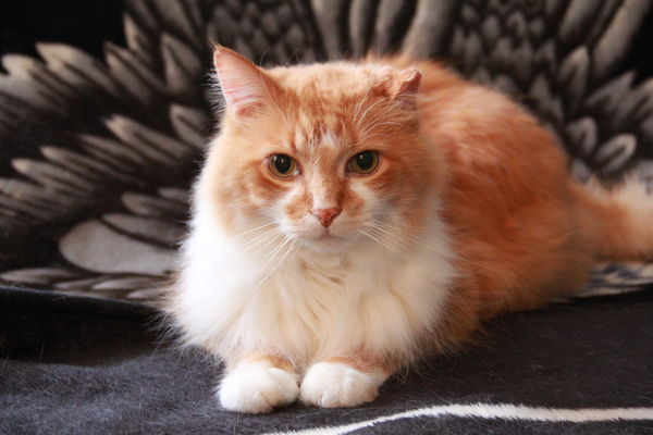
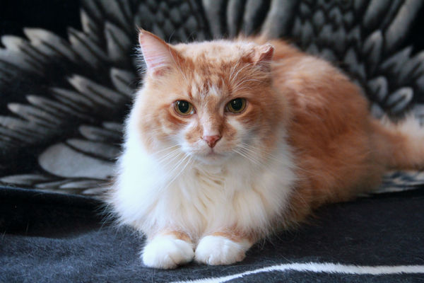
took this indoor with the lighting coming in on the left shot in manual 1/25 sec, f/5, ISO 3200 around noon.
is the icky color on the right just because of the lighting? Is there a better setting indoor? No extra lightening, just what was coming in the window. face looks fine to me but as you look back it get icky, any suggestions?
Thanks Rene
is the icky color on the right just because of the lighting? Is there a better setting indoor? No extra lightening, just what was coming in the window. face looks fine to me but as you look back it get icky, any suggestions?
Thanks Rene
kitty

Nov 30, 2012 09:38:10 #
wow .why such a high iso ,gingers are so tricky lol. nice cat though been in the wars i see.
Nov 30, 2012 09:41:24 #

You may want to upload the full-size shot if you want someone to help.
Are you talking about the reddish part of the fur halfway to the tail?
Are you talking about the reddish part of the fur halfway to the tail?
Nov 30, 2012 09:45:45 #

Doesn't look bad to me but then I've never actually seen your cat in person. During the shoot when you've got this much contrast you can try using a reflector to fill the shadows. A collapsible one is preferable but in a pinch even a white shirt, cardboard or anything without a tint should work.
In post it would be a little more tricky. Could try applying a graduated filter and experiment to get the right color.
In post it would be a little more tricky. Could try applying a graduated filter and experiment to get the right color.
Nov 30, 2012 09:55:52 #
hlmichel wrote:
You may want to upload the full-size shot if you want someone to help.
Are you talking about the reddish part of the fur halfway to the tail?
Are you talking about the reddish part of the fur halfway to the tail?
yes in the center on the side
kitty full size
Nov 30, 2012 10:22:59 #
Brendan wrote:
wow .why such a high iso ,gingers are so tricky lol. nice cat though been in the wars i see.
the lighting was pretty bad, thought I should. Never shot animals obviously, my sister asked me to so I thought why not just for the practice.
Nov 30, 2012 10:26:37 #
Frank T wrote:
Doesn't look bad to me but then I've never actually seen your cat in person. During the shoot when you've got this much contrast you can try using a reflector to fill the shadows. A collapsible one is preferable but in a pinch even a white shirt, cardboard or anything without a tint should work.
In post it would be a little more tricky. Could try applying a graduated filter and experiment to get the right color.
In post it would be a little more tricky. Could try applying a graduated filter and experiment to get the right color.
Thanks Frank, need to get more equipment to shoot with. just starting out and do it for fun but I LOVE taking photos. I will bring alone something white next time. :)
Nov 30, 2012 11:40:50 #
Your settings look ok to me for the lighting situation you had. Iso is rather high as mentioned earlier but you couldn't go any slower with the shutter speed. Obviously more light would have been nice but sometimes you just have to take the shot.
The photo is recoverable with a few tweaks. What software do you use. If you have one with a color slider for different channels (colors) reducing the red might work but there are other more selective ways.
Everything else looks great.
The photo is recoverable with a few tweaks. What software do you use. If you have one with a color slider for different channels (colors) reducing the red might work but there are other more selective ways.
Everything else looks great.
Nov 30, 2012 11:45:17 #

Was there possibly something back there out of frame reflecting some the color cast?
I don't think it's that bad. The face is what draws my attention.
I don't think it's that bad. The face is what draws my attention.
Nov 30, 2012 12:54:42 #
GoofyNewfie wrote:
Was there possibly something back there out of frame reflecting some the color cast?
I don't think it's that bad. The face is what draws my attention.
I don't think it's that bad. The face is what draws my attention.
I agree with Goofy. It still looks good even if the color is off.
Nov 30, 2012 15:19:56 #
gdwsr wrote:
Your settings look ok to me for the lighting situa... (show quote)
Thanks gdwsr, I use photoshop elements 10 I probably did reduce the red, just seems ugly there. Thanks again Rene : )
Nov 30, 2012 15:21:41 #
GoofyNewfie wrote:
Was there possibly something back there out of frame reflecting some the color cast?
I don't think it's that bad. The face is what draws my attention.
I don't think it's that bad. The face is what draws my attention.
I don't rememeber anything on that side, just not enough light. Thanks! I was hoping the face is where one would notice not the icky colored hair. :)
Nov 30, 2012 15:22:36 #
PalePictures wrote:
I agree with Goofy. It still looks good even if the color is off.
GoofyNewfie wrote:
Was there possibly something back there out of frame reflecting some the color cast?
I don't think it's that bad. The face is what draws my attention.
I don't think it's that bad. The face is what draws my attention.
I agree with Goofy. It still looks good even if the color is off.
Thank you I appreciate your comment as I admire your work :)
Nov 30, 2012 16:12:49 #
Rene'spictures wrote:
Thanks gdwsr, I use photoshop elements 10 I probably did reduce the red, just seems ugly there. Thanks again Rene : )
Thanks gdwsr, I use photoshop elements 10 I probably did reduce the red, just seems ugly there. Thanks again Rene : )
Rene, I took the photo into Elements 11 just to see about the adjustments. To me, the white fur seemed a bit pinkish. So I did a white balance correction picking the mid-tone white part of the fur. That corrected much of the problem. So I would have to say that it is mostly a white balance problem.
Not knowing what your cat really looks like I selected just the pinkish orange fur and adjusted the red and yellow color sliders to make it look more like my tabby.
Is this more what you were trying to get.
Dec 1, 2012 08:02:10 #
[quote=gdwsr]
gdwsr, thanks so much for the help, I got it now! Have a great day! Rene :)
Rene'spictures wrote:
br br br Rene, I took the photo into Elements ... (show quote)
gdwsr, thanks so much for the help, I got it now! Have a great day! Rene :)
If you want to reply, then register here. Registration is free and your account is created instantly, so you can post right away.