Can't get the water right in a waterfall
Oct 20, 2023 18:15:07 #

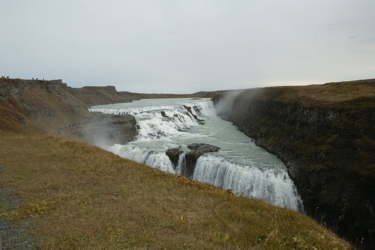
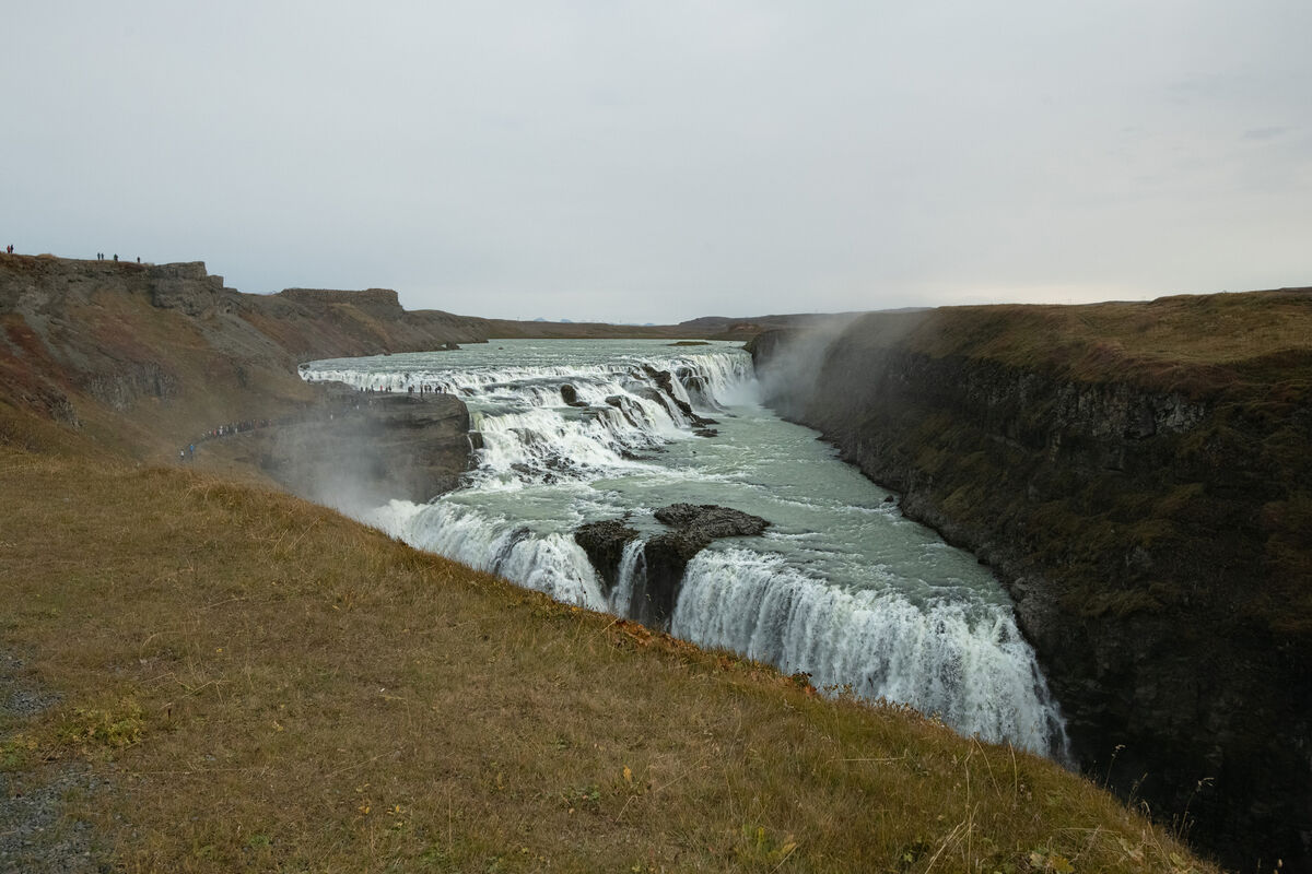
This is Gullfoss in the "Golden Circle" Iceland. Nikon D850 with Tamron 15-30 f/8 1/4000 ISO 2500. It was a cloudy day and very windy, I had to hang onto the rail and take the pic with one hand. To me the water looks blown out. Any suggestions?
Oct 20, 2023 19:23:31 #

The water doesn't look blown out to me. 1/4000 seems a little too fast for the cloudy conditions. Nice composition.
Oct 20, 2023 20:13:56 #
Oct 21, 2023 02:18:09 #
That's a difficult shot, especially under the conditions you describe.
At 100% focus looks okay but might be just a fraction over exposed over the big volume of water point due to that area appearing to be facing brighter light than the foreground water.
Maybe just a small amount of added contrast might help.
I assume no tripod. Is this SOC? If it is its pretty damn good.
Or is it a jpg from a RAW file? If so you have a few options.
Oct 21, 2023 02:54:26 #

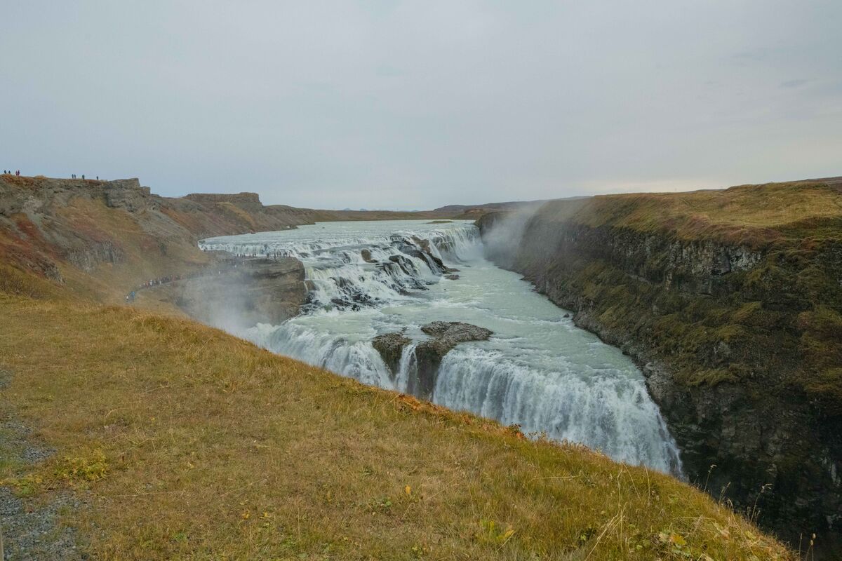
According to Lightroom the whites are more than 2.5 stops from being blown. Lowering the whites and highlights with the basic (i.e. global) adjustments will get you so far but you'll need to replace the lost contrast if you do that. The most effective measure is to select the brightest parts of the waterfall and give them their own adjustments. I tried a combination of lowered highlights and lowered brightness plus extra contrast, sharpening and a touch of extra clarity for that selection. If you use the brush's auto mask (or "Find Edges" or whatever your editor calls it) to apply those adjustments, together with using the brush in Erase mode with auto mask to clean up the selection, you should be able to keep the adjustments to just the highlights of the waterfall. I'll post my results if you like.
Oct 21, 2023 08:12:00 #

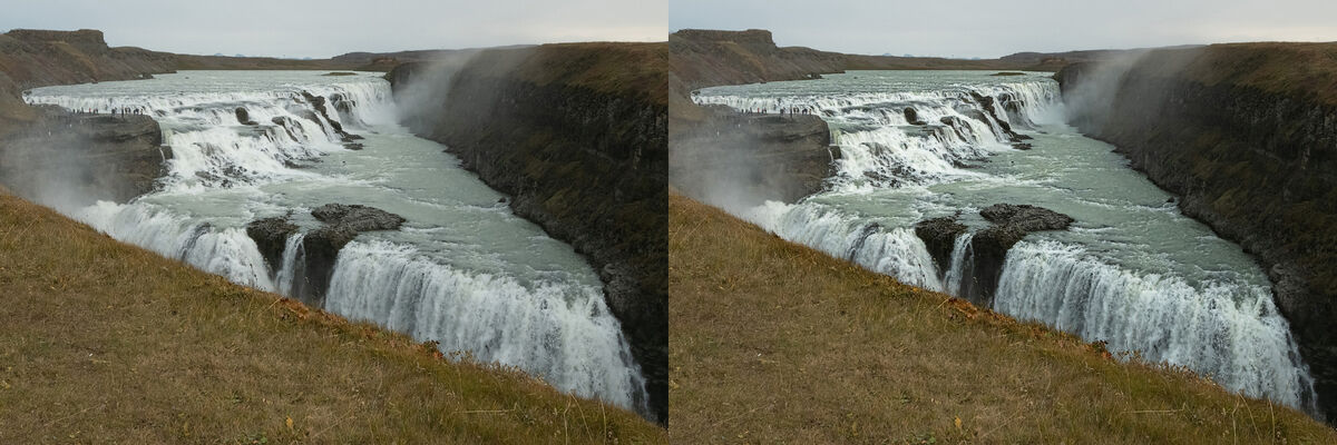
It doesn't look blown out to me. It does look a little noisy. In case your interested, I ran it thru Topaz & got this.
By the way, nice shot - I love the perspective.
By the way, nice shot - I love the perspective.
Oct 21, 2023 09:19:45 #
R.G. wrote:
According to Lightroom the whites are more than 2.... (show quote)
Please post your improvements. I like to see.
Oct 21, 2023 09:21:10 #
raymondh wrote:
It doesn't look blown out to me. It does look a little noisy. In case your interested, I ran it thru Topaz & got this.
By the way, nice shot - I love the perspective.
By the way, nice shot - I love the perspective.
Can you post your results?
Oct 21, 2023 09:21:54 #
TonyP wrote:
That's a difficult shot, especially under the conditions you describe.
At 100% focus looks okay but might be just a fraction over exposed over the big volume of water point due to that area appearing to be facing brighter light than the foreground water.
Maybe just a small amount of added contrast might help.
I assume no tripod. Is this SOC? If it is its pretty damn good.
Or is it a jpg from a RAW file? If so you have a few options.
At 100% focus looks okay but might be just a fraction over exposed over the big volume of water point due to that area appearing to be facing brighter light than the foreground water.
Maybe just a small amount of added contrast might help.
I assume no tripod. Is this SOC? If it is its pretty damn good.
Or is it a jpg from a RAW file? If so you have a few options.
Yes sooc and jog from raw
Oct 21, 2023 09:59:58 #
ggttc wrote:
Please post your improvements. I like to see.
This is just the adjustments I mentioned plus a very slight WB shift for the selection (more blue and green - watery colours) and a touch of global saturation. This isn't an attempt at a complete edit. I've deliberately left it simple. IMO it could do with a bit more brightening and perhaps another selection for the sky to bring out cloud detail and colour, plus some overall sharpening and denoise.
.
Oct 21, 2023 10:04:12 #
PS - I said the whites were 2.5 stops away from being blown. I forgot I was using Lr's brightness slider, not an exposure slider. The brightness slider doesn't push the highlights as much as a standard exposure slider would. But the highlights are definitely not blown.
Oct 21, 2023 12:08:03 #
ggttc wrote:
This is Gullfoss in the "Golden Circle" Iceland. Nikon D850 with Tamron 15-30 f/8 1/4000 ISO 2500. It was a cloudy day and very windy, I had to hang onto the rail and take the pic with one hand. To me the water looks blown out. Any suggestions?
First, it would have been helpful to have posted the unedited jpeg. The exif indicates that this image has already been edited with PSE and LR.
Rather than flattening the whole lake, the idea was to still have contrast between the smooth water and the falls. However, bringing more details into the falls reduces the overall whiteness. Part of the problem is that there is detail in the water but if viewed in a small format, it appears white, just due to compression. With that said, here’s what I recommed:
1) denoising the image.
2) in LR (or ACR) make the following adjustments
Exposure: -0.5
Highlights: -100
White: -25
Texture: +50
Dehaze: +10
3) Mask the changes only to the water
4) Straighten the horizon using the distant lake edge.
Hope this helps
Mike
Oct 21, 2023 13:16:54 #
R.G. wrote:
This is just the adjustments I mentioned plus a very slight WB shift for the selection (more blue and green - watery colours) and a touch of global saturation. This isn't an attempt at a complete edit. I've deliberately left it simple. IMO it could do with a bit more brightening and perhaps another selection for the sky to bring out cloud detail and colour, plus some overall sharpening and denoise.
.
.
Thanks looks very good. I'll try your suggestions
Oct 21, 2023 13:18:00 #
SalvageDiver wrote:
First, it would have been helpful to have posted t... (show quote)
Thanks especially for leaving the values. Look great
Oct 21, 2023 16:00:11 #

ggttc wrote:
This is Gullfoss in the "Golden Circle" Iceland. Nikon D850 with Tamron 15-30 f/8 1/4000 ISO 2500. It was a cloudy day and very windy, I had to hang onto the rail and take the pic with one hand. To me the water looks blown out. Any suggestions?
ggttc!
Here's my take! Nice image, detailed as you can see the people along the left side road leading to the ledge above the water in the middle-ground area when magnified. Usually when taking waterfall shots, photogs like the "cottony" almost detailless effect when using a slow shutter speed to not freeze the water's movement. Overall, your image, to me appears a little flat. I feel the image needed a little brightening and a little contrast. Using Nik Software's "Control Point" tool in Nikon's older Capture NX2 program, I lightened the left side and also the central highlight area of the flowing water to draw the eye to that area.
Just my 2 cents! Be well all! Ed
If you want to reply, then register here. Registration is free and your account is created instantly, so you can post right away.