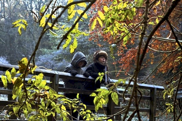
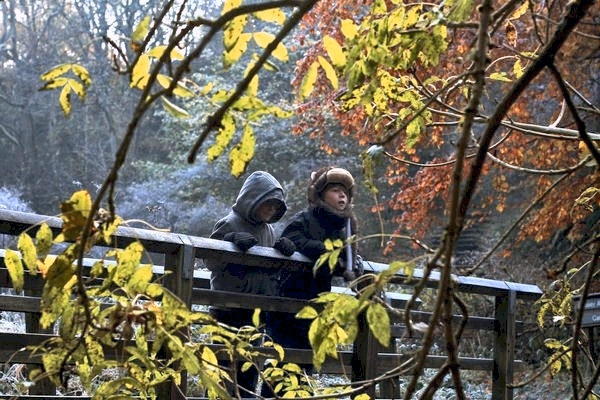
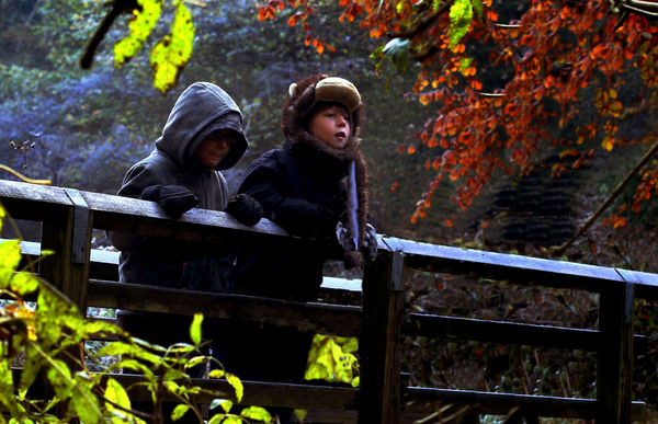
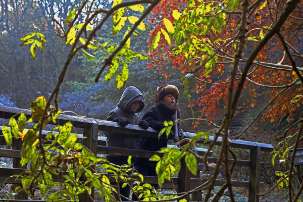
Pooh Sticks
Nov 22, 2012 10:55:10 #
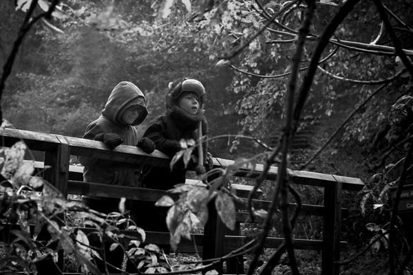
Hi all; how can I improve this to take out some of the haze and generally give it more appeal?
I think it's a fairly good shot apart from the scruffy leaves in the foreground.
Thanks
I think it's a fairly good shot apart from the scruffy leaves in the foreground.
Thanks

Nov 22, 2012 11:11:41 #

Hi
A curve or level adjustment would help the haze.For the scruffy leaves I would use the clone tool
A curve or level adjustment would help the haze.For the scruffy leaves I would use the clone tool
Nov 22, 2012 12:14:12 #
Nov 22, 2012 13:54:25 #
Nov 22, 2012 14:04:12 #
Nov 22, 2012 14:08:15 #
Nov 22, 2012 14:17:58 #
Nov 22, 2012 14:49:00 #
graham52 wrote:
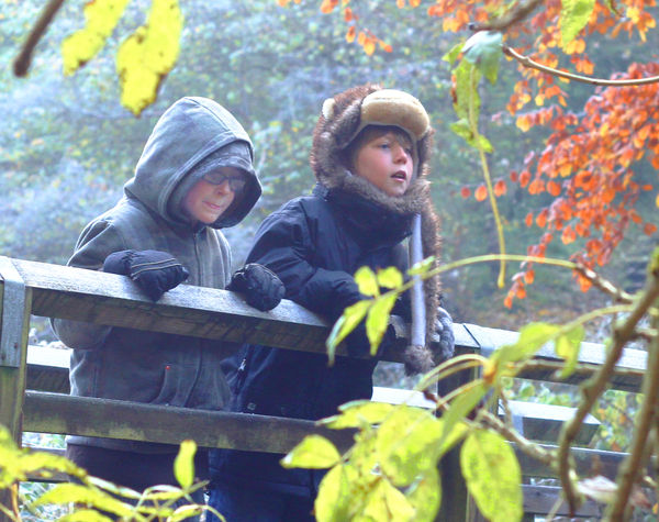
done a curve layer some cloning and a level adjustment
I like it better with the leaves oval framing! Nice shot.
Nov 22, 2012 16:37:10 #
A significant, square crop would remove much of the visible haze as well as most of the leaves. The image would then have less of a background and foreground and be much more focused on the children and the bridge.
A little sharpening is all you may then need.
A little sharpening is all you may then need.
Nov 23, 2012 09:00:25 #
Well its black Friday and since I am not shopping I thought I would take a crack at it. First I must say this is an excellent image. I adjusted the mid tones in levels, then used a topaz adjust preset called vibrance then adjusted the color for skin tone. Hope you like it.

Nov 23, 2012 09:41:16 #
Not having all those fancy tools, I just worked on it in PSE. Adjusted highlights, slight color correction, and burn in on left kids face. The cropped image is OK, but I like the full frame with the bridge and leaf framing.
Nov 23, 2012 09:59:40 #
I cropped the image to focus on the boys, adjusted the lighting, and then brought up the lighting on the face of boy boy on the left. Lightening was accomplished by duplicating layers and switching to Screen mode, then adjusting the opacity. I selected the face of the boy on the left, duplicated that into its own layer and set to screen mode. I then flattened the image, selected the greens, then inverted the selection and boosted the saturation.
Nov 23, 2012 10:10:03 #
Now try cutting back the highlights.
RMM wrote:
I cropped the image to focus on the boys, adjusted the lighting, and then brought up the lighting on the face of boy boy on the left. Lightening was accomplished by duplicating layers and switching to Screen mode, then adjusting the opacity. I selected the face of the boy on the left, duplicated that into its own layer and set to screen mode. I then flattened the image, selected the greens, then inverted the selection and boosted the saturation.
Nov 23, 2012 10:22:27 #
Great picture! A few more ideas to try...I used Lightroom to create a light vignetting around the edges. Then I used PS9 and lightened the boys, used levels to create slightly more vibrant colors, and cloned places where the leaves and branches were close to the boys. I also changed the placement of the boys to be off-center, which can look more interesting. This also converts well to b&w, drawing the eye to the boys.

Nov 23, 2012 11:13:10 #
Nice work.
amanda303 wrote:
Great picture! A few more ideas to try...I used Lightroom to create a light vignetting around the edges. Then I used PS9 and lightened the boys, used levels to create slightly more vibrant colors, and cloned places where the leaves and branches were close to the boys. I also changed the placement of the boys to be off-center, which can look more interesting. This also converts well to b&w, drawing the eye to the boys.
If you want to reply, then register here. Registration is free and your account is created instantly, so you can post right away.