Another Pen and Wash Effect - Broadgauge Victorians
Sep 20, 2023 17:14:25 #

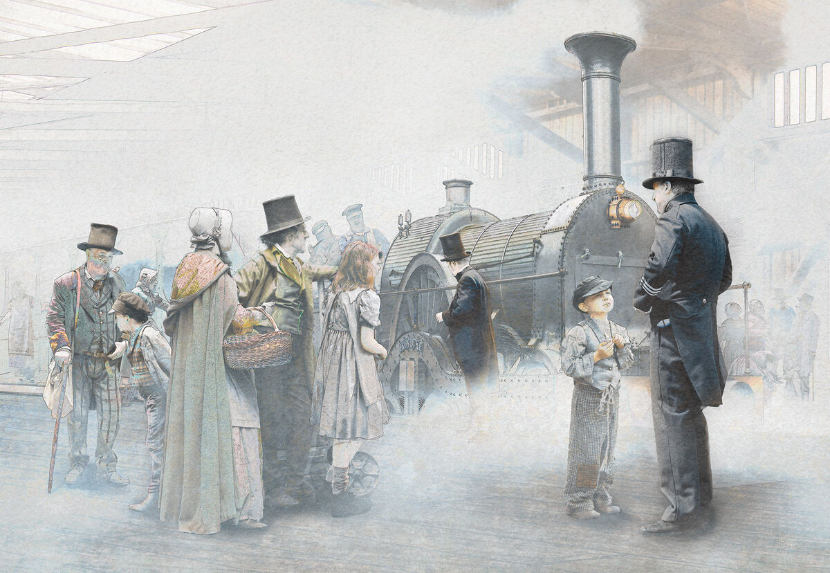
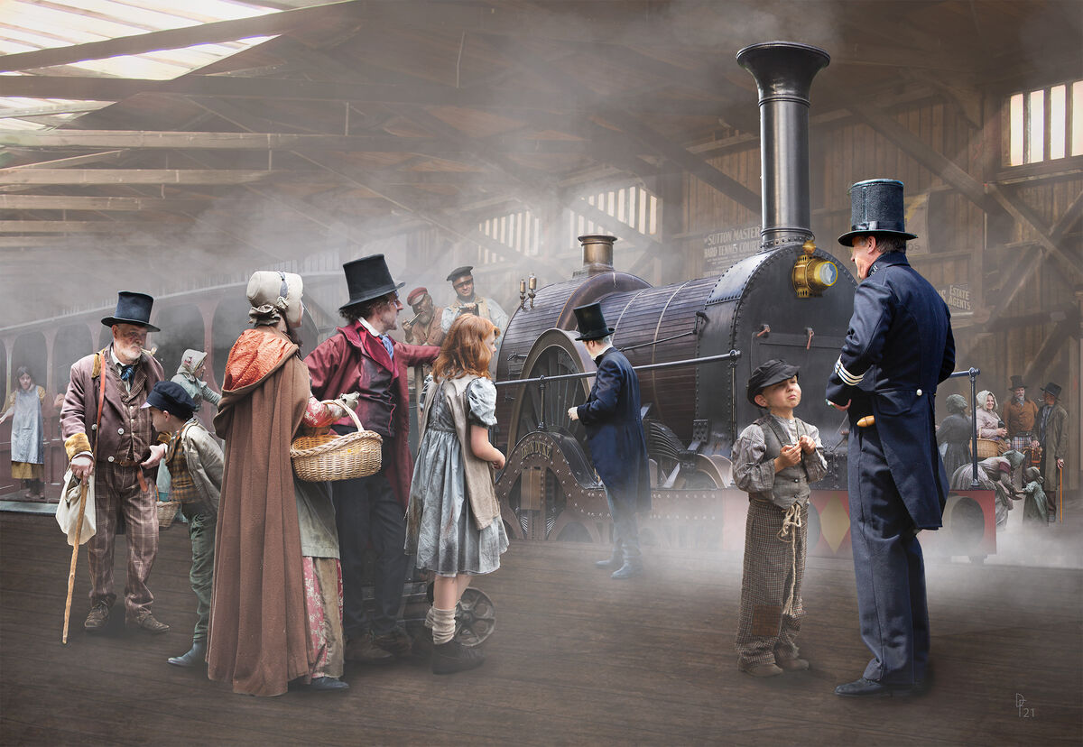
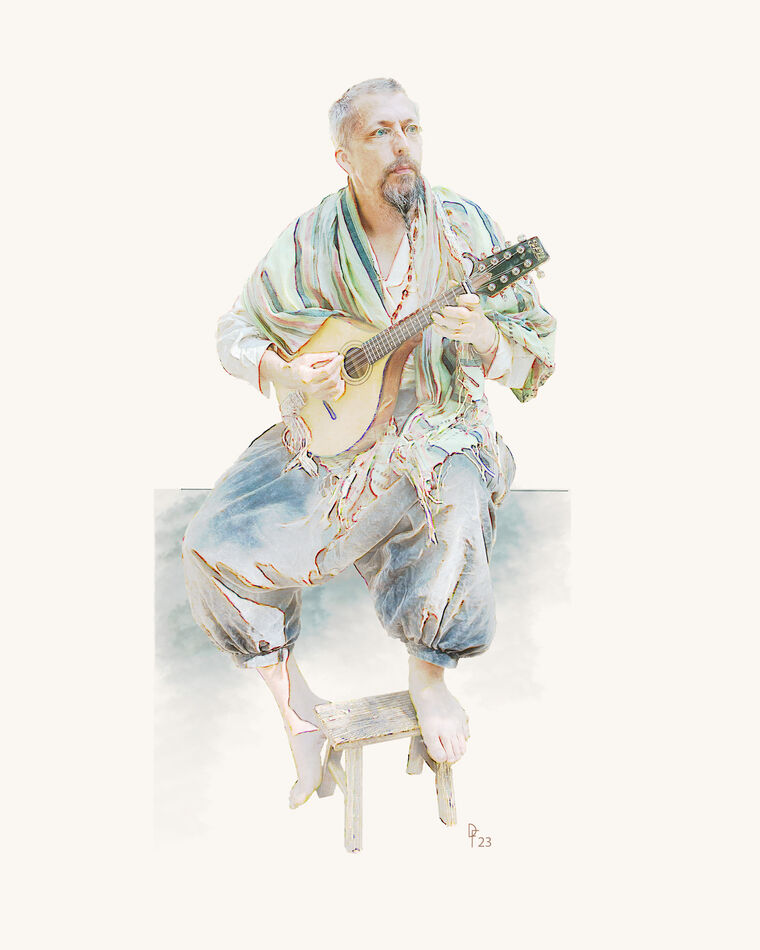
I'll make this the last of these 'painterly' tests for a while, don't want to bore you! The second image has appeared here a couple of years back in its original form. This one was modified after receiving critique and also had a figure added. Needless to say it's a composite, all individual figures taken on a shoot with the Ragged Victorians.
The first image is my attempt to make something a little different of it, hopefully that looks like an ink and water paint style. Your critique is welcome if you have the time.
The first image is my attempt to make something a little different of it, hopefully that looks like an ink and water paint style. Your critique is welcome if you have the time.
Sep 20, 2023 18:26:43 #
Sep 20, 2023 18:44:55 #
Those are both beautifully done Dave, I can't find anything to critique on either of these. Personal taste, I like the first one much better than the second. Just to satisfy my curiosity how much time to you spend on an image like the second one.
Sep 20, 2023 19:15:03 #

The first one reminds me of 19th century illustration. The second one is something that I would expect from you. Both nicely done. But if I had to choose I would go with the second one.
Sep 20, 2023 22:28:58 #
Cany143
Loc: SE Utah
Drop. The. Mic. Superbly executed!
I --for one-- would NOT be bored in seeing more of this kind of processing. I'd also be interested in learning your technique.
I --for one-- would NOT be bored in seeing more of this kind of processing. I'd also be interested in learning your technique.
Sep 20, 2023 22:59:04 #

Sep 21, 2023 05:42:45 #
magnetoman wrote:
I'll make this the last of these 'painterly' tests... (show quote)
Both are excellent, nicely done !!! the effect in the first is among my favorites, and the second is an excellent example of your compositing skills. Thank You for sharing !!!
Sep 21, 2023 07:11:19 #
Sep 21, 2023 07:58:37 #

Sep 21, 2023 08:16:14 #
Flying Three wrote:
Very nice image, the first. Thanks for your work.
Thank you very much, nice to have you take a look.
Sep 21, 2023 08:31:33 #
Curmudgeon wrote:
Those are both beautifully done Dave, I can't find anything to critique on either of these. Personal taste, I like the first one much better than the second. Just to satisfy my curiosity how much time to you spend on an image like the second one.
Well it's a couple of years since I did the original Jack but I think it was around a week's work, fairly 'full-on', as they say. It consisted around 160 layers according to my response to Frank at the time of first posting, and had about 24 image layers (the rest being various adjustments). I later improved the perspective a bit and added one or two more layers. This sort of layer count is not unusual and is often exceeded - but that comes naturally as image layers are added and one gets used to managing them by naming layers and grouping them in named groups. I also colour code the layers so it's easy to spot what you want when zooming up and down the layers panel in search of a particular part. One character may be more than one layer, particularly if the pose needs to be slightly altered but, again, grouping is the key to keeping a handle on things. No-one should be in awe of layer count, it's the end result that has to stand up to scrutiny - and I often fail at that stage, as you know! As I've said here often, practice is the answer to mastering Ps and I never tire of playing around - much like yourself and A.I., it's what keeps me going.
Sep 21, 2023 08:33:02 #
NJFrank wrote:
The first one reminds me of 19th century illustration. The second one is something that I would expect from you. Both nicely done. But if I had to choose I would go with the second one.
Thanks Frank, I seem to recall you liked the original when I posted it. I'm not sure which I prefer at the moment.
Sep 21, 2023 09:15:22 #
Cany143 wrote:
Drop. The. Mic. Superbly executed!
I --for one-- would NOT be bored in seeing more of this kind of processing. I'd also be interested in learning your technique.
I --for one-- would NOT be bored in seeing more of this kind of processing. I'd also be interested in learning your technique.
Wow! - you surprise me Cany, I didn't realise you had an interest in this type of work - and I am familiar with, and in awe of, many of your own posts!
The process here is quite simple but a little unpredictable. For a watercolour effect that's more controllable and probably more what most would want, there are many tuts online - I have used Rikard Rodin's Nucly watercolour course in the past to good effect (example follows). However, as regulars here know, I like things that are 'mine', so set-out to see what could be done. I've flattened the original file layers (non-destructibly) using shift/alt/cmd/E, then duplicated that layer as a new file. I then duplicated that layer and made it a Smart Object (so that I could adjust any filter added to it). I then applied a Glowing Edges filter from Ps Filter Gallery - this is where you need to judge how Edge Width and Edge Brightness might affect the image, but you can come back and adjust if necessary. Now Invert the layer produced and choose a Blend Mode that gives an attractive result (experiment by running up and down the Blend Mode list, don't take the first that appeals or you may miss something better!). Now the more difficult (or less obvious) choice needs to be made - I added two 'texture' layers, one of which is duplicated. These go above the first image layer and below the Glowing Edges layer, i.e., between the two. My first texture is my favourite 'BlindOrange', a photo of our bathroom window blind which consisted a coarse-weave, orange colour, roller blind. By trial, I set the first of these on Hue blending mode set at 100% opacity and the second on Divide at 84% opacity - it requires some experiment to decide what suits the image best. I then added another Texture layer, in this case a photo of verdigris on cement rendering of a wall at a stately home. It might work even if the home is not 'stately' I guess! That layer was set on Normal blending mode at just 12% opacity.
And that's it - but I'm pretty sure each image chosen to add the effect to will render differently and require playing with until you feel happy with it. Which is why watercolour brush effects are a popular route to this sort of thing. If you would like the files I used for textures you're welcome to them, just let me know. Personally I like to use my own images throughout. If you do make anything, please post it in Digital Artistry, I'd love to see it.
Sep 21, 2023 09:22:08 #
Horseart wrote:
Just don't ask me to choose. I LOVE them both equally!!!!
Pleased you like them Horseart, and good to see you in Digital Artistry, thank you for looking-in.
Sep 21, 2023 09:22:53 #
UncleBuck wrote:
Both are excellent, nicely done !!! the effect in the first is among my favorites, and the second is an excellent example of your compositing skills. Thank You for sharing !!!
Thanks Dave, pleased you like them.
If you want to reply, then register here. Registration is free and your account is created instantly, so you can post right away.