New (to me) old camera (DSC RX-10M3) on first family outing - SA Botanical Gardens
Aug 15, 2023 22:24:16 #
So - I've run Canons since the early 2000s - starting with a 10D, 20D, 40D, 7DM1 and now an 80D. BUT !
Not happy carrying all the stuff & lenses needed for the DSLR, particularly when travelling overseas.
I also wanted more range than I could get with my 200mm Canon zoom lens, and I prefer no lens changes = Bonus.
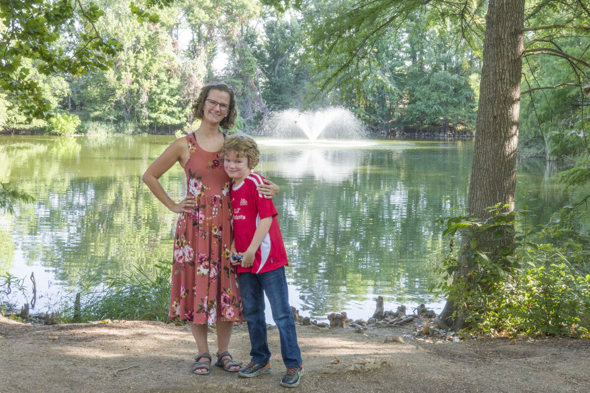
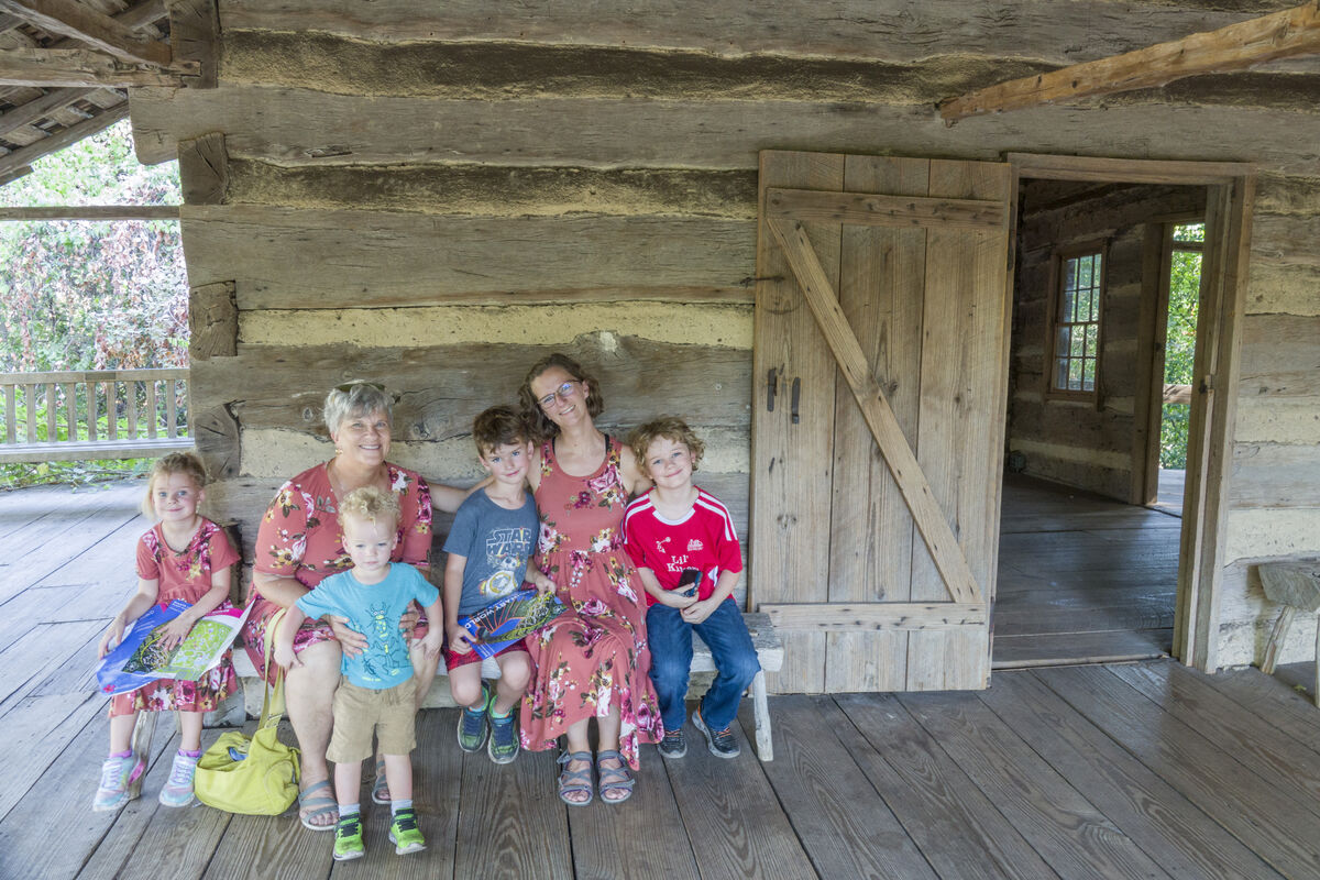
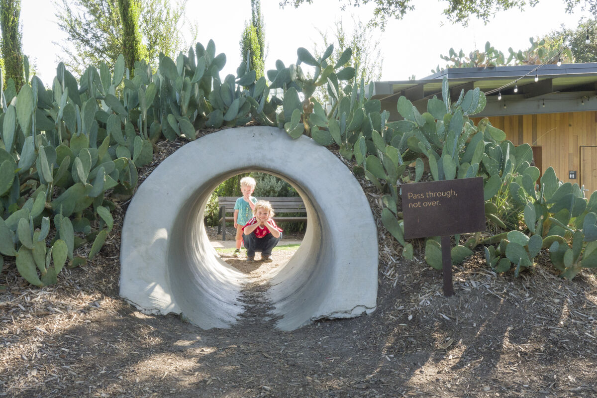
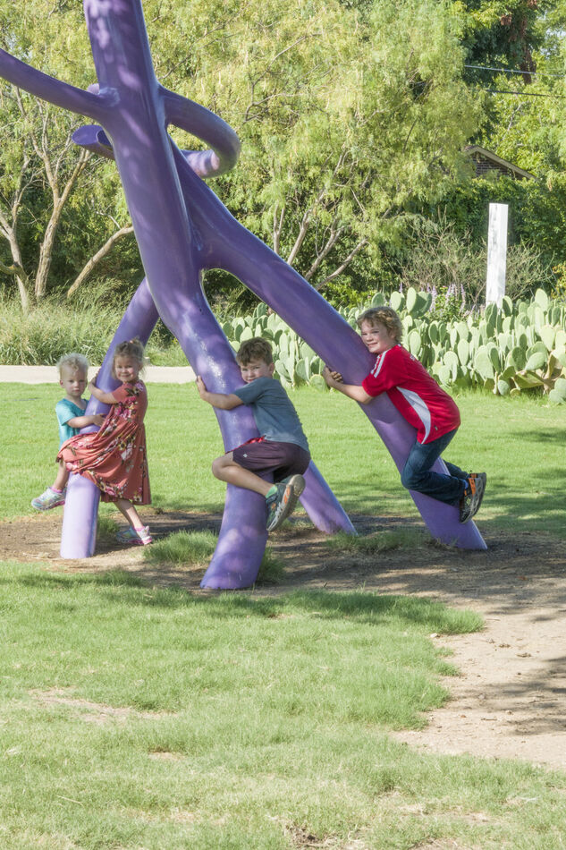
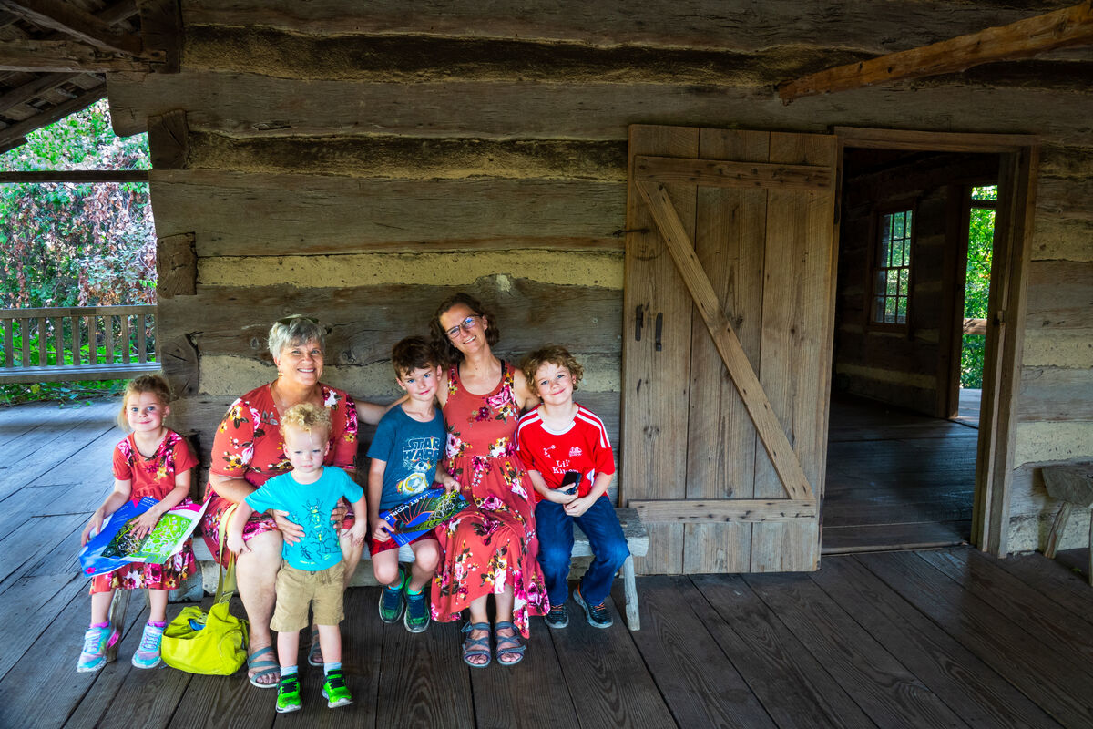
Enter the Sony DSC-RX10M3. 24-600mm equivalent f/2.4-4, video, autofocus zoom, RAW, 20.1 MPx, ISO 100 (really 64)–12800 equivalent (1/3 step) and a bunch more. Excellent condition on eBay for $899 (shipping included - but no extras). Daughter & kids here from 'out of town' - we went to the San Antonio Botanical Gardens for the morning - before temps hit 105 . Attached are a few of the group, with a little tweaking from the RAW (ok - Sony Baloney ARW). The 3 dresses were sewn by my wife
  . Comments and thoughts appreciated.
Not happy carrying all the stuff & lenses needed for the DSLR, particularly when travelling overseas.
I also wanted more range than I could get with my 200mm Canon zoom lens, and I prefer no lens changes = Bonus.
Enter the Sony DSC-RX10M3. 24-600mm equivalent f/2.4-4, video, autofocus zoom, RAW, 20.1 MPx, ISO 100 (really 64)–12800 equivalent (1/3 step) and a bunch more. Excellent condition on eBay for $899 (shipping included - but no extras). Daughter & kids here from 'out of town' - we went to the San Antonio Botanical Gardens for the morning - before temps hit 105
. Attached are a few of the group, with a little tweaking from the RAW (ok - Sony Baloney ARW). The 3 dresses were sewn by my wife . Comments and thoughts appreciated.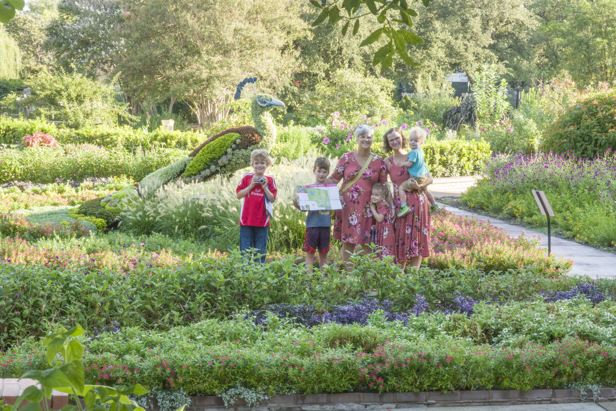
Aug 15, 2023 23:36:05 #
What are you using to process the Sony Baloney ARW? Seem to me that it is getting them too "bright". Could you upload one of the ARWs? I would stick it in my system to see what it does.
Aug 16, 2023 00:18:11 #

Merlin1300 wrote:
Comments and thoughts appreciated.
My thought, even nice photos like these should be posted in the "Photo Gallery"
---
Aug 16, 2023 00:29:16 #
Aug 16, 2023 00:29:56 #
Bill_de wrote:
You're right - I'll ask Admin to move it.My thought, even nice photos like these should be posted in the "Photo Gallery"
Aug 16, 2023 00:33:44 #
I've had the RX10 III and now the RX10 IV. Both great cameras and the lens is tack sharp.
bwa
bwa
Aug 16, 2023 01:20:47 #
bwana wrote:
Penny for your thoughts - the RX10M3 vs the M4 ?I've had the RX10 III and now the RX10 IV. Both great cameras and the lens is tack sharp.
Aug 16, 2023 08:18:33 #

Aug 16, 2023 11:16:41 #
Compared to what I would expect from my RX10m4, these are somewhat soft and washed out. I cannot help but think some TLC PP would help immensely and maybe lower ISO too.
Aug 16, 2023 11:23:02 #
Merlin1300 wrote:
Attached
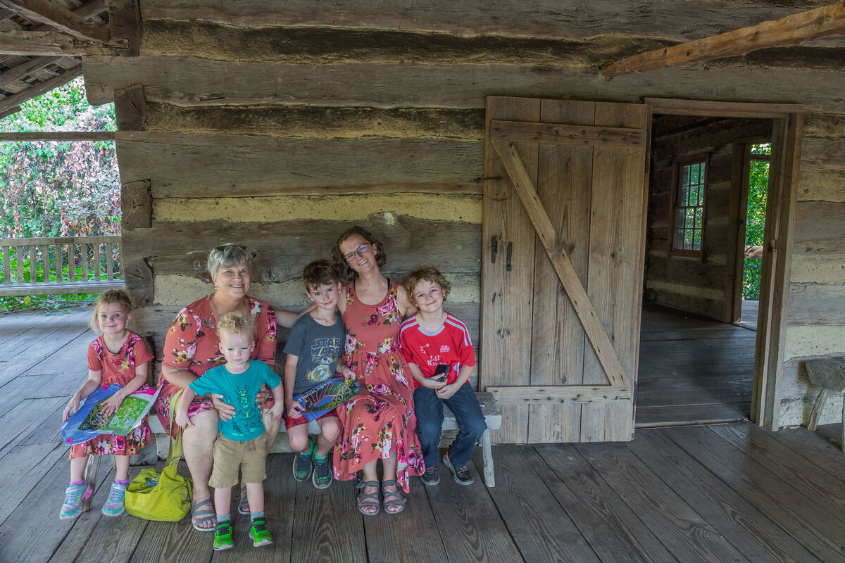
Compared to the first one, you uploaded the one that I think was the least "bright". It is a marvelous family portrait. I like that the subject group is off to the left of the door. The camera managed to get detail through the door and from the people! For the fun of it, I gave it a try anyway.
Aug 16, 2023 12:14:08 #

Merlin1300 wrote:
Attached
As Bill noted, the overall brightness is too high. That's not a bad thing because the highlights aren't blown and the shadows don't need lifting. In addition, the contrast is a bit low. One possible adjustment is to lower the highlights. I tried that in Lr and it wasn't enough, plus it did nothing for the lack of contrast.
Contrast makes the brights brighter and the darks darker. Pushing contrast can result in the darks becoming too dark and solid and the brights becoming to bright and harsh. Both of those unwanted effects can be partly mitigated by lifting the shadows and lowering the highlights, but with this image more was needed. The darks can be brightened by lifting the Blacks and the brights can be darkened by lowering the Whites. The whole of this process (pushing the contrast and mitigating the unwanted effects) is best done by incremental nudges to get to the point where the unwanted effects of pushing can't be mitigated any more. At that point you know the settings have been optimised.
I carried out this procedure on the posted raw file and found that when things were optimised the image was still a bit on the bright side so I darkened it using the Brightness slider. To give the colours a push I lifted the Saturation quite a bit and then gave it a workover with the HSL tool to subdue the colours that ended up a bit garish. I also added some sharpening and denoise.
My personal preference is to use Clarity for some final tweaking once I've got the contrast and brightness levels sorted out. Usually it only needs a slight adjustment. The main thing it does is add some contrast to the mid tones, which is where our eye-brain combo most likes to see contrast. Too much Clarity can give a harsh look and can introduce unwanted diffuse haloing. It's better to add most of the contrast using the Contrast slider.
Below are the Levels settings for this edit. The notable points are that the Contrast is quite high and so is the Blacks setting. Highlights and Shadows have both been maxed out but it isn't every image that suits those levels of adjustment (this one did, which I found out by making incremental adjustments - i.e. nudges). Pushing the Contrast was causing the darks to be crushed and lifting the shadows to the maximum wasn't enough. Lifting the Blacks sorted that. Lowering the Whites was also needed to subdue the brights that were becoming a bit too harsh, even with lowering the Highlights to the minimum setting.
The above was all achieved using only global adjustments. As well as allowing local adjustments for problem areas, the Adjustments brush also allows the Levels adjustments to be pushed further than they can in the Basic section. Setting the brush's feathering to zero, switching off masking and using a large brush allows you to select the whole image quickly. I left this image with global adjustments only. Further local adjustments are a possibility.
The usual use of the Blacks and Whites sliders is to establish the black point and the white point in the image. However, sometimes if you try to force a black or a white point it can make the image look unnatural. That is especially the case if the image doesn't have a proper white or black point in it. Forcing black or white points in an image where they don't exist isn't a good idea. On the other hand nothing loses contrast more than having the Blacks slider higher than it needs to be and/or having the Whites slider lower than it needs to be. If the Blacks and the Whites sliders are optimised, the contrast can be fully optimised. I lift the Blacks and lower the Whites only if it's needed to mitigate unwanted effects. Most of the time I adjust the Blacks and Whites by eye the same way I use the Highlights and Shadows sliders.
.

Aug 16, 2023 13:00:52 #
bsprague wrote:
Bill - thanks It is a marvelous family portrait. I like that the subject group is off to the left of the door.
The camera managed to get detail through the door and from the people! For the fun of it, I gave it a try anyway.
The camera managed to get detail through the door and from the people! For the fun of it, I gave it a try anyway.
 . I think that one is my favorite also - for the reasons you list. I think your version pops a little more than mine as the colors are more saturated. I prefer a little less saturation as my printer tends to boost the colors on a photo print, so I tend to back off just a bit. I do appreciate your critique
 Aug 16, 2023 13:08:57 #
R.G. wrote:
RG: I appreciate the work you did on this, and your detailed explanation. I only have PS-CS6 (way more than I'll ever be able to use), and so have to use the RAW converter (PS-CS6 won't work with ARW {how Sony titles their RAW files}) to make a DNG for subsequent processing. Even so, that produces far better results than the JPGs SOOC. If I see a JPG that looks promising, then I'll work with the RAW file to polish it up a bit. Thanks for your tips As Bill noted, the overall brightness is too high.... (show quote)
Aug 16, 2023 13:26:18 #
Merlin1300 wrote:
RG: I appreciate the work you did on this, and yo... (show quote)
You're welcome. Ps CS6 does have ACR but if the camera is more recent than your CS6, it won't open the raw files from that camera. You don't say how you edit your DNG files - ACR would be an excellent starting point. Lr is just ACR with some add-ons.
Aug 16, 2023 13:53:29 #
R.G. wrote:
CS6 does have ACR, but it won't import RAW files from the Sony RX10M3, nor from my Canon 80D. The Adobe Digital Negative Converter, however, will convert the RX10 and 80D RAW files into DNGs - which ACR in CS6 handles without a problem. So - that's how and where I work on my RAW files.You're welcome. Ps CS6 does have ACR but if the camera is more recent than your CS6, it won't open the raw files from that camera. You don't say how you edit your DNG files - ACR would be an excellent starting point. Lr is just ACR with some add-ons.
If you want to reply, then register here. Registration is free and your account is created instantly, so you can post right away.