Maui Moon - which do you like?
Apr 26, 2023 15:16:07 #

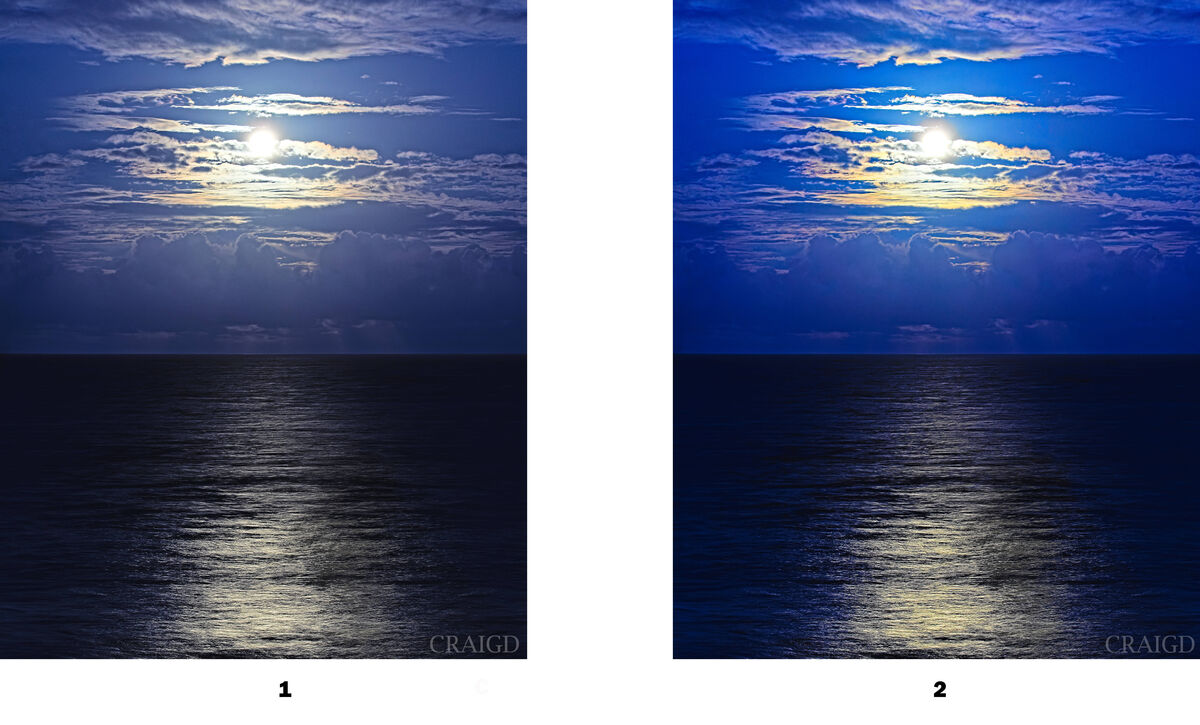
I’d like your opinion on which of these you prefer. If it depends on print vs screen, or contest vs sales, that would be interesting to learn also.
I tend to over saturate but can back it off.
My goal is to possibly casually sell my work online, probably through a shop like Fine Art America, or enter contests as some friends suggested for a few of my pics.
Thanks, this is just for curiosity so a quick reflex response would be excellent.
I tend to over saturate but can back it off.
My goal is to possibly casually sell my work online, probably through a shop like Fine Art America, or enter contests as some friends suggested for a few of my pics.
Thanks, this is just for curiosity so a quick reflex response would be excellent.
Apr 26, 2023 16:02:25 #

I prefer #1. The sky looks more realistic. The second one I find the sky to be a it too blue. I know I have been guilty of over saturating an image.
Apr 26, 2023 16:24:12 #

For me, there's a disconnect in both (though worse in the more saturated) because the water is such a deep, dark color compared to the sky. The centered position of the horizon adds to the feeling of two separate images.
However, what sells is really a whole different discussion. I'd recommend chatting with a few of the pro photographers on UHH, as well as studying what others post for sale online. Best to you, Craig!
However, what sells is really a whole different discussion. I'd recommend chatting with a few of the pro photographers on UHH, as well as studying what others post for sale online. Best to you, Craig!
Apr 27, 2023 09:42:42 #

NJFrank wrote:
I prefer #1. The sky looks more realistic. The second one I find the sky to be a it too blue. I know I have been guilty of over saturating an image.
👍🏻👍🏻👍🏻
Apr 27, 2023 10:17:48 #

I like #1 better, as #2 looks a bit garish to my eyes. However, the public is so tuned in to oversaturated colours, they do go for them a bit.
Apr 27, 2023 10:33:57 #


Apr 27, 2023 12:15:11 #

Apr 27, 2023 12:49:40 #
In My Opinion I like the first one the best. The second one is over saturated color in the sky. I took your image opened in camera raw and played around with the first image. Lowered the Highlights to -54 and increased the whites to +41. Now the moon's brightness is reduced and the sky blue is darkened matching the amount of reflection in the water a bit better.
In your first image I think the reflection would be wider with the sky being so bright. Please remember all this is just "In My Opinion".
In your first image I think the reflection would be wider with the sky being so bright. Please remember all this is just "In My Opinion".
Apr 27, 2023 13:09:07 #
Apr 27, 2023 13:09:23 #

Apr 27, 2023 13:46:00 #

At this point I like #1, but I bet some of the really talented pp people here could take it over the top beyond reality. Can’t beat the subject-water, moon, and clouds. 
Apr 27, 2023 18:32:21 #

Apr 27, 2023 19:02:41 #
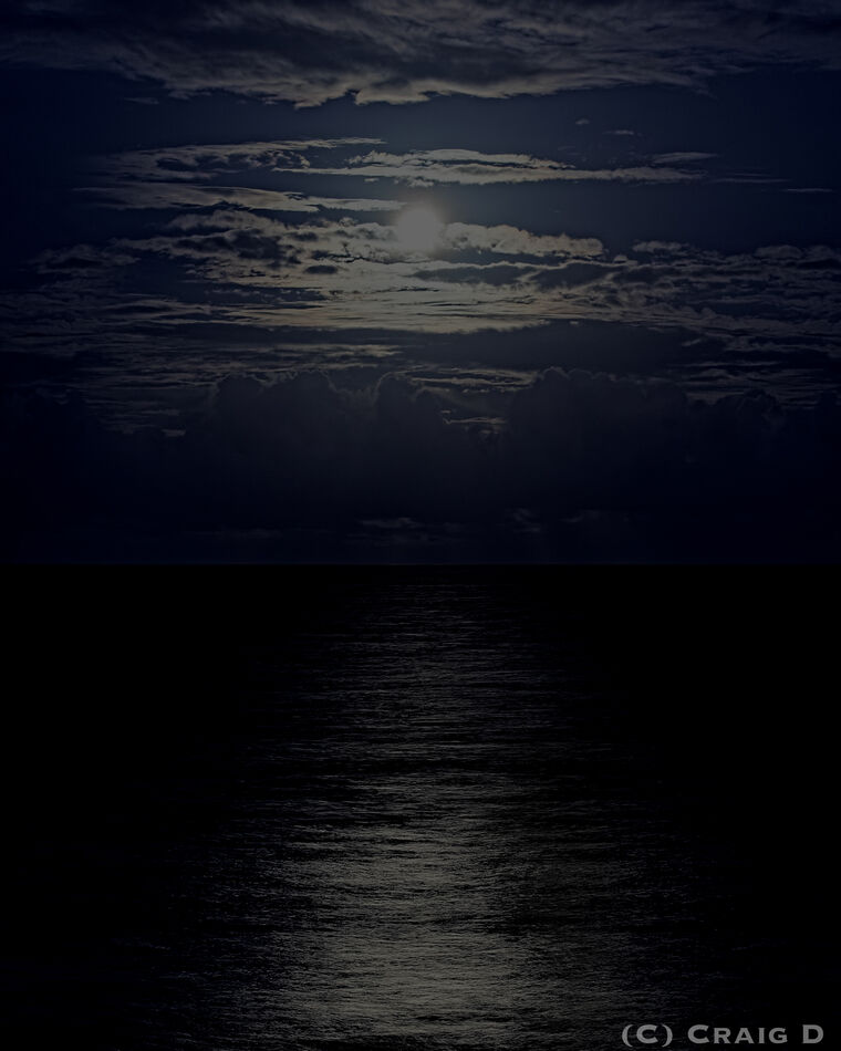
Thanks for your critiques and suggestions. I like this new color version and thought I’d try black and white to scape the challenge of color.
What do you think? If it’s worse or better, I want to know.
What do you think? If it’s worse or better, I want to know.

Apr 27, 2023 21:28:26 #
Craigdca wrote:
I’d like your opinion on which of these you prefer. If it depends on print vs screen, or contest vs sales, that would be interesting to learn also.
I tend to over saturate but can back it off.
My goal is to possibly casually sell my work online, probably through a shop like Fine Art America, or enter contests as some friends suggested for a few of my pics.
Thanks, this is just for curiosity so a quick reflex response would be excellent.
I tend to over saturate but can back it off.
My goal is to possibly casually sell my work online, probably through a shop like Fine Art America, or enter contests as some friends suggested for a few of my pics.
Thanks, this is just for curiosity so a quick reflex response would be excellent.
I like what Linda said about the horizon. In many shots a central horizon does not bother me; but with this composition it seems like half is sky and exactly the other half is water. I think I would crop from the bottom a bit. I also prefer the less saturated photo.
Erich
Apr 28, 2023 19:05:48 #
ebrunner wrote:
I like what Linda said about the horizon. In many shots a central horizon does not bother me; but with this composition it seems like half is sky and exactly the other half is water. I think I would crop from the bottom a bit. I also prefer the less saturated photo.
Erich
Erich
Thanks Erich and everyone, I learned some valuable lessons. Mainly to use saturation sparingly, consider exposure levels, and consider how the horizon’s placement might be a distraction from the subject.
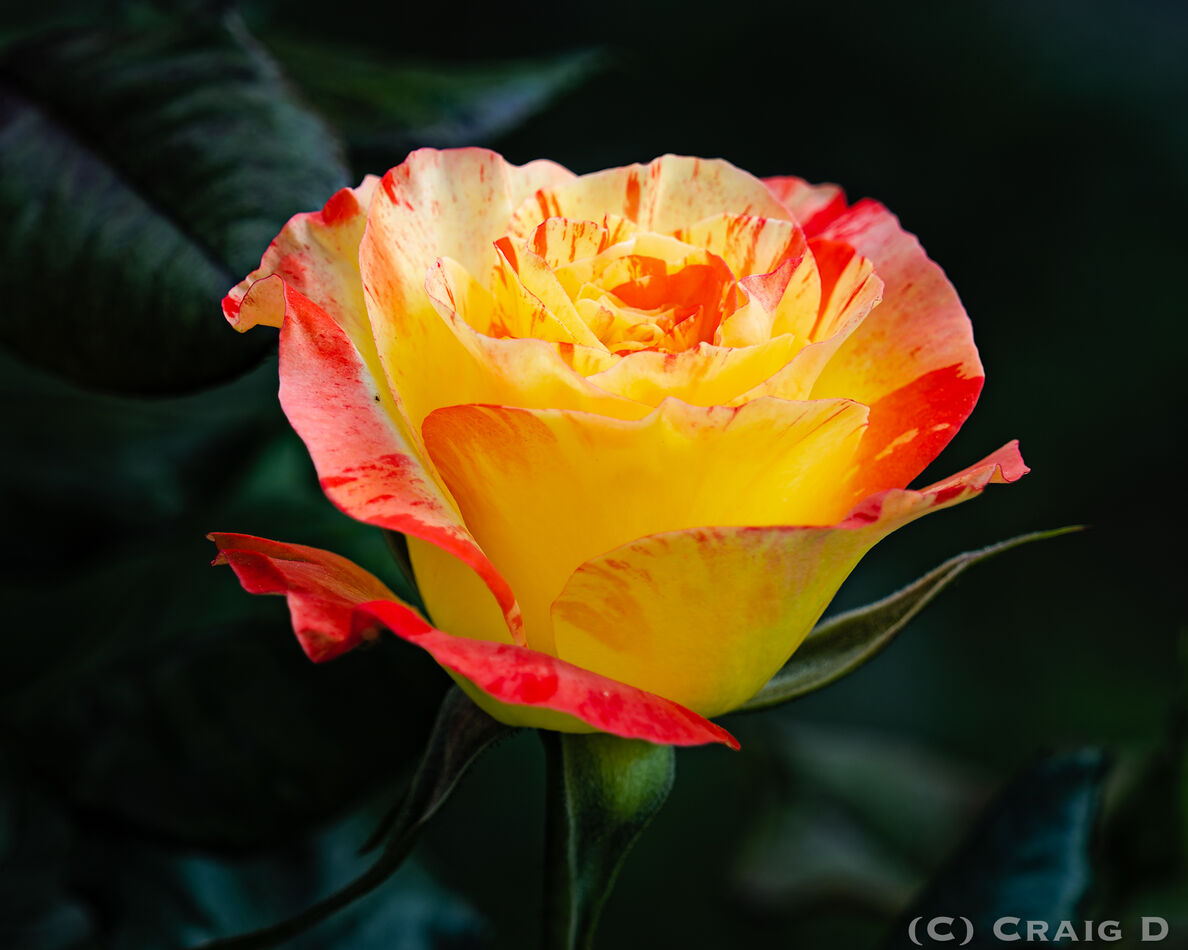
Now enjoy a bright flower just for fun and on to more photography!
If you want to reply, then register here. Registration is free and your account is created instantly, so you can post right away.