How could these be improved?
Apr 19, 2023 18:21:26 #
kbwheeler
Loc: Fremont, California
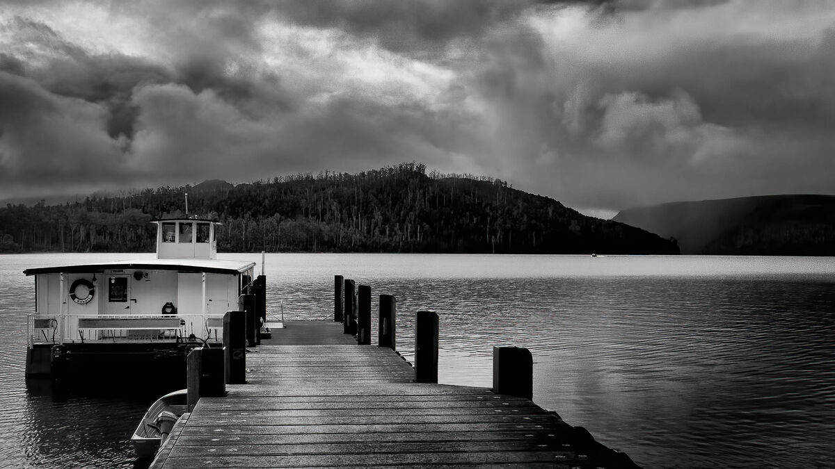
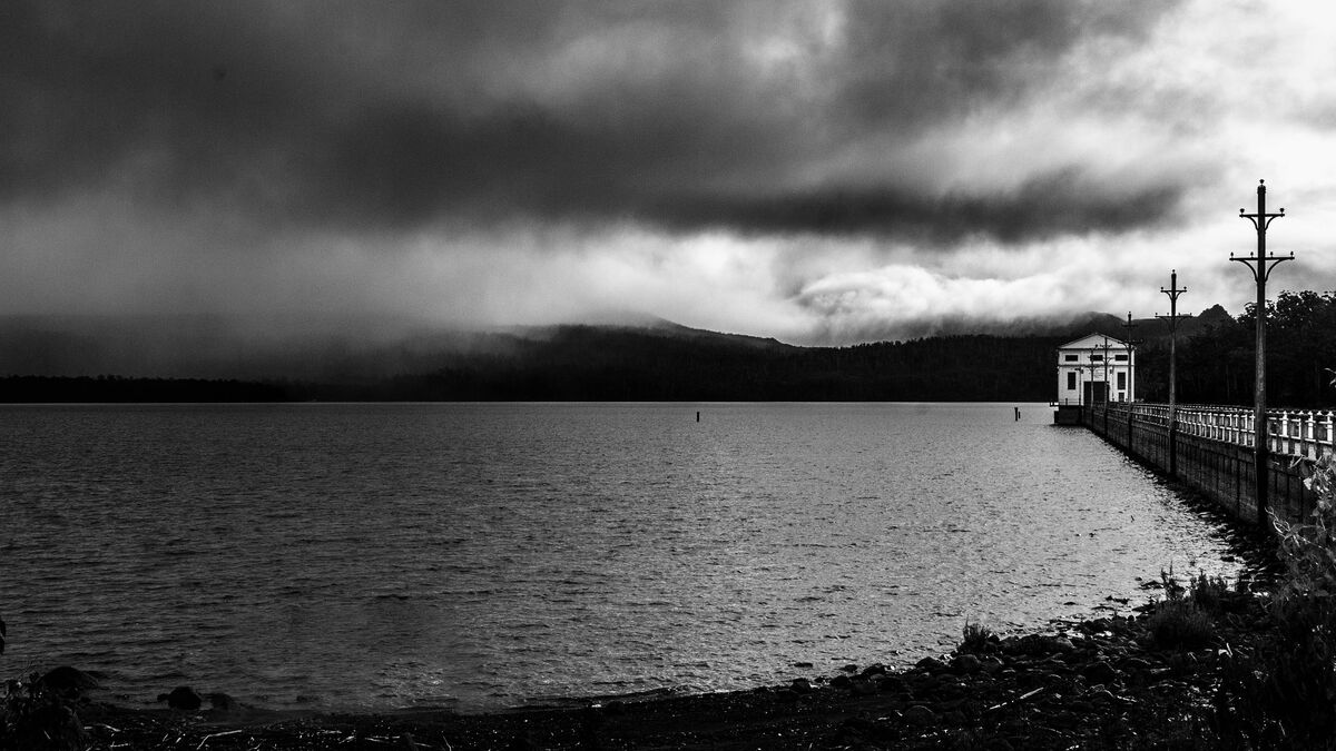
Two photos taken in Tasmania, Australia. Waning light on a beautiful lake. Are these too contrasty? Too dark? Thoughts?
Apr 19, 2023 18:52:21 #
wdross
Loc: Castle Rock, Colorado
kbwheeler wrote:
Two photos taken in Tasmania, Australia. Waning light on a beautiful lake. Are these too contrasty? Too dark? Thoughts?
I would crop some from the right on the first image and crop some from the left on the second image. Maybe slight increase in contrast. Or slightly increase in shadow details. Good shots anyway.
Apr 19, 2023 18:55:52 #

That would depend on your "vision" of the scene when taking the photograph.
Personally, I'd prefer to see a bit more detail (trees) on the mountainside of the first one.
--Bob
Personally, I'd prefer to see a bit more detail (trees) on the mountainside of the first one.
--Bob
kbwheeler wrote:
Two photos taken in Tasmania, Australia. Waning light on a beautiful lake. Are these too contrasty? Too dark? Thoughts?
Apr 19, 2023 21:32:54 #
Cany143
Loc: SE Utah
No, they're not 'too' contrasty. If anything, the first is --compositionally so, though ever so slightly, but sufficiently so that there's an overall un-balanced aspect-- im-balancement in the image. Beyond that, if anything could have been 'improved', an increased amount of detail (as Bob mentioned above, and in the blacks/whites, too) in the trees would conceivably have 'bettered' the image.
Granted, this is little more than a subjective response, and I recognize that 'subjective' is relative to whatever intents I might 'want' or 'expect' or 'hope' to see in an image -vs- those of yours, but they're subjective all the same.
You should 'do' what YOUR subjective intents are/may've been. Mine are merely academic.
Apr 19, 2023 21:46:42 #
Apr 19, 2023 22:25:57 #
Apr 20, 2023 00:03:05 #
Cany143
Loc: SE Utah
Cany143 wrote:
No, they're not 'too' contrasty. If anything, the... (show quote)
Apr 20, 2023 01:30:54 #
Cany143
Loc: SE Utah
Cany143 wrote:
No, they're not 'too' contrasty. If anything, the... (show quote)
Apr 20, 2023 06:18:34 #

The only thing which indicates that it's not just an underexposed photo is the overcast sky. The stormy sky is the reason for the sombre mood. That could be enhanced if the highlights in the sky were toned down a bit.
Apr 20, 2023 07:50:38 #

Apr 20, 2023 13:51:14 #
kbwheeler wrote:
Two photos taken in Tasmania, Australia. Waning light on a beautiful lake. Are these too contrasty? Too dark? Thoughts?
Color would be a good start.
May 27, 2023 05:29:53 #
Nice work! I like the first one a lot and like the B&W. I agree with others that the photo might be strengthened if some of the right side were cropped. Also, my eye is drawn to the black part of the hill, but there is nothing there but black to see. I think the photo would be much stronger if this were lightened, assuming that this area hasn't been blown out.
Aug 26, 2023 15:51:51 #

If you want to reply, then register here. Registration is free and your account is created instantly, so you can post right away.