Need for Critical Analysis
Jan 22, 2023 14:15:46 #
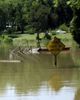
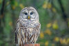
Attached are three photos taken while on a trip to Florida and Texas. Recommendations for improvement please.
Jan 22, 2023 14:29:26 #

charles brown wrote:
....Recommendations for improvement please.
Shooting or post processing?
Jan 22, 2023 14:44:25 #
timcc
Loc: Virginia
charles brown wrote:
Attached are three photos taken while on a trip to Florida and Texas. Recommendations for improvement please.
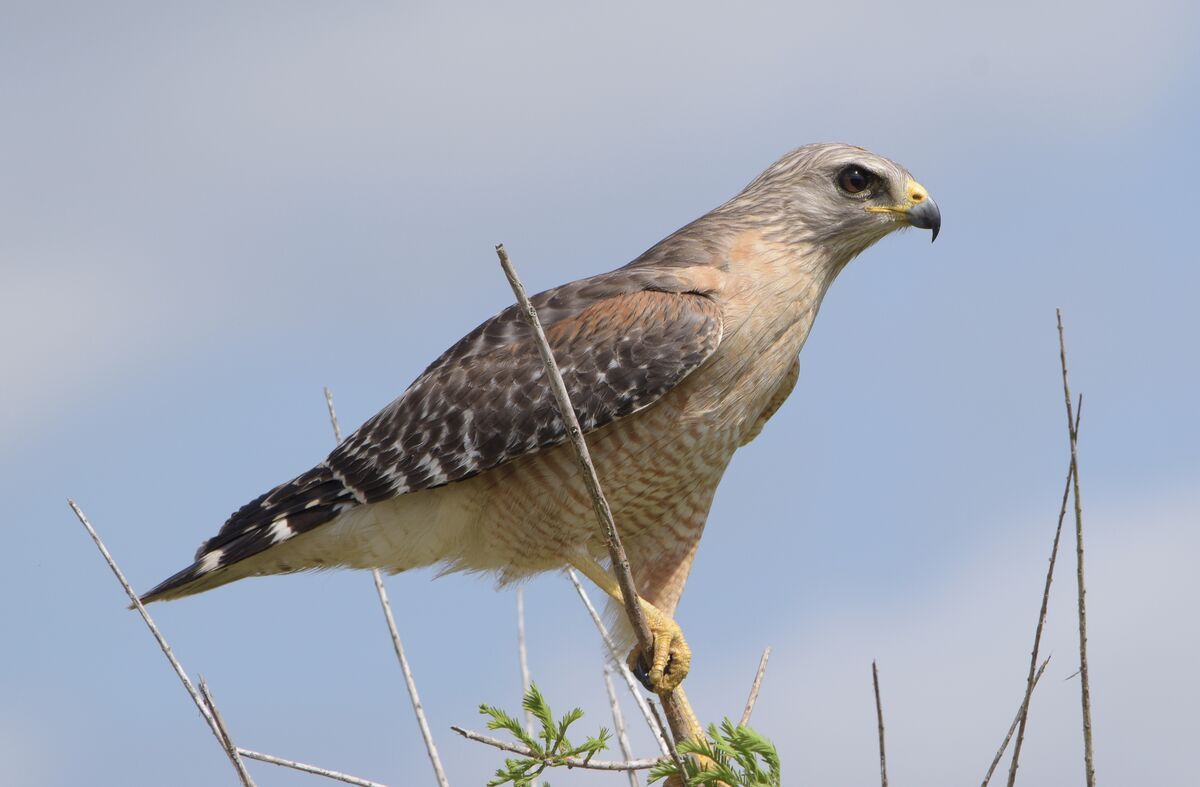
On the first photo, I suggest getting rid of the 5 or 6 vertical branches to the left of the main branch the hawk is holding onto, especially the ones that intersect the bird. They are an unnecessary distraction and clutter the shot, IMHO. I would also remove the short vertical branch just to the right of the main branch. Is the picture slightly out of focus? If so, a tiny bit of sharpening of the bird's feathers might help. Overall a nice shot of the hawk, though.
Jan 22, 2023 14:52:19 #
Jan 22, 2023 14:57:58 #
In #1 the focus was probably on the branch that's in front of the bird, which has left the bird's head looking a bit soft. A bit of extra contrast and sharpening will help alleviate the softness. Spot focus correctly aimed would have avoided the problem (or eye detect AF if you have it).
Jan 22, 2023 14:59:55 #
2 and 3 don't look obviously wrong in any way so if they're to your liking they're good to go.
Jan 22, 2023 15:21:56 #

charles brown wrote:
Attached are three photos taken while on a trip to Florida and Texas. Recommendations for improvement please.
Improvements
 I think you did a great job here
  Whatever you've been doing, continue ⭐🌟⭐🌟⭐
Jan 22, 2023 17:35:12 #
Jan 23, 2023 05:18:40 #

charles brown wrote:
Attached are three photos taken while on a trip to Florida and Texas. Recommendations for improvement please.
Nice set.
Jan 23, 2023 05:48:02 #

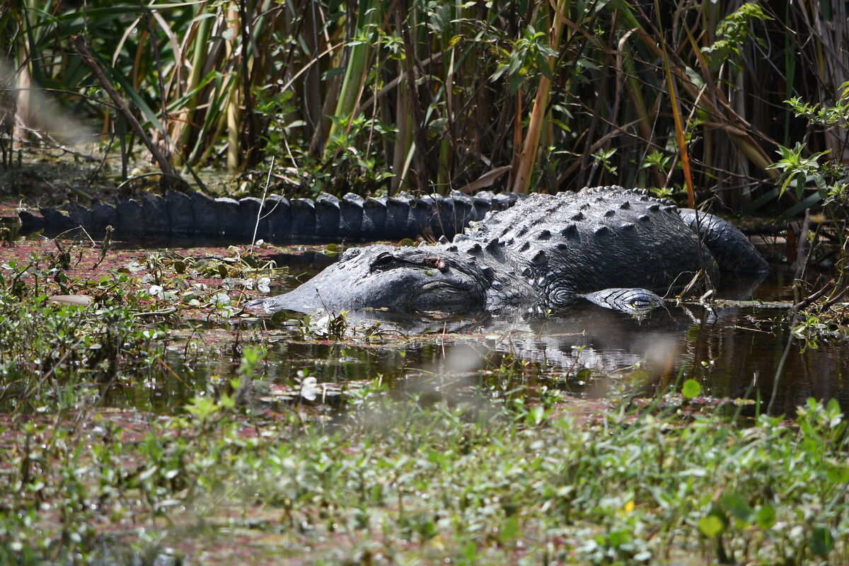
no.1 as per other comments. no.2 maybe crop a bit of the bottom to give a more 'lengthy' aspect to the 'gator.
Jan 23, 2023 09:15:32 #
gvarner
Loc: Central Oregon Coast
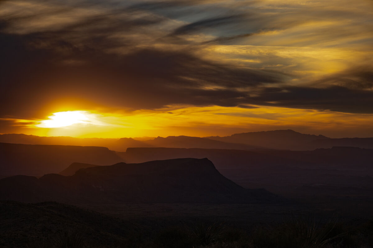
#1 is OK. Can’t do much in PP for the #2. It needed less foreground. #3 could be cropped up from the bottom and in from the upper right. Those would be my choices for what they’re worth.
Jan 23, 2023 13:40:39 #

Jan 23, 2023 13:54:48 #
I'm not one for removing things or adding things either like fill in sky. Yes the grass to the left is a bit of a distractor but that's Mother Nature. I would make sure that the eyes are always in focus. And be aware of DOF . I would lighten up the foreground in #3, showing a bit more atmospheric progression. Looks pretty good
Jan 23, 2023 15:32:24 #
charles brown wrote:
Attached are three photos taken while on a trip to Florida and Texas. Recommendations for improvement please.
#1- Vertical Crop. Lighten the bird's eye region.
#2-Better subject isolation. Background overpowering.
#3-Better subject isolation.
Great shots- my suggestions are what I might do. Any changes, other than the crop suggestion are small to very small adjustments.
Jan 23, 2023 15:42:48 #
charles brown wrote:
Attached are three photos taken while on a trip to Florida and Texas. Recommendations for improvement please.
I like them the way they are, Charles!
If you want to reply, then register here. Registration is free and your account is created instantly, so you can post right away.