Check out Digital Artistry section of our forum.
Ali
Jan 16, 2023 08:56:22 #
Jan 16, 2023 09:01:18 #

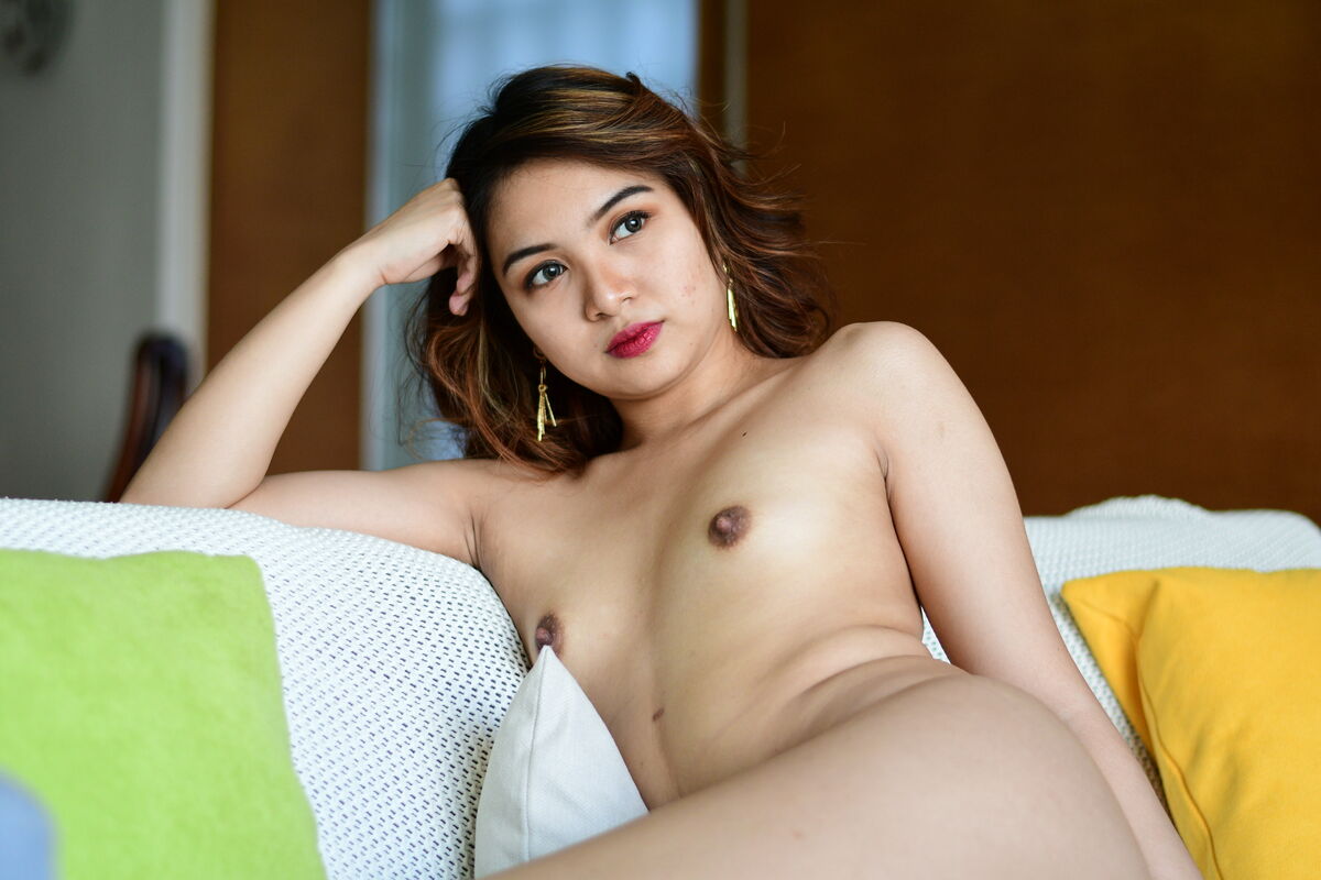
The colored pillows jump out at me, and not in a good way. I think keeping things in the brown tones that predominate the upper half of the photo would have provided better framing of the model.
Perhaps you can try recolouring them with software.
Perhaps you can try recolouring them with software.
Jan 16, 2023 09:01:32 #

Check out Bridge Camera Show Case section of our forum.
Jan 16, 2023 09:06:12 #

Jan 16, 2023 09:19:55 #

JohnFrim wrote:
The colored pillows jump out at me, and not in a good way. I think keeping things in the brown tones that predominate the upper half of the photo would have provided better framing of the model.
Perhaps you can try recolouring them with software.
Perhaps you can try recolouring them with software.

and the back ground is distracting.
Jan 16, 2023 17:06:06 #

mackie wrote:
Comments welcome .....
Very nice portrait. Your beautiful model appears relaxed and totally at ease. IMHO, "fixing" the distractions would only make the image less natural and more staged, if that makes sense?
I like it just the way it is. No pretense, no forced smile
Nice job!
Paul
Jan 16, 2023 20:04:02 #
Nicely lit subject. And nice framing and she has a nice expression, and a lovely natural and relaxed pose.
I agree with one other comment above about the cushions though. I think if they were white, same as the couch's overthrow, it would be a lot better, or just remove them all together before taking the photo, because the green and yellow cushions add too much colour variation and make it all a bit too 'busy' for my liking. And of course, the blue bit in the bottom-left corner could be very easily and convincingly removed in PP in a second, such as by using Photoshop's Content Aware tool.
I don't mind the background, the DoF is good and the window is quite okay IMHO, but I would have moved that chair out of the frame - note how her arm and the chair 'collide'. ""fixing" the distractions" as 'PaulW128' wrote.
Good work though.
Check out Astronomical Photography Forum section of our forum.
Jan 16, 2023 20:11:10 #

mackie wrote:
Comments welcome .....
There is an area of redness on her left cheek. Very minor touch-up will correct the problem. What would she look like in B&W?
Jan 16, 2023 20:46:03 #
davidrb wrote:
There is an area of redness on her left cheek. Very minor touch-up will correct the problem. What would she look like in B&W?
Looks to me like a little bit of acne, which is common among young asian people. It is there, so if it were my photo I would leave it there. It's 'the real her'.
Well, okay, if the purpose of the photo was for a glamour magazine or some other commercial purpose, or something, a different story.

Jan 16, 2023 21:17:49 #
paulrnzpn wrote:
Looks to me like a little bit of acne, which is common among young asian people. It is there, so if it were my photo I would leave it there. It's 'the real her'.
Well, okay, if the purpose of the photo was for a glamour magazine or some other commercial purpose, or something, a different story.
Well, okay, if the purpose of the photo was for a glamour magazine or some other commercial purpose, or something, a different story.
It could be caused by several things but the OP asked for comments on what is. Young women are aware of their features and any kind of discoloration is very noticeable. Her pose is not for his eyes only and I find no reason to leave it. Doubt she would find "the real her" very complimentary.
Jan 17, 2023 06:33:29 #
mackie wrote:
Comments welcome .....
The model is beautiful, looking very serene and at ease, to me, it feels like she enjoys being naked. You captured the look exceedingly well, Mackie. The lighting is very good, and the pose is excellent.
Though the cushions are a slight distraction, I feel the chair behind her arm is the most distracting.
Other than that, I would very much like to see more of this shoot.
Check out Wedding Photography section of our forum.
Jan 17, 2023 07:16:38 #
melismus
Loc: Chesapeake Bay Country
Lovely lady; nicely posed. Small, firm breasts are more alluring to me than great, pendulous jugs.
Jan 17, 2023 07:27:53 #

PaulW128 wrote:
Very nice portrait. Your beautiful model appears relaxed and totally at ease. IMHO, "fixing" the distractions would only make the image less natural and more staged, if that makes sense?
I like it just the way it is. No pretense, no forced smile
Nice job!
Paul
I like it just the way it is. No pretense, no forced smile
Nice job!
Paul
That was my thought , looks natural, unposed this way.
Jan 17, 2023 08:35:08 #

Jan 17, 2023 09:06:17 #

If you want to reply, then register here. Registration is free and your account is created instantly, so you can post right away.
Check out Drone Video and Photography Forum section of our forum.