More Rescues
Aug 29, 2022 09:01:28 #
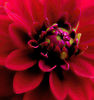
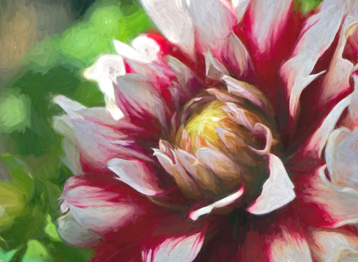
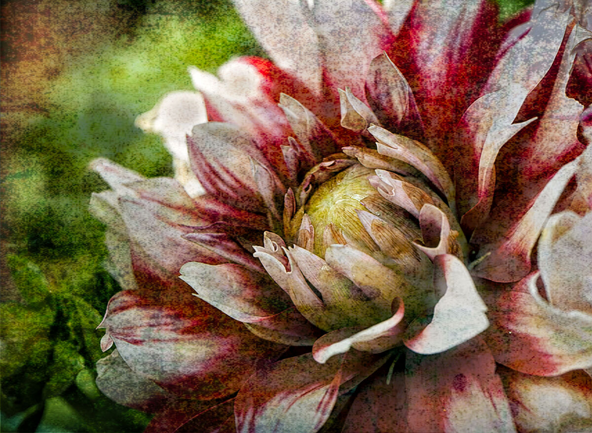
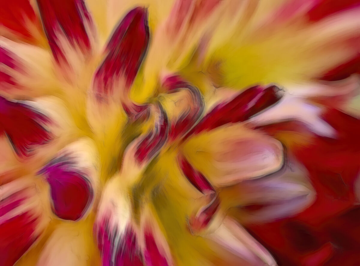
As I've stated before, I hate throwing out pictures if they have some potential. Her are a few more that i've processed. Two of them are the same flower...can't decide which I like better. Thanks for looking
Fran
P.S. do these images appear dark to you? I've calibrated my monitor but the color on UHH is definitely not the same as what's on my computer screen when I've finished editing.
Fran
P.S. do these images appear dark to you? I've calibrated my monitor but the color on UHH is definitely not the same as what's on my computer screen when I've finished editing.
Aug 29, 2022 09:14:20 #
StanMac
Loc: Tennessee
Fran, the images look fine on my iPad. My favorites are the first two, but the best is the first image, IMO. The third image is a bit too abstract for me.
Stan
Stan
Aug 29, 2022 09:18:36 #
Aug 29, 2022 12:49:40 #

Colors and brightness look fine to me. #1 is my favorite also 
Aug 29, 2022 13:45:20 #
StanMac wrote:
Fran, the images look fine on my iPad. My favorites are the first two, but the best is the first image, IMO. The third image is a bit too abstract for me.
Stan
Stan
Thanks for commenting , Stan. The more I look at it the more I like number 1 as well.
Fran
Aug 29, 2022 13:46:03 #
Guyserman wrote:
#1 far outshines the other two (my opinion.)
Guyserman, thanks for dropping in and commenting.
Fran
Aug 29, 2022 13:46:47 #
Linda From Maine wrote:
Colors and brightness look fine to me. #1 is my favorite also
Linda, glad you like it. It's either my monitor or my old eyes!
Fran
Aug 29, 2022 14:49:06 #
Ben's nana wrote:
As I've stated before, I hate throwing out pictures if they have some potential. Her are a few more that i've processed. Two of them are the same flower...can't decide which I like better. Thanks for looking
Fran
P.S. do these images appear dark to you? I've calibrated my monitor but the color on UHH is definitely not the same as what's on my computer screen when I've finished editing.
Fran
P.S. do these images appear dark to you? I've calibrated my monitor but the color on UHH is definitely not the same as what's on my computer screen when I've finished editing.

Aug 29, 2022 17:00:32 #
robertjerl wrote:
Thanks for the thumbs ups, Robert...much appreciated
Fran
Aug 29, 2022 18:37:22 #
Ben's nana wrote:
Thanks for the thumbs ups, Robert...much appreciated
Fran
Fran
you are welcome
Aug 30, 2022 06:05:49 #

Like others I like the first one the best. The third one is too abstract for my taste. I am viewing these on a IPAD, and they don’t look too dark to me.
Aug 30, 2022 08:18:29 #

Aug 30, 2022 08:29:24 #

Beautifully done, Fran. I’m also a fan of #1 but really like your work on the others also.
Aug 30, 2022 09:27:41 #
lnl
Loc: SWFL
I definitely like the first one best. #2 is too edgy for me and #3 too abstract.
Keep on. You do great work!
Ellen L
Keep on. You do great work!
Ellen L
Aug 30, 2022 10:12:55 #

If you want to reply, then register here. Registration is free and your account is created instantly, so you can post right away.