Mixed Sepia and Color
Aug 7, 2022 23:18:11 #
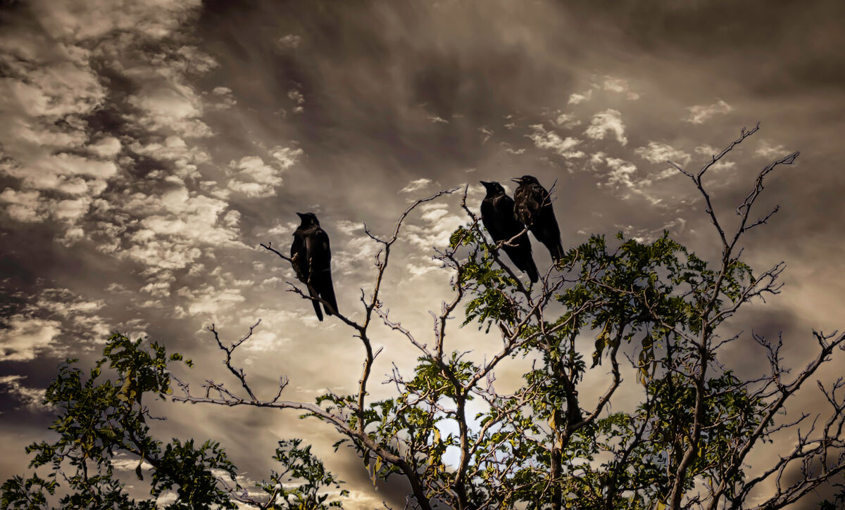
Don't know how people feel about these mixed color and sepia type pictures, this one with a replaced sky. Would be curious to get any feedback on it
Aug 7, 2022 23:25:07 #
Aug 7, 2022 23:28:46 #
Aug 7, 2022 23:58:42 #
Cany143
Loc: SE Utah
Some say it isn't nice to comment 'critically' on images posted in The Gallery. Thankfully --since I think that's a lot of bunk-- you axed..... So.........
No problem whatsoever with the sepia & (yellowish-) green. They're somewhat analogous in this instance, so there's no color wheel competition there. Beyond that, while I'm not a sky replacement fancier, generally speaking, the replacement you've done is virtually flawless --technique-wise-- which is considerably less common than we've --i.e., than I've-- come to expect, so kudos in that regard.
What 'problem' I have, however, concerns the relative 'brightness'/lack of texture on (some) of the facing branches: they're too light/undefined within their spaces in relationship with the presumed source of the light and where lights/shadows would logically fall. Conversely, I'd have liked to see just a bit more 'light' (reduced from the Zone X where they mostly are down to a Zone VIII or IX where they could be) and/or texture in the ravens (or are those crows?) such that they'd be revealed slightly better, despite the source of light.
Those would be my 'preferences', but they need not be yours. Overall, rather better than the norm.
Aug 8, 2022 16:44:59 #

Aug 8, 2022 19:32:55 #

Remove the blue ball and it would be a nice picture. That sky and the birds tell a story.
Aug 9, 2022 22:16:18 #

gener202002 wrote:
Don't know how people feel about these mixed color and sepia type pictures, this one with a replaced sky. Would be curious to get any feedback on it
I do like it, Gener!
Aug 10, 2022 00:20:53 #
Aug 10, 2022 00:21:07 #
Aug 15, 2022 18:25:39 #

Aug 15, 2022 18:31:56 #
Aug 15, 2022 18:32:19 #
ski wrote:
Great contrasts between the greens and the sepia. Great Gothic photo
Thanks, ski
If you want to reply, then register here. Registration is free and your account is created instantly, so you can post right away.