Check out Film Photography section of our forum.
Colorized 4
Jun 6, 2022 19:57:51 #
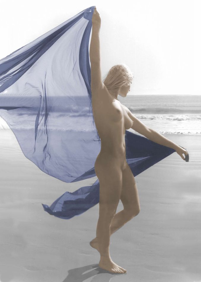
Another one. The black & white version of this ( previously posted ) image is on the front cover of one of my Shutterfly books.
Jun 6, 2022 22:17:12 #
mjc925
Loc: SF Bay Area
The colorized shots are pretty cool, nicely done and glad you shared. Very different feel than the BW, which I also really like, so it is a win-win. Makes me want to learn more about colorizing my BW stuff.
Jun 7, 2022 08:05:39 #


Check out Sports Photography section of our forum.
Jun 7, 2022 10:35:55 #
Jun 8, 2022 19:52:37 #

Fotoartist wrote:
The color tones harmonize well on this one.
I agree. There is a softness to them that strikes a nice mood.
If you want to reply, then register here. Registration is free and your account is created instantly, so you can post right away.
Check out The Pampered Pets Corner section of our forum.