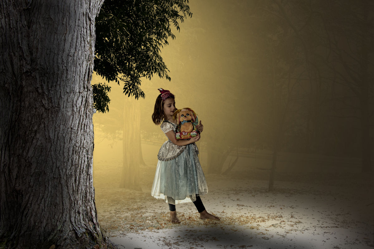
Girl in the woods
Feb 25, 2022 22:20:47 #
Steve DeMott
Loc: St. Louis, Missouri (Oakville area)
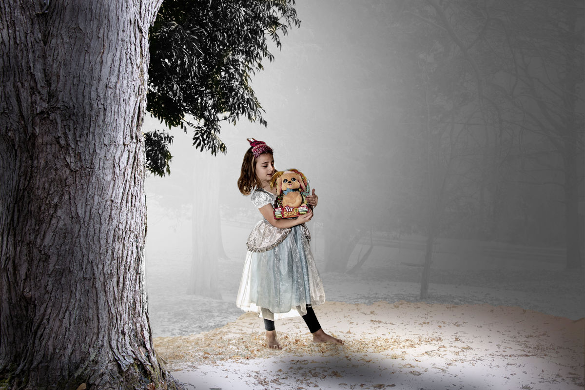
Need a little help with this. My G.G.daughter had her 5th birthday and I've been playing around with combining 3 photos together. The yard scene and branches look ok, but the girl has me baffled. She looks like a cut & paste and I haven't found the right blend combination to make it look seamless. Any help would be appreciated.
I've put the entire PSD file in dropbox for anyone who wants to play or see what I've done.
https://www.dropbox.com/s/kooexmb1ei6r4z0/girl%20in%20forest.psd?dl=0
hope the link works
Steve
I've put the entire PSD file in dropbox for anyone who wants to play or see what I've done.
https://www.dropbox.com/s/kooexmb1ei6r4z0/girl%20in%20forest.psd?dl=0
hope the link works
Steve
Feb 25, 2022 22:55:45 #

I am looking at this on an IPAD, so what I am going to suggest my not fit. Since the screen is not very big. But with that said, I would give a bit of rim light on her hair on the left. The light coming through her dress should match the light source in the background. I am sure there are others who could make additional suggestions.
Feb 25, 2022 23:01:01 #
Steve DeMott
Loc: St. Louis, Missouri (Oakville area)
NJFrank wrote:
I am looking at this on an IPAD, so what I am going to suggest my not fit. Since the screen is not very big. But with that said, I would give a bit of rim light on her hair on the left. The light coming through her dress should match the light source in the background. I am sure there are others who could make additional idea.
Great suggestions, I'll work on that. Thanks
Feb 26, 2022 07:04:30 #

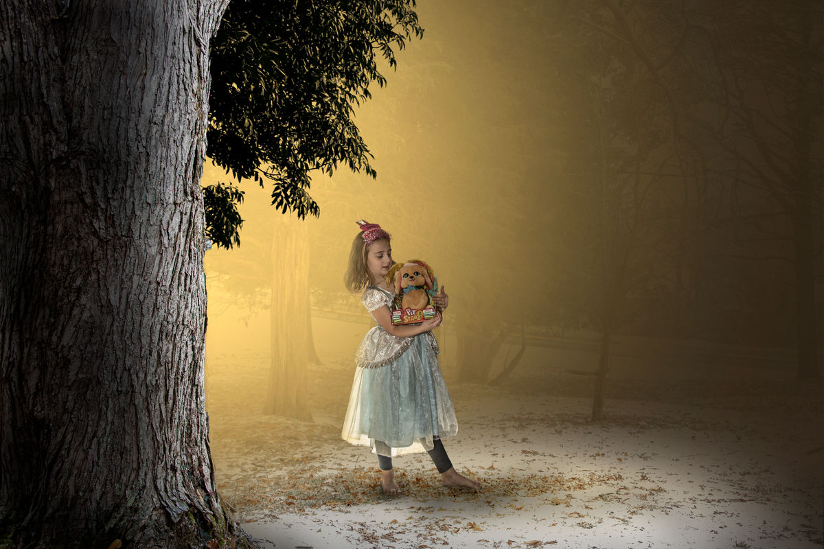
When you're adding things to a scene the lighting has to match - not just the amount and direction but also the colour. I selected the girl and added some of the background yellow to her. To create a more uniform ambient colour I shifted the WB slightly towards yellow and also used Split Toning to add a touch of yellow to the highlights plus cyan/blue to the shadows (for balance - warm for the highlights, cool for the shadows). The overall effect is to add contrast and colour in an unobtrusive way. To keep things looking natural I slightly desaturated the selected girl.
Another thing that has to match is the texture. The background has a misty, soft texture and if the add-ins are too sharp they can look out of place. I added a touch of denoise to the selected girl and added global denoise for softening (which suits the overall look). I also added a small amount of global negative Clarity for the same reason.
Another thing that has to match is the texture. The background has a misty, soft texture and if the add-ins are too sharp they can look out of place. I added a touch of denoise to the selected girl and added global denoise for softening (which suits the overall look). I also added a small amount of global negative Clarity for the same reason.
Feb 26, 2022 10:55:28 #
R.G. wrote:
When you're adding things to a scene the lighting ... (show quote)
Great beginning and It's progressing nicely.
Feb 26, 2022 11:10:31 #
Steve DeMott
Loc: St. Louis, Missouri (Oakville area)
R.G. wrote:
When you're adding things to a scene the lighting ... (show quote)
Thanks R.G.
This will take some time figuring out everything you suggested. One must take the time playing to figure ideas out.
Feb 26, 2022 11:10:52 #
Steve DeMott
Loc: St. Louis, Missouri (Oakville area)
Fotoartist wrote:
Great beginning and It's progressing nicely.
I agree
Feb 26, 2022 14:13:03 #

Feb 26, 2022 17:48:33 #

I have taken a different approach in regards to the background color. To me, it just seemed to be too distracting, so I made a selection of it and changed the color.
Some of the edits I made were to reduce the shadows due to the subject's backlighting. I also lightened the shadow more on the side of her face that was concealing her facial features. She was floating in the air so I used the clone stamp to add some of the ground to the base of her feet. I also used the blur tool set at 50% and using a small soft brush went around the edges of the young lady to tone down the effect of what you referred to as cut out.
I wanted to do something about the lighting which seems to light her up from the front too much but decided to leave it alone. Needing more time to consider it.
Feb 26, 2022 20:06:59 #
Steve DeMott
Loc: St. Louis, Missouri (Oakville area)
SoHillGuy wrote:
I have taken a different approach in regards to th... (show quote)
Thanks. You did a great job of reducing the cut-out effect and I do like the change in lighting.
Originally I was looking for a late evening before sunset. We have this beautiful yellowish-red glow during that time. The original photo of the girl was backlite with natural light and a flash for fill-in. One of those birthday photos you don't really expect to do much with.
I think I'll keep to the original idea but lighten the orange a lot.
Feb 26, 2022 21:02:17 #
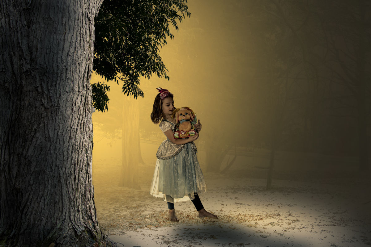
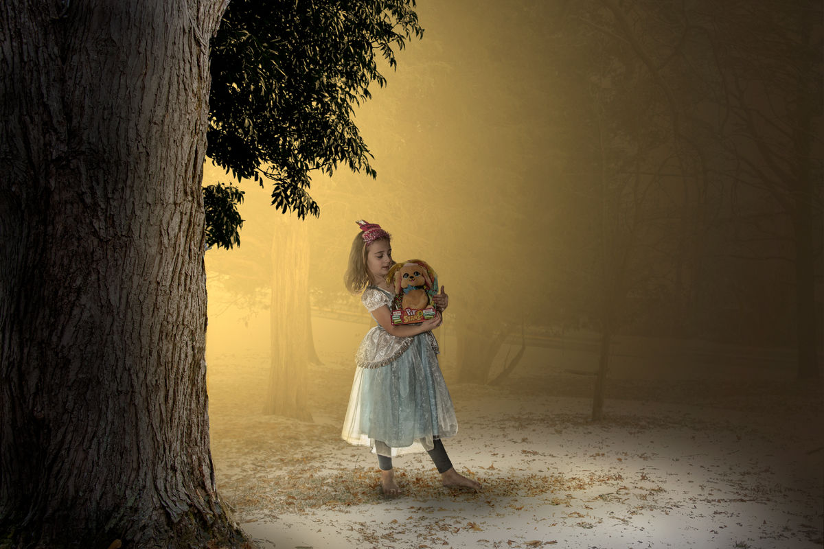
Here is my interpretation. I worked on the masking some around her feet. Made her a little smaller, then played with her shadow to ground her better. Played with lighting and shading. I don't think she has to be that dark. I believe if you were taking the picture you would expose for the girl therefore lighter. I blurted her a very small amount and also added noise to the whole picture. I added a gradient map over the whole picture. Also added some dodge and burn to the child.
Feb 27, 2022 05:06:42 #
Steve DeMott wrote:
....This will take some time figuring out everything you suggested.....
The basics of what I did are quite simple - using a selection (or selections) to make the components of the composite as similar as possible (without losing a natural look), then adding global adjustments to create uniformity across the frame. Adding a subtle global colour cast has the effect of unifying the various parts of a composite. That can be done using the WB and/or Tint sliders, adding colour via the Adjustments brush or using Split Toning (or a combination of all three).
In your example it was simpler to adjust the added part (the girl) to suit the background, and that would probably still have been true if there had been several parts to the composite.
Feb 27, 2022 13:55:28 #

The shadow and the ground at her feet looks like it was done in a studio. Can you put in a real forest floor image at her feet? Something's not right about the background too. It looks like a backdrop instead of a real forest. The color isn't consistent with the very real looking tree in the foreground.
The light on the tree in the foreground is coming from the right while the light on the girl is coming from the left and behind her. It's not something everyone might notice at first but it gives the viewer a sense of "something's not right here." You might want to reverse the tree image and place it on the right so the light directions match better.
The light on the tree in the foreground is coming from the right while the light on the girl is coming from the left and behind her. It's not something everyone might notice at first but it gives the viewer a sense of "something's not right here." You might want to reverse the tree image and place it on the right so the light directions match better.
Feb 27, 2022 15:56:21 #
I think the comments were correct. I went back darken and added yellow to the tree. Then a final darkening of the tree and the girl. Added some additional yellow on the ground at feet and in front of the girl.
Feb 28, 2022 08:54:37 #
Steve DeMott
Loc: St. Louis, Missouri (Oakville area)
Jim-Pops wrote:
Here is my interpretation. I worked on the masking some around her feet. Made her a little smaller, then played with her shadow to ground her better. Played with lighting and shading. I don't think she has to be that dark. I believe if you were taking the picture you would expose for the girl therefore lighter. I blurted her a very small amount and also added noise to the whole picture. I added a gradient map over the whole picture. Also added some dodge and burn to the child.
Thanks Jim. I had to take a day off this project, been staring at it too long and wasn't seeing all the small changes. The shadow is a lot better along with lighting her up a tad. I do think maybe a little darker. The hair has a better look, but the sun is low on the left which might darken the face a tad bit. You and R.G. both played with the noise(grain) of the photo. It's hard to see unless the images are side by side.
Again thanks this give me more ideas to play with.
Did you download the PSD file or from UHH?
Steve
If you want to reply, then register here. Registration is free and your account is created instantly, so you can post right away.