Real or realistic
Dec 16, 2021 12:13:47 #

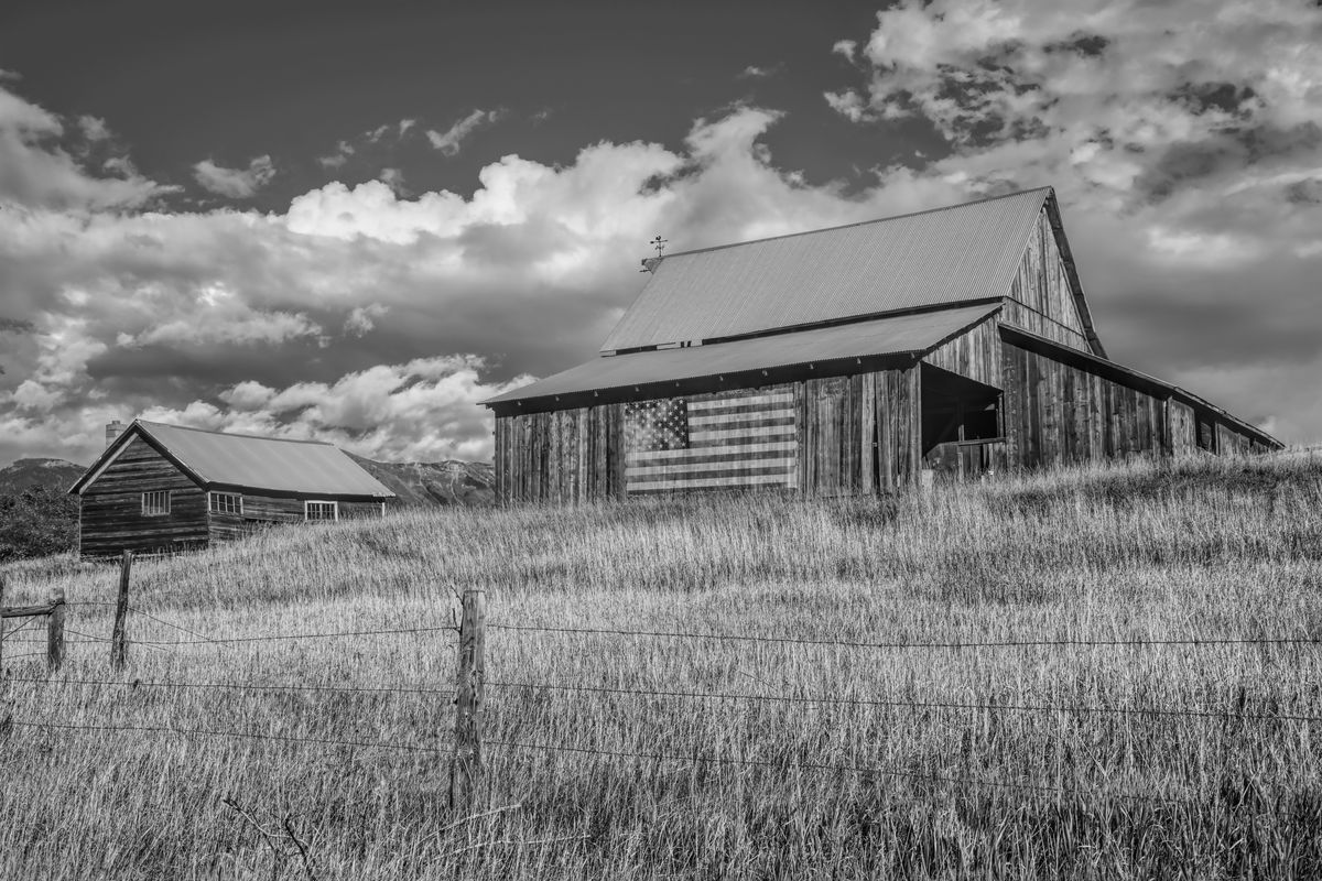
I was watching a documentary on black and white movie making, film noir and the requirements of lighting, shading and contrast that b&w movies require. An interesting opinion was voiced by one of the commentators - that we see the world in color, but black and white is more realistic. I guess it comes down to what the term "realistic" means.
I personally dislike "colorized" classic movies because, well, that's not the way the movie was intended to be viewed, and the filmmakers went to great lengths to create moods, feelings and emotional impact using light, dark and shadows. No one can tell me the scene in "Casablanca" where Rick is at the bar, getting drunk in the dark, and Ilsa walks in can possibly be more impactful in color... just ain't happening.
So... here's an image in both color and b&w. Personally, I prefer the b&w rendition for the impact of the flag... what do you think?


Dec 16, 2021 12:30:44 #
Dec 16, 2021 12:33:32 #

...I like 'em both ways, but lean to B&W also. Maybe it's the Brownie my dad gave me when I was a kid...
Dec 16, 2021 12:41:20 #
Cany143
Loc: SE Utah
What do I "think"? I "think" (believe, opine, assert, etc.) that there'd be greater 'impact' (in the B&W) if there were less dependence on middle grays and increased contrast in the foreground grasses/fence.
Dec 16, 2021 12:48:22 #
I think it’s like the expression: “it’s black and white.” It’s plain, simple, undistorted, what you see is what you get.
Dec 16, 2021 12:53:47 #
The B/W in my opinion says nothing. The Flag is Red, White and Blue. It is not Black and White. The color picture says it all.
Dec 16, 2021 12:55:48 #

There are some of my photos that I desaturate to make them B/W and some that I give a sepia toning, depends on the photo. For these posted here I do like the B/W as the contrast provides a better distinction pf several of the points of interest within it. The flag is an example, the residual red of the barn's color conflicts with the red stripes of the flag in the color version. It is much more visible in the B/W.
Dec 16, 2021 13:11:48 #
Dec 16, 2021 13:41:08 #
peekaboo wrote:
I prefer the B & W but I would give it a little more saturation.
How do you give a B&W image more saturation when saturation is an attribute of color? Did you perhaps mean more contrast?
Dec 16, 2021 13:43:21 #
Taking a great color picture is an amazing skill requiring both camera and, if you shoot in RAW, PP skills. B&W, I believe, involves an entirely different skill set, one I have never been able to master.
Dec 16, 2021 13:55:11 #
Dec 16, 2021 14:22:59 #
Cany143 wrote:
What do I "think"? I "think" (believe, opine, assert, etc.) that there'd be greater 'impact' (in the B&W) if there were less dependence on middle grays and increased contrast in the foreground grasses/fence.
I think, surmise, intuit and agree with your assessment... here is an edited version...
Dec 16, 2021 14:50:59 #

Dec 16, 2021 14:57:51 #
tommystrat wrote:
I was watching a documentary on black and white mo... (show quote)
I love both 💫💎🏆💎💫
Dec 16, 2021 15:04:45 #
Cany143
Loc: SE Utah
tommystrat wrote:
I think, surmise, intuit and agree with your assessment... here is an edited version...
Getting there....
....is half the fun.
If you want to reply, then register here. Registration is free and your account is created instantly, so you can post right away.