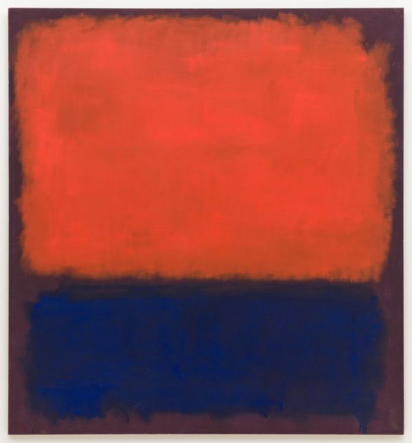
Monthly Masters' Critique - February 2021 - Mark Rothko's #14
Feb 1, 2021 08:18:15 #

Introduction
Lacking inspiration for this month’s offering, I consulted my grandson Jack and his friend Wesley, a couple of 9 year old boys who like art. Their recommendation was to explore the work of Mark Rothko. So here we go. As with all traditional art works shared on this thread, please consider how this work and this artist might connect to photography.
Rothko was born in Latvia in 1903, immigrated to the US with his family as a child, and spent most of his adult life in New York. His art work is often classified as Abstract Expressionist. His most famous paintings and his signature style are referred to as “Color Field paintings, composed of several large rectangular blocks of color place mostly horizontally on the canvas. Sometimes vivid and sometimes quite subdued, these paintings conveyed human emotion in all its splendour; from joy and ecstasy to grief and depression.” Early critique suggested that these artworks would not appeal to the general public but they became wildly popular, and financially successful. Rothko struggled with depression his entire adult life and ultimately committed suicide in 1970.
Look carefully at this image and share your thoughts about it in your reply. Below are some links to learn more about Rothko, and some questions that may spur your thinking about him and his imagery. (Jack and Wesley made a little slideshow about the critique they read and their own impressions, and they're eager to know what adults experienced with color theory and artistic expression think).
Questions For Consideration
1. What do you make of this painting? What do you think of the color palette? The composition? The impact? Would you want it on your wall? Why or why not?
2. Rothko himself, as well as many art critics who have written about his work, referenced the feeling that such paintings may evoke? Does this painting express a mood or message for you? If so, please tell us about it. Do you agree with Rothko that the primary purpose of art is to express human emotion? Explain.
3. I’m willing to bet that many of you have taken at least a photo or two that is almost as spare in subject matter as Rothko’s Color Field paintings, and that rely primarily on large areas of color to define them. If you have, please share one, and tell us about it, including whether you personally like your own photo or not and why.
Links for Further Study
https://en.wikipedia.org/wiki/Mark_Rothko
https://www.nga.gov/features/mark-rothko.html
https://www.moma.org/artists/5047
https://www.mark-rothko.org/
https://www.wikiart.org/en/mark-rothko
http://www.artnet.com/artists/mark-rothko/
https://www.pacegallery.com/artists/mark-rothko/
Feb 2, 2021 09:59:46 #

OK, I guess I'm going to be the first to comment on this. And you'll probably all throw tomatoes at me for what I say. This type of painting is, in my opinion, a rather stupid waste of canvas and paint. I get nothing from it. I see nothing in it. I have learned to enjoy abstract art, but this isn't even that. It's a glob of paint accompanied by another glob of paint. That anyone would pay money for this is beyond my understanding. Sorry. I warned you!
Feb 2, 2021 13:27:44 #
AzPicLady wrote:
OK, I guess I'm going to be the first to comment on this. And you'll probably all throw tomatoes at me for what I say. This type of painting is, in my opinion, a rather stupid waste of canvas and paint. I get nothing from it. I see nothing in it. I have learned to enjoy abstract art, but this isn't even that. It's a glob of paint accompanied by another glob of paint. That anyone would pay money for this is beyond my understanding. Sorry. I warned you!
All opinions are welcome! If we all liked the same stuff, what a boring (art) world we would have! Thanks for sharing!
Feb 2, 2021 17:27:56 #
AzPicLady wrote:
OK, I guess I'm going to be the first to comment on this. And you'll probably all throw tomatoes at me for what I say. This type of painting is, in my opinion, a rather stupid waste of canvas and paint. I get nothing from it. I see nothing in it. I have learned to enjoy abstract art, but this isn't even that. It's a glob of paint accompanied by another glob of paint. That anyone would pay money for this is beyond my understanding. Sorry. I warned you!
Kathy, I agree with you completely. One thing I would add is that the blobs are nauseatingly blurry.
Feb 2, 2021 18:36:24 #
MadMikeOne wrote:
Kathy, I agree with you completely. One thing I would add is that the blobs are nauseatingly blurry.
Always appreciate folks taking time to join in a discussion!
Feb 2, 2021 18:48:49 #
minniev wrote:
Always appreciate folks taking time to join in a discussion!
I apologize for not caring at all for it, but I had to be honest. Plus, I thought Kathy could use some support!
Feb 2, 2021 19:44:47 #
MadMikeOne wrote:
I apologize for not caring at all for it, but I had to be honest. Plus, I thought Kathy could use some support!

Feb 2, 2021 21:38:08 #
minniev wrote:
b Introduction /b br br Lacking inspiration for... (show quote)
Let me say at the outset that, even though I often like and enjoy abstract art, Rothko is not one of my favorites. I can find pleasure in some of his color compositions, but I have trouble recognizing that his work (your quote) “conveyed human emotion in all its splendour; from joy and ecstasy to grief and depression.”
I can’t think of much to say about a connection of Rothko’s work and photography. I’m sure there are photographers that see artistic expression the way he saw it. In my own “picture taking” I think of abstracts more in terms of black & white. Color adds dimensions (the visual ”weight” of the individual colors and our emotional responses to them) that make subject choice and composition that much more difficult!
Some further thoughts, triggered by AzPicLady’s and MadMikeOne’s comments. I can understand someone not liking the painting. But I have trouble understanding the extent of the negative feelings. Made me think of how people react to an abstract image and why they react the way they do.
I’ve often wondered how people who strongly dislike abstract works like Rothko’s feel about similar designs used in rugs and other decorative applications (Rothko’s painting reminded me of some Scandinavian Rya rugs I have seen. Example: http://1.bp.blogspot.com/-SYn8_Fh2548/UL0nL2jUdoI/AAAAAAAAJSg/YAzO_WkYwdg/s1600/1.jpg). I take it a step further and wonder how people would react to a sunset image that is gradually modified to eliminate recognizable shapes and is reduced to pure color! Just some thoughts spinning around my head…..
Thanks for posting, minniev, and kudos to your grandson and friend!
Feb 2, 2021 22:01:56 #
srt101fan wrote:
. . . Some further thoughts, triggered by AzPicLady’s and MadMikeOne’s comments. I can understand someone not liking the painting. But I have trouble understanding the extent of the negative feelings. Made me think of how people react to an abstract image and why they react the way they do. . . .
The best way I can describe MY negative reaction to abstract art/images is that I find them, for the most part, to be visually jarring and disjointed. Abstract art to my eyes is the visual equivalent of sounds that I consider to be cacophony. The subjects of my photography are birds and wildlife with an occasional landscape thrown in. Nature appeals to me both visually and emotionally. It is calming and brings me great joy. The natural world is home to me - both mind and heart. Abstraction does nothing at all for me, and in all honesty I have much better uses of my time than to spend whatever I have left on things that do not bring me joy and happiness in some form. I hope I have managed to convey the "why" of my negative feelings as they pertain to abstract art/images.
Feb 2, 2021 22:58:18 #
In response, I actually like abstract art as I already stated. To me this is not abstract art. It's two blobs of colour juxtaposed on one canvas. I said someone would likely throw tomatoes. Consider me blasted.
Feb 2, 2021 23:58:12 #
MadMikeOne wrote:
I apologize for not caring at all for it, but I had to be honest. Plus, I thought Kathy could use some support!
There are no right and wrong answers for the monthly critiques, they are just a way to get people to think about what they like/don't like, and have a conversation. The more stuff we see and think about the more our opinions about our own art can develop. Nobody likes all art!
Feb 3, 2021 00:00:35 #
MadMikeOne wrote:
The best way I can describe MY negative reaction t... (show quote)
You've explained very well, and it's always good to think purposefully about what we do and don't like and why. That can only help us as we find our own routes in our own art. Thanks for adding more to the conversation!
Feb 3, 2021 00:49:07 #
srt101fan wrote:
Let me say at the outset that, even though I often... (show quote)
I agree that there is some similarity to textile art that I see at craft guild events. They also reminded me of certain glass and ceramic art pieces.
I can't say as how I'd want to rush out and buy a Rothko color field painting but there is something appealing about the ones with the brighter colors and I do associate certain colors with certain emotions so I'll have to admit I see his point ( I pilfered that quote off the Rothko website). I agree that there are only a few steps between the #14 and a vivid sunset, I suspect I picked the orange and blue one of all the different Rothko combinations because I'm drawn to the blue/orange complement offered by sunsets over water. If you've got one of those in your archives, I wish you'd share it! I'll be looking for something of that sort too.
Feb 3, 2021 07:35:55 #

I usually don’t comment on the monthly critique. But I thought I would add my two cents. I find his use of color not so much as abstract, but very calming. I can understand how his work can be viewed as color field painting. His colors are very compelling and bring out the raw emotions in me.
Ok enough of that dribble. I find it hard to believe any thought was put into his work. It is hard to believe any one would buy and display his work. But kudos to him for making a good living with his work.
By the way if anyone is interested I have some photos I have taken that were produced when I was thinking outside the box. At a very reasonable price. Make me an offer.
Feb 3, 2021 07:37:20 #
minniev wrote:
You've explained very well, and it's always good to think purposefully about what we do and don't like and why. That can only help us as we find our own routes in our own art. Thanks for adding more to the conversation!
Thanks, Minnie. I was trying to tread carefully enough to get my point across clearly and firmly, but without offending those who enjoy/appreciate/"get" abstract art.
If you want to reply, then register here. Registration is free and your account is created instantly, so you can post right away.