Yosemite from my Archives
Oct 17, 2020 16:38:03 #
I haven't been to Yosemite this year because of covid, the fires and the crowds. So I dug thru some of my older Yosemite fall images. There wasn't a lot of fall color changes but there was a lot of sky drama.
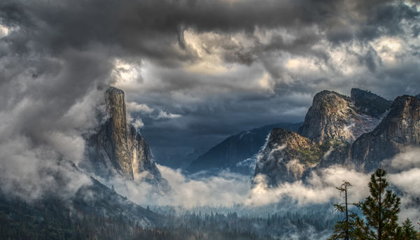
Image 1 is another (yes, another one) from tunnel view.
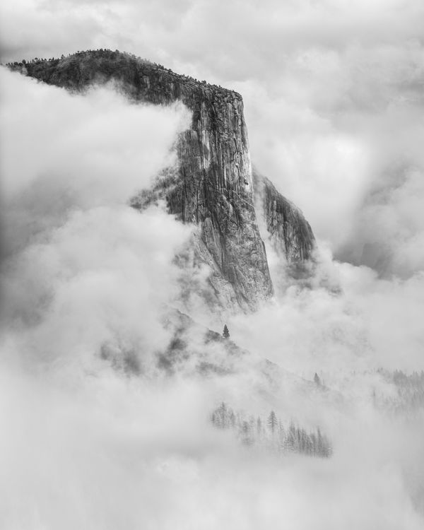
Image 2 was a throw-away of El Capitan until Linda from Main started another discussion about minimalism in the PP forum. While this isn't a minimalist image, I did cropped out some of the extraneous. The colors were muted and didn't add to the image, so the colors went also.
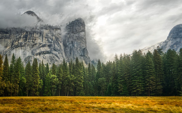
Image 3 is of Royal Arches as the sky begins to roll over into the valley.
As always, constructive critique/feedback is always welcome.
Best viewed in download.
.
Image 1 is another (yes, another one) from tunnel view.
Image 2 was a throw-away of El Capitan until Linda from Main started another discussion about minimalism in the PP forum. While this isn't a minimalist image, I did cropped out some of the extraneous. The colors were muted and didn't add to the image, so the colors went also.
Image 3 is of Royal Arches as the sky begins to roll over into the valley.
As always, constructive critique/feedback is always welcome.
Best viewed in download.
.
Oct 17, 2020 16:39:13 #

Oct 17, 2020 16:52:09 #

Great impact for me! Very cool to know that the Minimalism discussion inspired you with #2. It's a stunning result.
btw, I'm from Maine not Main
btw, I'm from Maine not Main
Oct 17, 2020 16:56:00 #
Oct 17, 2020 16:56:11 #
What can I say? you asked for comments, so here are a few. Extraordinary, beautiful, tastefully rendered artistry. Sharply rendered, well chosen majestic images. Oh, and by the way, very nice :) Stay well and keep on posting your great work.
Oct 17, 2020 17:01:06 #


Oct 17, 2020 17:11:59 #

Good ones, Mike. My favorite is the third but it has a rather hot streak through the center. If there were a bit more detail there, it'd be quite a good photograph.
--Bob
--Bob
SalvageDiver wrote:
I haven't been to Yosemite this year because of co... (show quote)
Oct 17, 2020 17:12:54 #

Oct 17, 2020 18:02:48 #
Linda From Maine wrote:
Great impact for me! Very cool to know that the Minimalism discussion inspired you with #2. It's a stunning result.
btw, I'm from Maine not Main
btw, I'm from Maine not Main
Ooops, but what's a little 'e' among friends? LOL
Oct 17, 2020 18:05:00 #
Mike .. I like more detail ..., but because all three are art .., who needs the detail ..., well done ...
Oct 17, 2020 20:21:14 #

I'm thankful you didn't throw #2 away. I think this one deserves many more edits.
Oct 17, 2020 20:22:02 #
SalvageDiver wrote:
🤗 🤗Ooops, but what's a little 'e' among friends? LOL
.
Oct 17, 2020 21:49:05 #

Oct 17, 2020 22:36:23 #
rmalarz wrote:
Good ones, Mike. My favorite is the third but it has a rather hot streak through the center. If there were a bit more detail there, it'd be quite a good photograph.
--Bob
--Bob
Thanks Bob for your feedback. I looked at this image many times and never recognized the hot areas. So I toned it down just a smidgen.
Thanks
Mike

Oct 18, 2020 06:03:54 #
If you want to reply, then register here. Registration is free and your account is created instantly, so you can post right away.