Monthly Masters' Critique - October 2020 - Whistler's Mother
Oct 1, 2020 11:08:45 #

Introduction
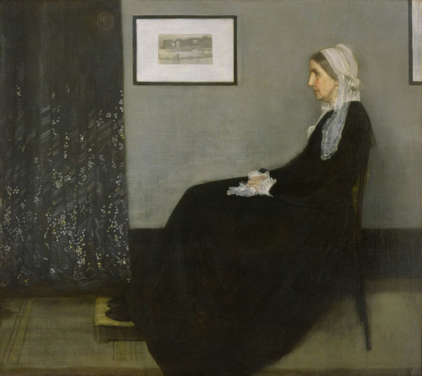
James Whistler was an an American born artist whose career spanned the second half of the 19th century, and was mostly spent in England and France. His work tended toward the realistic, and he never dabbled much in Impressionism, which became very popular in the time and place he worked most. Most of his work were portraits and lithographs.
His most famous painting, commonly known as “Whistler’s Mother”, was actually entitled “Arrangement in Gray and Black”, and was undertaken on impulse, when a model he was scheduled to paint failed to show up and he asked his mother to sit instead. The painting has a very limited color palette, and relies heavily on a balance of different shapes in the composition, and the careful blending of the limited tones and colors.
Please share your opinion of this famous artwork. Below are some links to articles about the painting and some questions to help guide your thinking. Answer any questions that interest you.
Questions to Consider
1. What is your overall opinion of the painting? The composition? The color palette? The use of shapes? Does it tell a story? Would you want it on your wall? Why or why not?
2. A totally side-facing profile pose is unusual in portraiture. Do you think it works in this portrait? Why or why not? Do you ever take pictures from a profile angle? If so, do you have one you especially like? If so, would you share it here?
3. Most portraits in Whistler’s era offered a richer, brighter color palette than this. By the title he gave the image, it is clear that he considered the color palette of importance in what he was trying to accomplish. Do you find the colors depressing and dull? Realistic? Engaging? How does the color palette influence the mood of the image? How does it influence your overall impression?
4. The portrayal of older models in fine art is often fraught with challenges whether in painting or photography, and portrayal of older women even moreso. Modern culture is youth-focused in many aspects. Older persons may find themselves more de-valued and isolated as society becomes more youth focused. What are your thoughts about art featuring senior subjects? This can be philosophical or practical.
5. As photographers, we often use monochrome as an alternative to full color portraits. Consider the advantages and disadvantages. Do you prefer to work in monochrome or color for your portraits? Have you ever worked with a reduced color palette such as this? If so, would you share an image and explain your goals for it?
Links for Study
https://en.wikipedia.org/wiki/Whistler%27s_Mother
https://www.artic.edu/exhibitions/2712/whistler-s-mother-an-american-icon-returns-to-chicago
https://www.newyorker.com/magazine/2015/08/31/moms-home
https://news.wttw.com/2017/03/29/surprising-story-behind-whistler-s-mother
https://www.theguardian.com/books/2018/may/12/whistlers-mother-daniel-sutherland-georgia-toutziari-review
https://www.theguardian.com/artanddesign/gallery/2016/mar/29/how-whistlers-mother-became-a-powerful-symbol-of-the-great-depression-in-pictures
https://www.mentalfloss.com/article/71473/14-things-you-might-not-know-about-whistlers-mother
https://blogs.getty.edu/iris/the-portrait-of-the-artists-mother-as-an-old-woman/
https://sites.harding.edu/gclayton/2DDesign/Crits/Crit008_WhistlerMother.html
Oct 1, 2020 12:06:57 #
IDguy
Loc: Idaho
Doesn’t work for me. I don’t get a story from it.
Yes, dull. The only part I like is the lace over the black.
Many photos of seniors showing the lines in their faces are interesting. Most are face on. This neither.
I dislike monotone. This would be even worse in monotone.
Whistler was an awesome painter. I visited a room in England he painted the ceiling on. The room had square corners. You could not tell.
Oct 1, 2020 20:27:22 #
IDguy wrote:
Doesn’t work for me. I don’t get a story from it.
Yes, dull. The only part I like is the lace over the black.
Many photos of seniors showing the lines in their faces are interesting. Most are face on. This neither.
I dislike monotone. This would be even worse in monotone.
Whistler was an awesome painter. I visited a room in England he painted the ceiling on. The room had square corners. You could not tell.
Yes, dull. The only part I like is the lace over the black.
Many photos of seniors showing the lines in their faces are interesting. Most are face on. This neither.
I dislike monotone. This would be even worse in monotone.
Whistler was an awesome painter. I visited a room in England he painted the ceiling on. The room had square corners. You could not tell.
Thanks for sharing your thoughts! I agree with you that the lace is very nice. My eyes go straight to that, more so than her face.
Oct 2, 2020 09:45:05 #

I've always liked this image. I did not know it's "real" title, but it makes sense. I'm drawn to her hands and the every-present handkerchief. In the actual painting there are a lot of nuances in the black of her dress that don't show up here. It's interesting to me that so much space and effort was put into the setting - the drape, the pictures on the wall, etc.
I think his use of a soft palette shows respect for the model. Bright colours would have overpowered the simplicity of the subject. The turned head has always been interesting to me, as most artists use a 3/4 view. She does have a nice profile, and being turned that way gives the appearance of being unaware of the artist. I have sometimes used that technique when photographing children at play. I didn't want them to be aware of me, and getting a fuller profile accomplishes that.
I think his use of a soft palette shows respect for the model. Bright colours would have overpowered the simplicity of the subject. The turned head has always been interesting to me, as most artists use a 3/4 view. She does have a nice profile, and being turned that way gives the appearance of being unaware of the artist. I have sometimes used that technique when photographing children at play. I didn't want them to be aware of me, and getting a fuller profile accomplishes that.
Oct 2, 2020 10:34:46 #
AzPicLady wrote:
I've always liked this image. I did not know it's... (show quote)
Thanks for sharing your thoughts. It is interesting that he got so much variance in the tones of what's basically just grays. I wondered if perhaps that was the whole point. The way he rendered detail in the fabric was also pretty impressive to me.
Oct 10, 2020 07:29:22 #

Thank you for posting another interesting subject and thought-provoking questions. As a standalone subject this painting would not be rated by most as being strong. If it appeared out of the blue in the present age it probably wouldn't get much in the way of attention or interest. However, what it does have to make it interesting is a history and the background that it came from. And that, I believe, is the light in which it should be viewed and assessed.
I suspect that what made it interesting in its day was the fact that it bucked some of the trends of the day, together with the fact that it was an exploration of a relatively new genre. Photography already existed in that era, as did sketching and printing, so black and white and monochrome weren't new concepts, but where painting was concerned it was probably a novelty for a painter to explore the possibilities of those genres. And painting as a medium would have provided extra potential for exploring subtleties of light and shadow (i.e. shades of grey) because the painter would have had full control over them and how they were portrayed.
I suspect that many will see that painting as an interesting study in technique. The subject isn't particularly strong, there isn't any obvious storytelling behind it and it's lacking many of the usual ingredients that give an image visual interest, such as vivid colour and contrast. However, those weaknesses become strengths if your main interest is to contemplate the techniques used in its creation, because those techniques can be viewed without the distractions that storytelling etc would have been. It's that same lack of distractions that allows the viewer to become more aware of the use of shape and position, and the fact that it is all done in near monochrome is in keeping with the idea of eliminating distractions.
It's widely acknowledged in this era that elimination of distractions is one of the reasons for using B&W or monochrome, but in the early days when photography wasn't so widespread or well developed, that concept was probably something of a novelty and it was probably a novelty to see a painter explore that concept. It may not be a novelty any more, but it's still interesting to see techniques and underlying principles stripped bare.
Oct 15, 2020 12:37:30 #
RichieC
Loc: Adirondacks
minniev wrote:
Thanks for sharing your thoughts. It is interesting that he got so much variance in the tones of what's basically just grays. I wondered if perhaps that was the whole point. The way he rendered detail in the fabric was also pretty impressive to me.
This painting is commonly referred to as "Whistlers Mother" but that isn;t its real name. . It was the first American piece of art ever bought by the French state, it is owned by the Musée d’Orsay, in Paris. Like the Mona Lisa- there is simply something about it, and is arguably the most famous American painting outside of the US.
The comments above remind me of a time in school. In an Art History lecture, Guernica was flashed onto the large screen, close to the size it really is, which is billboard, entire wall-sized , overwhelming.. the professor did not tell the background if it, just wanted responses. "It makes me uneasy, its horrible, i don't like it, can we go to another" .. were the comments- then she told what it was about- and we realized that we all played into the hands and expertise of a master- as these were all the reactions he wanted to evoke. Guernica was a city in Spain that supported Franko, So he invited Nazi's to attck it. They picked a particularly busy- market day, in five waves, and with support of aircraft from Italy, to test bombing patterns and incendiary's and new equipment , to maximize casualties- it had little military significance & 1/3 of the city inhabitants were killed.
SO we arrive at Whistlers master piece, and the comments i read, like- wise reveal perhaps part of what it was intended to accomplish. The real name of the panting that the artist gave it is " Arrangement in Grey and Black, No. 1" by James Abbott McNeill Whistler, 1871. His mother is a part of the composition, and not necessarily the entire focus of it.
Oct 15, 2020 12:53:56 #
RichieC wrote:
This painting is commonly referred to as "Whi... (show quote)
Always appreciate your insightful comments. I agree that the "real" name of the piece is a pretty clear indication that it isn't to be thought of simply as a portrait. The clue is given by the artist. And for me, its strongest appeal is not as a portrait but as what he called it.
Oct 15, 2020 13:06:42 #
RichieC
Loc: Adirondacks
Got interested and googled it- found this web page with interesting tidbits about it.
https://www.mentalfloss.com/article/71473/14-things-you-might-not-know-about-whistlers-mother
WHOOPS see it on your list LOL- I didn't cheat- i'm a fine arts major!
I saw where it was at the Clark in 2015, in Wiliamstown, that's right near Norman Rockwell's studio and gallery. Wish i knew this painting was there! While isn't there any more- the Clark is a fantastic private museum, one of the original Washington portraits we have all seen resides there, as well as many very impressive works, Remingtons and Degas, etc. etc. you can do it and the Rockwell museum in a (long) day, just north of the Mass turnpike nearer the border of New York and just up in Vermont- if you are ever driving by- these are both well worth the time to visit.
If you want to reply, then register here. Registration is free and your account is created instantly, so you can post right away.