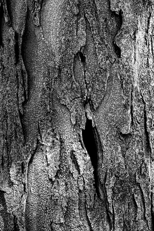
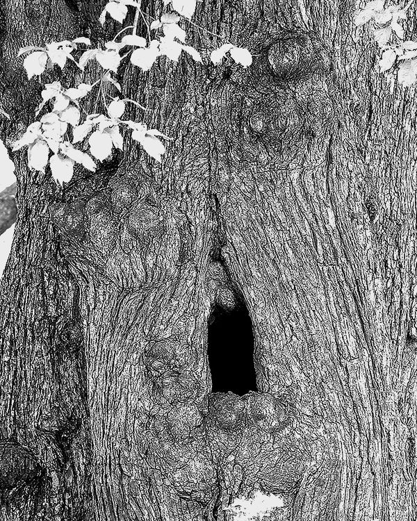
B&W -- want your opinion
Sep 3, 2020 13:54:14 #
allanj
Loc: New York City
I think I like these two, but not sure. Would appreciate your opinions, and feel free to indicate which you prefer. Thank you.
Sep 3, 2020 13:56:11 #

allanj wrote:
I think I like these two, but not sure. Would appreciate your opinions, and feel free to indicate which you prefer. Thank you.
Allan, I prefer number 2 because of the contrast of the flowers against the bark.
More natural looking
I think number one is overcooked
Sep 3, 2020 13:57:38 #
allanj wrote:
I think I like these two, but not sure. Would appreciate your opinions, and feel free to indicate which you prefer. Thank you.
#1
Sep 3, 2020 14:00:23 #
Just Ducky
Loc: Ohio/Florida
I like #2 with the flowers...and the shape of the opening is more appealing to me.
Sep 3, 2020 14:11:39 #

I am not fond of either but I like #2 best. I think the space on the side that allows you to see something besides tree bark plus the leaves gives #2 more depth and makes a better photo.
Sep 3, 2020 14:15:06 #
#2 has a more three-dimensional feel, but unfortunately a light patch appears from background at left, top. Needs to be quelled in some way. Contrast is quite high, making the leaves white and near detail-less. I wonder what less contrasty versions would look like. Not necessarily better, just different, perhaps more realistic, tho I don't think that in itself has to be a goal.
Sep 3, 2020 14:17:49 #
Jack B
Loc: Mount Pleasant, SC
Both definitely hold their own! Like #2 best due to the contrast of the leaves and hole.
Jack B
Jack B
Sep 3, 2020 14:20:15 #
Cany143
Loc: SE Utah
Prefer #2, but would've liked to see some texture or detail in the blank, white leaves.
Both give the appearance of having been over sharpened.
Both give the appearance of having been over sharpened.
Sep 3, 2020 14:45:15 #
Sep 3, 2020 15:37:05 #

If #2 is a result from a "sketch" filter, then it's very cool. If you intended it to look natural, I agree with other negative comments. I do love the featureless black hole and the leaves (with detail or not). I would clone out the white space on left of trunk in order to fill the frame with textured bark, and do something about the white in middle bottom.
The editing on the first doesn't translate to me; I don't know what your intention is but the technique is not attractive IMO. The composition is less interesting than #2.
The editing on the first doesn't translate to me; I don't know what your intention is but the technique is not attractive IMO. The composition is less interesting than #2.
Sep 4, 2020 07:46:11 #
bbrown5154
Loc: Baltimore, MD
allanj wrote:
I think I like these two, but not sure. Would appreciate your opinions, and feel free to indicate which you prefer. Thank you.
I'm not sure what your going for or what "look" you want.
For composition I like #2 the best but honestly they both have too much contrast for me and look to be over sharpened.
Focus looks off as well.
Sep 4, 2020 08:12:08 #

Sep 4, 2020 08:49:19 #
mizzee
Loc: Boston,Ma
I prefer #2. I would remove the white patch near the bottom because it’s distracting.
Sep 4, 2020 09:14:03 #

IMO, the top one has too much contrast and texture. If you look at the top right 2/3 of the image you might see a face. I would focus on that and try to show what your subject really is in the image.
The bottom one again has too much contrast in my opinion. The open section of light on the left is distracting and the bottom leaves offer nothing to the image. All the leaves are overblown in the highlights. Again, I think you can find a face in there with the leaves on the top left being more of an eyepiece. I think you can find some interesting compositions in each of them if you balance your tones and discover what story your trying to tell. Personally, I think it's in the faces in the bark if you look to see them. Just my opinion but I think you have something to work with in each image.
The bottom one again has too much contrast in my opinion. The open section of light on the left is distracting and the bottom leaves offer nothing to the image. All the leaves are overblown in the highlights. Again, I think you can find a face in there with the leaves on the top left being more of an eyepiece. I think you can find some interesting compositions in each of them if you balance your tones and discover what story your trying to tell. Personally, I think it's in the faces in the bark if you look to see them. Just my opinion but I think you have something to work with in each image.
Sep 4, 2020 09:27:07 #
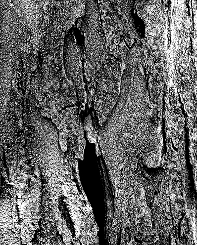
You would still have to maybe work on the tones but maybe something like this for the top one? Try to see the face and work on the dodging and burning to highlight the eyes, nose and mouth? Just a suggestion.
You already have good blacks but idk, work some around the nose and maybe even try to show the tears that you can see if you look. I think you can really do something wit that composition with some work.
If you prefer to tell me that I'm nuts that's fine too :)
Mike
You already have good blacks but idk, work some around the nose and maybe even try to show the tears that you can see if you look. I think you can really do something wit that composition with some work.
If you prefer to tell me that I'm nuts that's fine too :)
Mike
If you want to reply, then register here. Registration is free and your account is created instantly, so you can post right away.