Monthly Masters' Critique - September 2020 - Durer's "Praying Hands"
Sep 1, 2020 10:05:29 #
Introduction
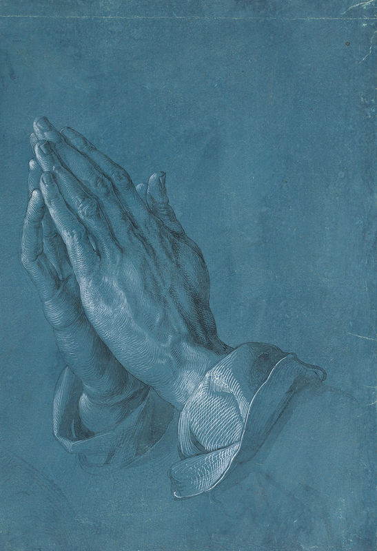
The image we will review this month is Albrecht Durer's “Praying Hands”. It is likely familiar to you in some form even if you aren't sure where it came from. It has been used for many purposes in print and sculpture. The original “Praying Hands” is a pen and ink sketch on a blue paper that was created by the artist. The artist used a technique called “white heightening” to convey depth and enhance a sense of texture. There is still controversy about the intent of the artwork: one theory maintains that it is a finished work meant to convey the hands of an apostle, another suggests it was a preliminary sketch for a section of an intended altarpiece, and a third contends that it was meant as an advertisement to showcase the intricate skill of the artist and recruit other customers. There are also competing theories about whether Durer featured his own hands in the sketch, or his brothers, or someone else’s. There are more stories about this artwork than any I’ve researched since beginning these threads; some are linked below and others can be found with a Google search.
Albrecht Durer was a German painter, printmaker and art theorist born in 1471. His watercolors mark him as one of the first European landscape artists, while his ambitious woodcuts revolutionized the potential of that medium. His prints established his reputation across Europe when he was still in his twenties, and he has been conventionally regarded as the greatest artist of the Renaissance in Northern Europe ever since. His books on the subjects of measurements and proportion in art were considered early classics in their field.
Review some of the linked material, look closely at the sketch, and try to think past any preconceptions you may have because of its familiarity. (I have to think past the bookends inherited from my husband’s grandmother, and the many church bulletins I’ve seen that featured the artwork). Then share your impression of it. The questions below may help you formulate your thinking.
Questions to Consider
1. What do you think of the artwork? Is it compelling or not? Why? Is the level of detail sufficient or not? Is it too simple? Is there a story? Why do you think the artist selected this color for the background? Would you want it displayed on your wall?
2. Why is this image so widely utilized? There are hundreds of thousands of images from the thousand years of Western religious art. Why is this one so iconic? How has it stayed relevant?
3. The human hand has always been an intriguing subject for artists and photographers, and can be used to convey a larger story. How well does this art work convey its story? Have you made photographs specifically of human hands? If so, would you share your favorite and offer any comments about your capture and the story you sought to convey?
4. Read over the competing explanations for how this art work came to be. Is one explanation more convincing to you? Why do you think there are so many competing stories? Do you think the original intent matters? Why or why not? Do you always have a specific intent for your work? Have you ever started with one intent and changed your mind later after looking at or working with the image, and used it for an entirely different purpose or story? Share any particulars if you’d like.
Links for Further Study
http://totallyhistory.com/praying-hands/
Wikipedia: Durer - Praying Hands
http://www.albrechtdurer.org/praying-hands/
https://www.youtube.com/watch?v=VGbZhcAMZ14
https://hekint.org/2017/01/25/the-model-for-albrecht-durers-praying-hands/
https://www.theartstory.org/artist/durer-albrecht/artworks/
https://www.artic.edu/artists/40561/albrecht-durer
https://www.theartnewspaper.com/news/duerer-puts-his-hands-to-some-early-advertising
Sep 2, 2020 11:26:06 #
I think that making a few simple comments about this drawing is sufficient and appropriate because the artwork as a whole is simple. And that, I would say, is one of its strengths. The subject is easily identifiable and the story is obvious, which makes the artwork as a whole very accessible. It's also true that the subject of prayer is timeless, and that, together with the artwork's accessibility, explains the persistence of its popularity.
I don't have an in-depth understanding of the psychology of colour, but it seems to me that blue/green is a colour that suggests deep contemplation, which to my mind makes it an appropriate choice.
While the artwork as a whole is simple, the subject itself (the hands) is somewhat more complex. As a symbol, hands have all sorts of connections and are evocative in all sorts of ways. So much in life is achieved with our hands, so much is expressed through our hands and so much of our world is contacted through our hands, it would be hard to think of a more multi-layered symbol to use. The fact that the whole artwork consists of just the hands (and a glimpse of sleeve) doesn't stop it from being loaded with meaning and sentiment. In fact focusing uniquely on the hands draws our attention to the wealth of meaning that they convey, which is another reason why the artwork's simplicity is one of its strengths.
I see no reason to doubt that a partial sketch made for a larger work could take on a life of its own and become a work in its own right. The artist rightfully recognised that the message and sentiment conveyed by the hands was the very essence of the meaning of the larger work, and as such it deserved its own canvas.
Sep 2, 2020 22:14:20 #
R.G. wrote:
I think that making a few simple comments about th... (show quote)
Thanks for your insightful comments. Perhaps that is true for any image we choose to capture and present up close and in isolation? The details become more meaningful as we remove other elements of composition. I wonder if the intended altarpiece would have become so iconic or if the hands would have lost some power as a single element in a larger and probably much busier art work.
Sep 3, 2020 00:56:32 #
minniev wrote:
......Perhaps that is true for any image we choose to capture and present up close and in isolation?.......
I almost agree completely with you. We can focus on particular elements to make them more meaningful, but sometimes (especially in photography) we focus on specific features just for the sake of interest, and sometimes that interest is visual rather than intellectual or sentimental. It would be easy to think that we can enhance storytelling just by zooming in on specific details, but storytelling usually requires some careful consideration when it comes to the choice of what to focus on and why. That sort of choice can determine the success (or otherwise) of a work of art. But regarding the point you made, I agree with your suggestion that a busier image would be less effective.
Sep 3, 2020 16:57:09 #
Wonderful topic, Min!
Many artists in many media will acknowledge the necessity of rendering hands and manual gestures well- as well as the damnable challenge that necessity presents to do it well. “Hands are a bitch to do” is a common sentiment among illustrative artists.
I First became aware that hands were important communicative tools by watching Miss Bushly, my fourth grade teacher; her hands seemed as explicitly and articulately as important as were her voiced words and her facial expressions. Another early example of articulate gestural communication was Mr Reid, our chorus die for in junior Highschool. His hands spoke volumes! And I often recognized over the years that the most effective users of the classroom for facilitating learning were, probably not simply coincidentally, articulate users of gestural communication.
Indeed,IMO in some cultures, manual gestures are at least as important in communication, if not more important than facial expression.
Hands are fascinating and a number of books on the role of gestures in verbal augmentation and communication have been written. I have a book that goes into wonderful detail on the use of the incredible range and variety of manual and manual/postural gestures used by many cultures ( can’t find it right now or I’d give you the specific reference. If I have to lent it to my son I’ll find it and tell you later.)
And, of course, the use of the touch-of-hand in much silent and intimate communication is truly awesome in its potential virtuosity.
IMO Durer’s “Hands in Prayer” are second only to Michaelangelo’s rendering of the hands of God and Adam.
I am, indeed, looking forward to progression of this thread
To start on your questions:
“ 1.
A.” What do you think of the artwork?” It’s a classic; one of a kind universally recognized in the western world as the essential symbol of prayer..and thus incomparable.
B. “Is it compelling or not? Why?” Clearly, it is compelling to the community of believers, by its unifying symbolism.
C. “Is the level of detail sufficient or not? Is it too simple?” Compared to what? A photograph? No, but photographic realism wasn’t and isn’t expected.
I had not before reading one of your linked articles understood that it was but a sketch of a detail fo another work. I always thought it a finished piece, explaining AD’s care with detail rendered. Sketch cartoons by many great artists rarely if ever reveal such detail.
D.” Is there a story?” Effective symbolism requires no story. Unless perhaps it might be the themes of the Old and New Testament, the Sanskrit bases of Hinduism, the Khoranic Sutras, and the interpreted philosophies of Theravada and Mahayana Bhuddism.
E.”Why do you think the artist selected this color for the background?” My guess is based on the common supposition that the most restful color is somewhere among the blues and greens...no idea if a. That’s true, nor b. If that’s actually why he chose it.
F.”Would you want it displayed on your wall?“
If I owned the original, it would be in a vault or a museum. A print? No.
An additional response to the question re: Dürer’s choice of colored background is acknowledgement that choice of a toned, colored ground on which to sketch, paint, of otherwise render an image provides a “tonal base” against which highlight and shadow detail can be expressed - technically as they would be within any work on a White ground - but with a very different visual effect of the final image as a whole. Highlight and shadow detail take on different effectual impact depending upon the value (“depth” of the ground beneath and around the subject.
Such “toned ground” art was being adopted by many artists from Dürer’s time and those early ventures into the non-traditional colored/toned ground has influenced graphic artists to the present time (including yours truly).
While I said that I had no answer as to specifically why Dürer chose that particular blue-gray ground I should also have pointed out specifically why an artist would choose a toned ground as his choice for a finely detailed image involving subtle to strong shadow and highlight detail.
Other examples of use of toned ground by Dürer:
“Kneeling donor”, “Head of an Apostle”, “Study of Two Feet”, “An Elderly Man of Ninety-three Years”, “Head of an Angel”, “Hanns Dürer, Brother of Albrecht Dürer“.
Yeah; I’m a long time fan of Dürer!
Dave
Sep 3, 2020 18:20:41 #
In order to see what I wrote, you'll need to show the quote because they are embedded in the quotation.
I think perhaps starting a new rumor was a good marketing ploy for someone who wanted to sell their version. (Sorry, I'm a cynic.). I don't pay a lot of attention to stories like this because we cannot go back in time, talk to the actual person and find out the truth. So it's all conjecture that's part of the drama surrounding the piece. And drama is done for marketing.
minniev wrote:
br br br 1. What do you think of the artwork? I... (show quote)
I think perhaps starting a new rumor was a good marketing ploy for someone who wanted to sell their version. (Sorry, I'm a cynic.). I don't pay a lot of attention to stories like this because we cannot go back in time, talk to the actual person and find out the truth. So it's all conjecture that's part of the drama surrounding the piece. And drama is done for marketing.
Sep 4, 2020 14:06:16 #
Uuglypher wrote:
Wonderful topic, Min! br br Many artists in many ... (show quote)
Thanks for this thorough review, Dave. I especially appreciated your comment about effective symbolism requiring no story. That may explain the widespread popularity of the piece and the astounding array of different kinds of art media used to reproduce it.
Sep 4, 2020 14:11:23 #
AzPicLady wrote:
In order to see what I wrote, you'll need to show the quote because they are embedded in the quotation.
I think perhaps starting a new rumor was a good marketing ploy for someone who wanted to sell their version. (Sorry, I'm a cynic.). I don't pay a lot of attention to stories like this because we cannot go back in time, talk to the actual person and find out the truth. So it's all conjecture that's part of the drama surrounding the piece. And drama is done for marketing.
I think perhaps starting a new rumor was a good marketing ploy for someone who wanted to sell their version. (Sorry, I'm a cynic.). I don't pay a lot of attention to stories like this because we cannot go back in time, talk to the actual person and find out the truth. So it's all conjecture that's part of the drama surrounding the piece. And drama is done for marketing.
Thanks for taking the time to consider the questions and share your thoughts. I agree with your statement about hands being “hard”. I’ve seen plenty of art in museums that illustrated your premise, and I think they are hand in photography too. For one thing, they are seldom still, and for another, they have so much detail and dimension that is hard to capture just right. I have few if any successful photos of hands. I am gonna look for one when I get home from the country house, since I said I would!
Sep 4, 2020 15:21:49 #
This image appeals to me very much, mainly because of its beautiful simplicity.
I do have some pictures of hands, however they are always holding something.
I do have some pictures of hands, however they are always holding something.
Sep 4, 2020 23:12:27 #
RichardTaylor wrote:
This image appeals to me very much, mainly because of its beautiful simplicity.
I do have some pictures of hands, however they are always holding something.
I do have some pictures of hands, however they are always holding something.
Well, hands are usually doing something! In the image we're critiquing, they are doing something. So post away if you have one you like.
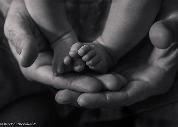
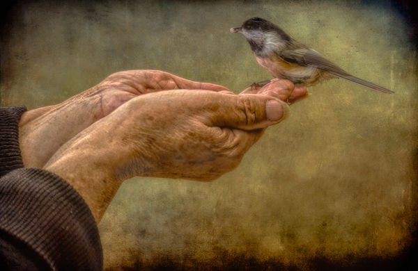
Here's two of mine. The first is my son with his youngest son, a little trite because it's done a lot but I liked it because it's them! The second is a bird whisperer I met in Ontario. She was standing in front of my vehicle so the background was awful, but I loved her hands so I tried an artistic type rendering to free her and the bird of a dreadful background.
Sep 4, 2020 23:16:55 #
Sep 4, 2020 23:19:20 #
From the archives.
.
.
Sep 5, 2020 13:05:03 #
minniev wrote:
Well, hands are usually doing something! In the im... (show quote)
Hi, Min;
You asked earlier whether I would hang and display AD’s “Praying Hands” on my wall and I said “No”.
Personally, I would far rather hang either or both of these images of yours on my wall than I would Dürer’s “praying hands” - which portrays our species impulse to passive, fawning supplication - rather than to its proactive, loving, supportive nature and impulses.
Realize,please, that the above is just the personal perspective of this evangelical secular humanist Unitarian Universalist (UU) with a strong philosophic leaning toward the views of Baruch Spinoza!
Stay well and safe on this Labor Day weekend!
Dave
Sep 5, 2020 14:40:56 #
RichardTaylor wrote:
Beautiful set.
Thanks. I enjoyed yours too! And thanks for sharing.
If you want to reply, then register here. Registration is free and your account is created instantly, so you can post right away.

