New York Long Arms in Monochrome
May 13, 2020 00:02:49 #
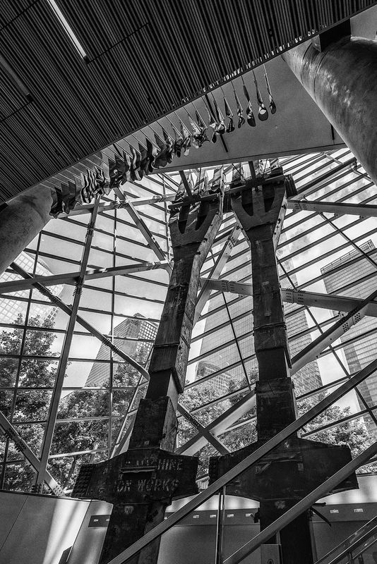
I'm under house arrest in a 4 star resort with no room service and have a lot of time on my hands. I was going back through my photo library trying to find something that I overlooked before and I came across this image from 2018. It was taken on an escalator coming up from the basement of the World Trade Center Museum in New York. I believe the two arms are columns from one of the towers. This place is a must see when in New York but be prepared to be moved to tears.
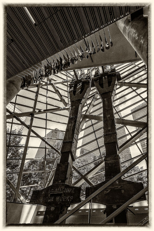
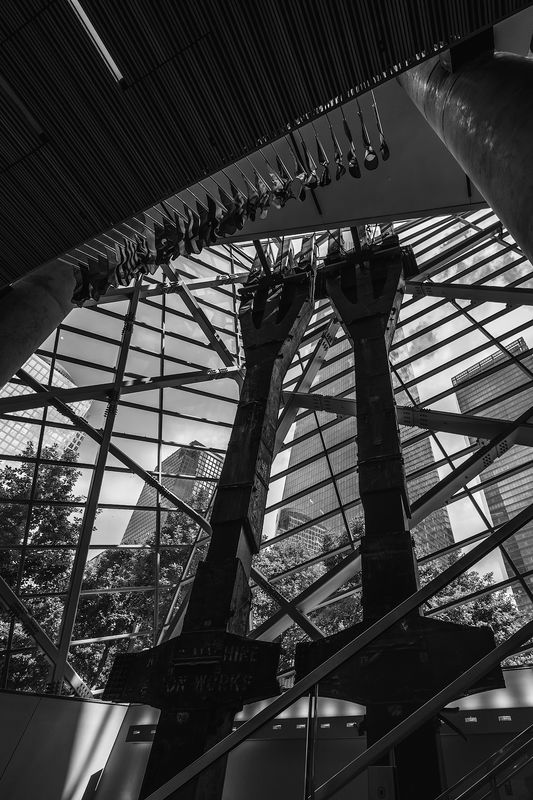
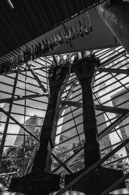
I stared at the original image for an hour trying to figure out the best composition and interpretation of the scene. I couldn't quite find a single presentation that I liked best so I prepared 4 different versions with the last being a slightly different crop. My vision is that this is an abstract with multiple elements of converging and diverging lines with different light values. What is your favorite and why?
I stared at the original image for an hour trying to figure out the best composition and interpretation of the scene. I couldn't quite find a single presentation that I liked best so I prepared 4 different versions with the last being a slightly different crop. My vision is that this is an abstract with multiple elements of converging and diverging lines with different light values. What is your favorite and why?
New York Long Arms 1
(Download)
New York Long Arms 2
(Download)
New York Long Arms 3
(Download)
New York Long Arms 4
(Download)
May 13, 2020 01:38:06 #

I like this photo. There are so many details and textures that I find appealing.
My preference is for #1. This photo makes the arms the focus of the photo. I prefer seeing the textures in the roof, posts and the metal of the arms. I like that I can read the words on the cross pieces and that there are details in the flags.
#2. I don't feel sepia is right for this photo
#3 The focus is shifted outside to the buildings and a lot of details are lost
#4. If I were going to crop this I would crop the top to just above the junction of the roof and the post on the right side and then clone out the piece of the light fixture/opening in the roof that is left so that it isn't a distraction. By cropping the bottom the arms look stubby. I would take very little off the left side and none off the right. By cropping so much off the left the flags are now leading the eye out of the frame.
JUST MY OPINIONS.
Dodie
May 13, 2020 01:48:31 #
luvmypets wrote:
My preference is for #1. This photo makes the arm... (show quote)
Just the kind of comments I was looking for. There is lots going on in the image and finding just the right composition was escaping me. I don't know that I agree with all of your thoughts but some of them could lead to a better picture. Thanks for viewing.
May 13, 2020 08:00:04 #

If you want to reply, then register here. Registration is free and your account is created instantly, so you can post right away.