Vintage colored postcard experiment
May 6, 2020 01:39:20 #
mwsilvers
Loc: Central New Jersey
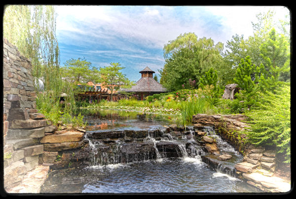
I need help on this one. I'm not sure I captured the effect I was attempting. I was trying to create the look of an old textured color travel postcard from the 1930's-40's, slightly worn and faded with imperfections and rounded corners. I recall seeing something similar many years ago, but I don't think I quite got it. The original image was captured at Grounds for Sculpture in New Jersey.
Original raw in dropbox if you'd like to edit:
https://www.dropbox.com/s/crthyk3onqka0fw/LP0A2961.CR2?dl=0
.
Original raw in dropbox if you'd like to edit:
https://www.dropbox.com/s/crthyk3onqka0fw/LP0A2961.CR2?dl=0
.
May 6, 2020 10:59:41 #
kenievans
Loc: Dallas
I think you are headed in the right direction. I looked up some examples of travel post cards from that time period. They tend to be a little grainy with a little more saturated in color or leaning towards a more graphic (hand drawn and colored) look. I think you have the right amount of grain in the image. You might try uping the saturation and vibrance a little. Great idea. Thanks for sharing.
May 6, 2020 11:43:38 #
mwsilvers
Loc: Central New Jersey
kenievans wrote:
I think you are headed in the right direction. I looked up some examples of travel post cards from that time period. They tend to be a little grainy with a little more saturated in color or leaning towards a more graphic (hand drawn and colored) look. I think you have the right amount of grain in the image. You might try uping the saturation and vibrance a little. Great idea. Thanks for sharing.
Thanks very much. Your thoughts are along the same direction as mine. I actually added some saturation and a lot of vibrance to this one and was going for a bit of a hand colored look. My software has around 50 different colored film emulations and the ability to add grain to them in varying sizes and amounts, as well as variable paper texture. I only tried a half dozen or so different films. Maybe I need to experiment with a wider number of film types to get the overall color right. Linda kindly inserted a Dropbox link to my original post a few minutes ago in case anyone wants to play with my original Canon raw file.
May 6, 2020 11:56:37 #
kenievans
Loc: Dallas
mwsilvers wrote:
Thanks very much. Your thoughts are along the same... (show quote)
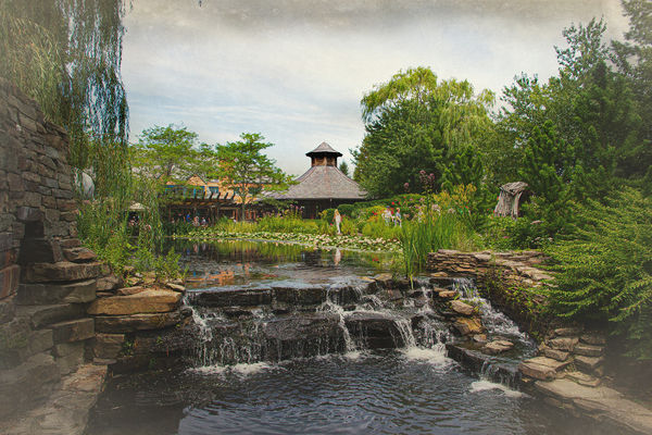
Here is my version. I added a lot of grain but not to the sky then I added an aging texture layer. I left the people in the image. Thanks for letting me play.
Edit: I think mine is too dark.
May 6, 2020 12:20:01 #
mwsilvers
Loc: Central New Jersey
kenievans wrote:
Here is my version. I added a lot of grain but not to the sky then I added an aging texture layer. I left the people in the image. Thanks for letting me play.
Edit: I think mine is too dark.
Edit: I think mine is too dark.
I like what you did but I agree that it's too dark. I think a travel postcard needs to be brighter, more colorful and inviting. Your version is a bit somber for that purpose. By the way the overall softness of my version is due to a small amount of blur I added to the whole image, in part to give it more of a hand colored feel. I also darkened the edges of some of the trees against the sky to try to add the appearance of a hand colored bleed.
May 6, 2020 12:27:25 #

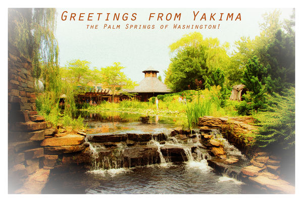
Mark, which software are you using? Nik Collection has not only the "analog efex" module, but all those pre-sets in Color Efex, including what you're speaking about re film types. It can be so hard to make a decision 
I'm going to try my hand with your pic, and appreciate yours and Keni's conversations about what is working and not. Excellent thread!
I'm going to try my hand with your pic, and appreciate yours and Keni's conversations about what is working and not. Excellent thread!
May 6, 2020 12:38:18 #
mwsilvers
Loc: Central New Jersey
Linda From Maine wrote:
Mark, which software are you using? Nik Collection has not only the "analog efex" module, but all those pre-sets in Color Efex, including what you're speaking about re film types. It can be so hard to make a decision
I'm going to try my hand with your pic, and appreciate yours and Keni's conversations about what is working and not. Excellent thread!
I'm going to try my hand with your pic, and appreciate yours and Keni's conversations about what is working and not. Excellent thread!
I own all the DXO software including their version of the Nik Collection, but I did not use Nik for this one. The film emulation, vignetting, grain, texture, blurring and frame were all added using DXO's FilmPack 5 integrated plug-in in PhotoLab. In retrospect, perhaps using Nik's Color Efex Pro or Analog Efex Pro would have been a better choice. I look forward to seeing what you come up with.
May 6, 2020 13:58:14 #
This was fun!! You guys did the hard work with your descriptions:
Slightly worn, grainy, saturated, hand-colored/drawn, rounded edges.
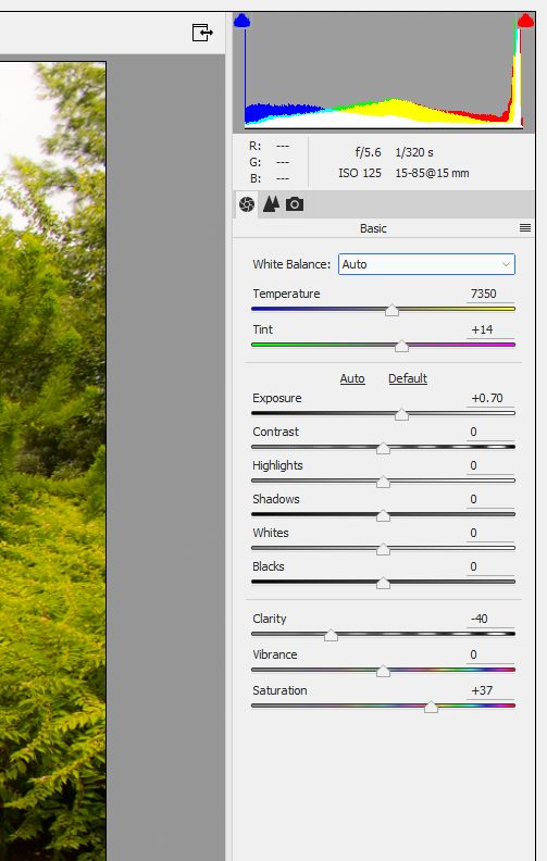
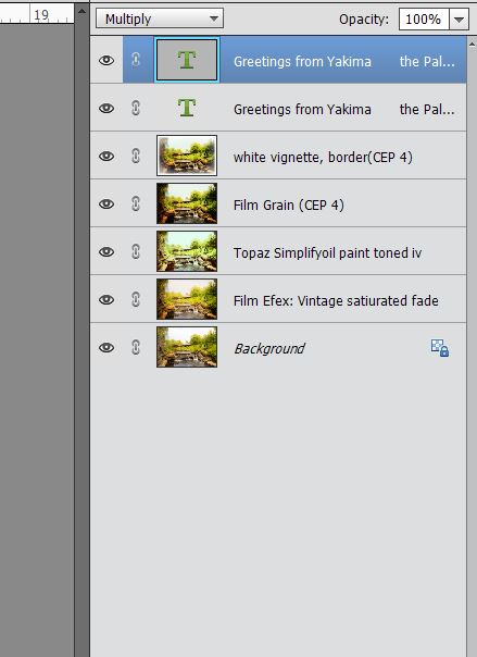
I couldn't come up with the rounded edges; I'm sure there must be a simple way! Below my pic are the screenprints of how I did.
I was going to load the psd to Dropbox but it's almost 400 mb
Slightly worn, grainy, saturated, hand-colored/drawn, rounded edges.
I couldn't come up with the rounded edges; I'm sure there must be a simple way! Below my pic are the screenprints of how I did.
I was going to load the psd to Dropbox but it's almost 400 mb
(Download)
PSE's version of ACR. Note negative clarity.
(Download)
Mostly Nik Color Efex + a 3/4 dose of Topaz Simplify oil painting Toned IV.
May 6, 2020 14:15:55 #
kenievans
Loc: Dallas
Linda From Maine wrote:
This was fun!! You guys did the hard work with your descriptions:
Slightly worn, grainy, saturated, hand-colored/drawn, rounded edges.
I couldn't come up with the rounded edges; I'm sure there must be a simple way! Below my pic are the screenprints of how I did.
I was going to load the psd to Dropbox but it's almost 400 mb
Slightly worn, grainy, saturated, hand-colored/drawn, rounded edges.
I couldn't come up with the rounded edges; I'm sure there must be a simple way! Below my pic are the screenprints of how I did.
I was going to load the psd to Dropbox but it's almost 400 mb
Nice job Linda! I like the negative clarity.
May 6, 2020 14:48:55 #
kenievans wrote:
🤗Nice job Linda! I like the negative clarity.
May 6, 2020 15:00:08 #
mwsilvers wrote:
Thanks very much. Your thoughts are along the same direction as mine. I actually added some saturation and a lot of vibrance to this one and was going for a bit of a hand colored look..
I thought you did a good job, perhaps a bit more noise, and less saturation. My memory of old post cards is a little washed out colors, almost like water colors. I DAGS for images of old ones and saw nothing to change my impressions.
May 6, 2020 15:46:50 #
mwsilvers
Loc: Central New Jersey
Linda From Maine wrote:
This was fun!! You guys did the hard work with your descriptions:
Slightly worn, grainy, saturated, hand-colored/drawn, rounded edges.
I couldn't come up with the rounded edges; I'm sure there must be a simple way! Below my pic are the screenprints of how I did.
I was going to load the psd to Dropbox but it's almost 400 mb
Slightly worn, grainy, saturated, hand-colored/drawn, rounded edges.
I couldn't come up with the rounded edges; I'm sure there must be a simple way! Below my pic are the screenprints of how I did.
I was going to load the psd to Dropbox but it's almost 400 mb
Very, very nice. I like it. It's given me a few ideas. Thanks
May 6, 2020 15:50:35 #
mwsilvers
Loc: Central New Jersey
BigDaddy wrote:
I thought you did a good job, perhaps a bit more noise, and less saturation. My memory of old post cards is a little washed out colors, almost like water colors. I DAGS for images of old ones and saw nothing to change my impressions.
Thanks for the feedback. I agree about the watercolors feel. I think that was the direction I was working towards, although I didn't want to overdo it.
May 6, 2020 16:02:32 #
mwsilvers wrote:
If you do another, please post; I'm interested to see where this finally ends up Very, very nice. I like it. It's given me a few ideas. Thanks

May 6, 2020 19:58:26 #
mwsilvers
Loc: Central New Jersey
Linda From Maine wrote:
If you do another, please post; I'm interested to see where this finally ends up
I will. I plan on using a different antique film type and softening and fading the colors a bit more with the addition of more vibrance and saturation. I appreciated the text that you added to your version. That was really clever. Right now though I'm just interested in recreating the look and feel of the image that I remember from years ago.
If you want to reply, then register here. Registration is free and your account is created instantly, so you can post right away.