A matter of Choice - and your choice is ............()?
Apr 23, 2020 10:51:38 #

Apr 23, 2020 10:54:43 #

Apr 23, 2020 10:57:50 #

Apr 23, 2020 10:58:43 #

Apr 23, 2020 11:02:12 #
Apr 23, 2020 11:15:16 #

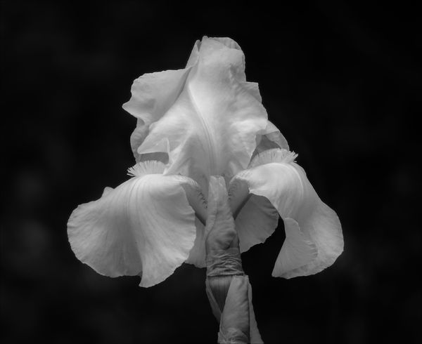
My preference is the first one. The colors are somewhat subdued. Therefore, not a very important part of the photograph. The black and white emphasizes the textures which play a more important role in the presentation than those subdued colors.
--Bob
--Bob
Bob Yankle wrote:
Yes?
Apr 23, 2020 11:19:03 #
Apr 23, 2020 11:23:01 #

Apr 23, 2020 11:31:13 #
Apr 23, 2020 11:52:14 #
Jack B
Loc: Mount Pleasant, SC
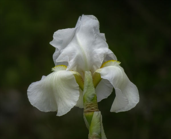
My choice would totally depend on the mood I happen to be in. Just completed a project so the color is the choice at this time. Both are very nice. Thanks for sharing.
Jack B
Jack B
Apr 23, 2020 11:53:30 #
Apr 23, 2020 11:55:38 #
Angel Star Photography
Loc: Tacoma, WA
Bob Yankle wrote:
Yes?
I vote for #2. Color does more justice to the flower. The black-and-white just looks lifeless to me.
Apr 23, 2020 11:58:33 #
Apr 23, 2020 12:08:22 #

Apr 23, 2020 12:18:24 #

I have to agree with most everyone else.
This Iris does not have enough different tones to make it pop in B&W.
The color version does bring out the textures and detail much better.
Will
This Iris does not have enough different tones to make it pop in B&W.
The color version does bring out the textures and detail much better.
Will
If you want to reply, then register here. Registration is free and your account is created instantly, so you can post right away.