The Plague of Expired Fruit in B&W
Apr 18, 2020 01:58:28 #
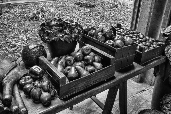
I'm going back to the B&W theme of my recent postings. This image is actually an artwork in a courtyard at the Basel Minster church in Basel, Switzerland. The fruits and vegetables are actually an anodized metal and have virtually no color. Conversion to a B&W gave them a very sinister appearance which I did not appreciate in my original editing.
Apr 18, 2020 03:52:36 #
Color is much nicer. With color you can easily tell what you are looking at, and it's far more real.
Apr 18, 2020 07:35:13 #
domcomm
Loc: Denver, CO
I think of it the other way. Although it varies with the subject matter, I often like B&W because you're looking at the subject, not just the colors.
Apr 18, 2020 07:48:47 #
this wasn't 'real' b&w, right? this is a digital slr that was told to make a b&w- oid image … I really miss Tri-X
Apr 18, 2020 13:43:58 #
domcomm wrote:
I think of it the other way. Although it varies with the subject matter, I often like B&W because you're looking at the subject, not just the colors.
See my response to the previous comment with the original photo. You are spot on.
Apr 18, 2020 13:45:35 #
MSW wrote:
this wasn't 'real' b&w, right? this is a digital slr that was told to make a b&w- oid image … I really miss Tri-X
Please revisit this post and see the response I gave regarding the color of the original image. Would you say I improved on the photo by B&W processing? To me, the original in color was worthless.
If you want to reply, then register here. Registration is free and your account is created instantly, so you can post right away.