Toning B&W images
Mar 23, 2020 11:40:22 #

I should say first of that I dislike sepia, here is a comparison of some of the tones that I use. Platinum is the one I use most often, it makes for much richer blacks and a slightly warmer image. I also favour the Silver Efex paper toner which is warmer.
I hope the differences show on the various monitors.
I hope the differences show on the various monitors.
Straight BW in PhotoShop
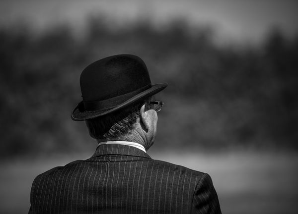
(Download)
Platinum - My homebrew
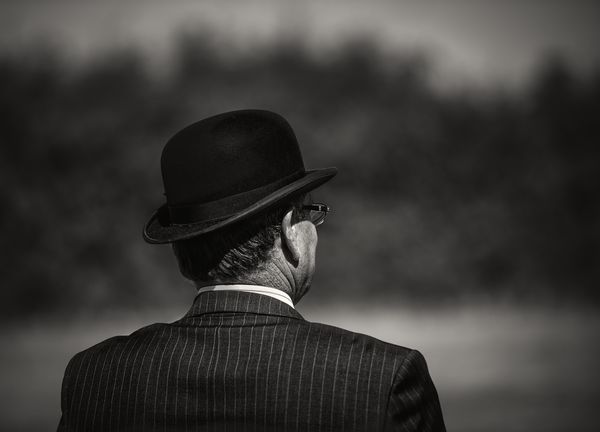
(Download)
S Efex Paper Toner #6 @60%
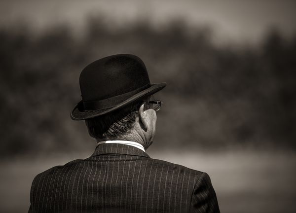
(Download)
Sepia
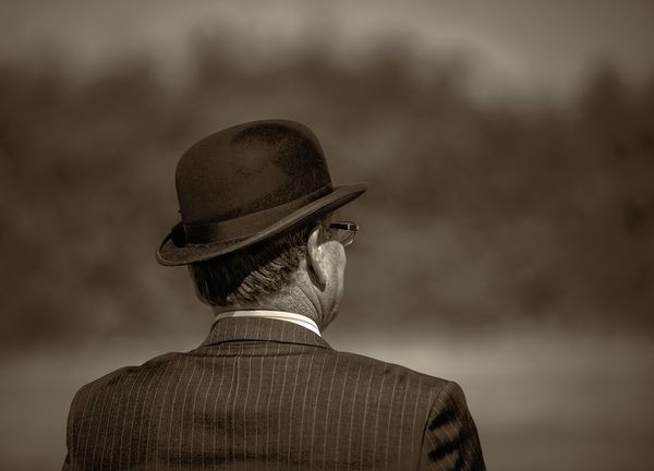
(Download)
Mar 23, 2020 11:42:32 #

Excellent demo, Graham! What does the home brew consist of, please? (Corona beer jokes notwithstanding  )
)
)Mar 23, 2020 12:01:29 #
Graham Smith wrote:
I should say first of that I dislike sepia, here is a comparison of some of the tones that I use. Platinum is the one I use most often, it makes for much richer blacks and a slightly warmer image. I also favour the Silver Efex paper toner which is warmer.
I hope the differences show on the various monitors.
I hope the differences show on the various monitors.
That is a great comparison. The difference did show on my monitor. Subtle, but significant. Thanks for the ideas. I think it is time to expand my repertoire.
Erich
Mar 23, 2020 12:02:23 #

I haven't done much experimenting with B&W toning but I have tried using split toning on B&W which (in my very unprofessional opinion) works well. Have you tried anything like that? (I'm referring to very subtle levels of tint - subtler than you would use for monochrome tints).
It seems to me that no matter how carefully you choose a monochrome tone it will always be flatter than what split toning can achieve, plus split toning can add a bit of colour contrast on top of the B&W contrast without the unwanted effects of pushing the B&W contrast (i.e. the luminosity contrast). Plus you can choose warm, cool or you can balance warm and cool.
It seems to me that no matter how carefully you choose a monochrome tone it will always be flatter than what split toning can achieve, plus split toning can add a bit of colour contrast on top of the B&W contrast without the unwanted effects of pushing the B&W contrast (i.e. the luminosity contrast). Plus you can choose warm, cool or you can balance warm and cool.
Mar 23, 2020 18:12:21 #
R.G. wrote:
I haven't done much experimenting with B&W ton... (show quote)
Yes, split toning is a good way to go. I use it; but I should use it more.
erich
Mar 24, 2020 07:23:22 #
R.G. wrote:
I haven't done much experimenting with B&W ton... (show quote)
I have to admit, R.G. that I completely forgot to include split toning as my intention was to show that there are alternatives to the overused and abused sepia tint.
You are quite right about toning giving a more flat look to the image, sometimes this isn't a bad thing as the trend is to think that B&W must have a great deal of contrast, whereas, I think that a larger range of tones with good separation between them gives a more pleasing image. Of course a contrasty image is more suited to some pictures.
Split toning is very easy and infinitely variable in Silver Efex Pro
Mar 24, 2020 07:23:42 #
ebrunner wrote:
Yes, split toning is a good way to go. I use it; but I should use it more.
erich
erich

Mar 24, 2020 07:27:44 #
Linda From Maine wrote:
Excellent demo, Graham! What does the home brew consist of, please? (Corona beer jokes notwithstanding )
)It was done with a PS action I concocted several years back and typically, I didn't note down the method

Mar 24, 2020 08:20:31 #

Im all ears when you talk about black and white processing. I downloaded the first two, and went about turning the first one into the second one. A slight increase in contrast with curves, then a warming filter corrected in channels. A small shift of the histogram to the right followed by a slight clipping of the lights produced identical histograms, and images that I could not tell apart. Doing this is the only way I can understand. There is no question that the home brew results in an image with a lot more impact. A very interesting exercise for me Graham. Thanks for posting this.
Mar 24, 2020 08:43:15 #
fergmark wrote:
Im all ears when you talk about black and white pr... (show quote)
Thanks Mark, I should also mention that ACR is a very good option for split toning.
EDIT: And don't to forget LightRoom.
Mar 24, 2020 08:44:01 #
ebrunner wrote:
That is a great comparison. The difference did show on my monitor. Subtle, but significant. Thanks for the ideas. I think it is time to expand my repertoire.
Erich
Erich
Thanks, Erich.
Mar 24, 2020 10:51:41 #

Mar 24, 2020 12:05:13 #

I've never liked sepia toning either. I did see one on this site that had such a light touch with it that it was OK. These are really nice, Graham, and really show the differences.
Mar 24, 2020 14:56:20 #

I like your platinum effect best Graham, it seems to add depth. I’m also a fan of split toning and by the sound of it you’re well aware of it’s possibilities. Interesting post.
If you want to reply, then register here. Registration is free and your account is created instantly, so you can post right away.