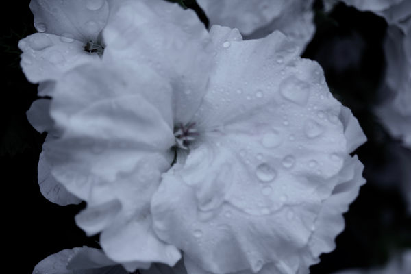
First attempt at using layers...
Apr 4, 2019 11:55:24 #

Thanks to a lot of encouragement and advice from Linda, I decided to
see if I could start to get the hang of using layers to clean up images,
or better yet, make them more visually appealing.
Using Photoshop Elements 2019, I added an "overlay" layer to the original
image so I could mask out a lot of the secondary blooms and drive attention
to the "main" bloom. In addition, I tried to highlight the edges of each petal,
especially where they overlapped another petal.
After doing that, I tried "sharpening" the image as well.
I found out a bunch in the process....first and foremost, I don't have a very
steady hand, so on my iMac, command z is my friend.
Your thoughts, suggestions and certainly critique are absolutely welcome, and
if you can make this image really pop, please feel free.
Tim
Apr 4, 2019 12:06:02 #

The world is your oyster now, Tim! Kudos for tackling an aspect of pp that has brought many of us to tears 
I love the starkness and drama of the b&w and am looking forward to many more postings as you continue on your journey.
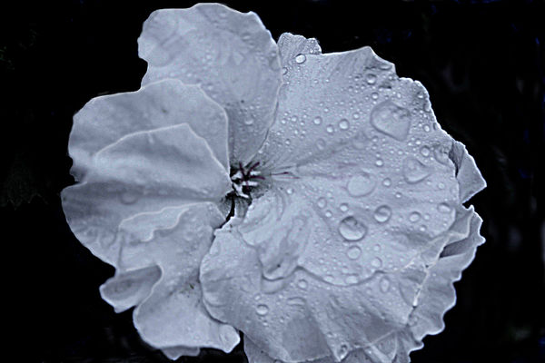
(a side observation on you original: a couple of the petals on the left behind the main flower, and one of the water drops in particular, appear to be well focused while the rest is out of focus. I wonder if you were too close for the lens's minimum focusing distance to catch your main blossom?)
I love the starkness and drama of the b&w and am looking forward to many more postings as you continue on your journey.
(a side observation on you original: a couple of the petals on the left behind the main flower, and one of the water drops in particular, appear to be well focused while the rest is out of focus. I wonder if you were too close for the lens's minimum focusing distance to catch your main blossom?)
Apr 4, 2019 12:21:57 #

Good start, Tim. Layers are very powerful. Almost every one of my processed photographs have at least 11 layers.
--Bob
--Bob
Apr 4, 2019 14:02:08 #
Apr 4, 2019 16:21:46 #

Good touches! If you want more pop, go to "Brightness Contrast" and move some sliders. Since you already know about layers, You might want to use them to adjust some areas.
Apr 4, 2019 17:13:11 #

The white line along the edge of some of the petals is an indication of over sharpening. You can't get an out of focus image in focus by sharpening, so if you can get the original in better focus, you won't need to do as much sharpening.
Apr 4, 2019 20:55:21 #
Linda From Maine wrote:
The world is your oyster now, Tim! Kudos for tackl... (show quote)
Thank you again, Linda for your help and for taking the time to view and critique.
You are absolutely correct in that I was too close for the lens's minimum focusing distance,
thus the need to "sharpen," which I've never done before....
Apr 4, 2019 20:56:37 #
rmalarz wrote:
Good start, Tim. Layers are very powerful. Almost every one of my processed photographs have at least 11 layers.
--Bob
--Bob
Holy cow, Bob...I had trouble with three layers while I was "playing."
I'm sure I'd have one heck of a hard time keeping track of them, which
would make it imperative to name them.
Apr 4, 2019 20:57:17 #
kenievans wrote:
Excellent job Tim. Much better than my first attempt!
Thanks so much, Kenie!
Tim
Apr 4, 2019 20:57:53 #
artBob wrote:
Good touches! If you want more pop, go to "Brightness Contrast" and move some sliders. Since you already know about layers, You might want to use them to adjust some areas.
Thank you, Bob, I'll do that when we get back from NYC next week!
Tim
Apr 4, 2019 20:59:25 #
JohnSwanda wrote:
The white line along the edge of some of the petals is an indication of over sharpening. You can't get an out of focus image in focus by sharpening, so if you can get the original in better focus, you won't need to do as much sharpening.
I understand what you are saying, John, and agree it's always better to get it focused correctly in the camera.
As far as the white line along the edge of some of the pedals, I added most of those so one can see the individual pedals better.
Apr 4, 2019 21:02:40 #
Even if you are only using 3, it's best to name them when you create them. It's a good habit to develop. One retouching job I did had in excess of 32 layers. Without naming them meaningful names, I'd have never been able to keep track.
--Bob
--Bob
Rolk wrote:
Holy cow, Bob...I had trouble with three layers while I was "playing."
I'm sure I'd have one heck of a hard time keeping track of them, which
would make it imperative to name them.
I'm sure I'd have one heck of a hard time keeping track of them, which
would make it imperative to name them.
Apr 4, 2019 21:09:01 #
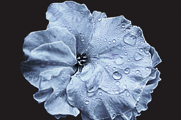
Tim, I went back to see your original post after reading some comments, and noticed you gave an okay to process your image. Here is my adjustment of value range, plus a touch of warm color for the background and a slight desaturation and hue adjustment of the cyan in the flower--to give the shot more "pop."
Apr 4, 2019 21:18:48 #
artBob wrote:
Tim, I went back to see your original post after reading some comments, and noticed you gave an okay to process your image. Here is my adjustment of value range, plus a touch of warm color for the background and a slight desaturation and hue adjustment of the cyan in the flower--to give the shot more "pop."
This definitely has more "pop," Bob!
I'm not as good as most people on here when viewing/critiquing images,
but I'm just not seeing the change in color in the background, and I'm not
sure what you mean by "value range." I definitely can see the difference
with the desaturation and hue adjustment of the flower itself, and I really like it!
Tim
Apr 4, 2019 21:42:44 #
Rolk wrote:
This definitely has more "pop," Bob!
I'm not as good as most people on here when viewing/critiquing images,
but I'm just not seeing the change in color in the background, and I'm not
sure what you mean by "value range." I definitely can see the difference
with the desaturation and hue adjustment of the flower itself, and I really like it!
Tim
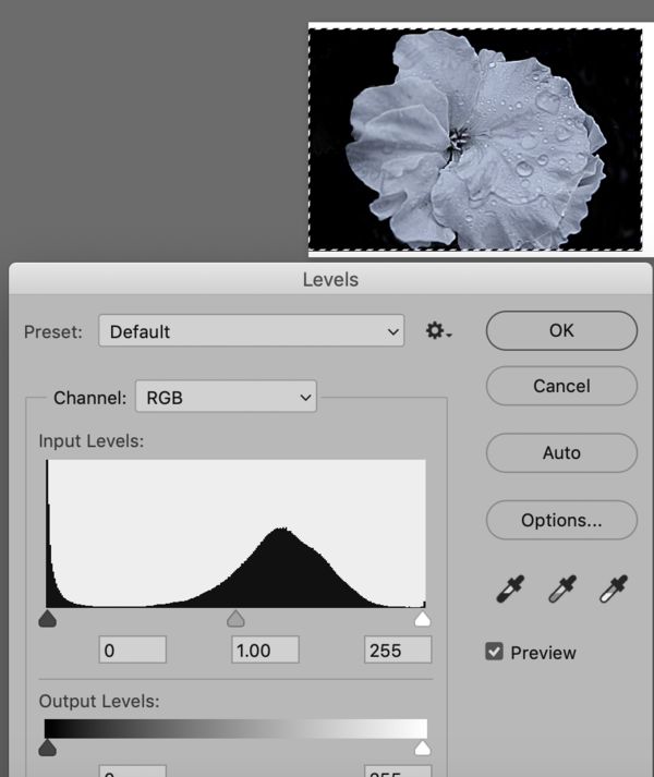
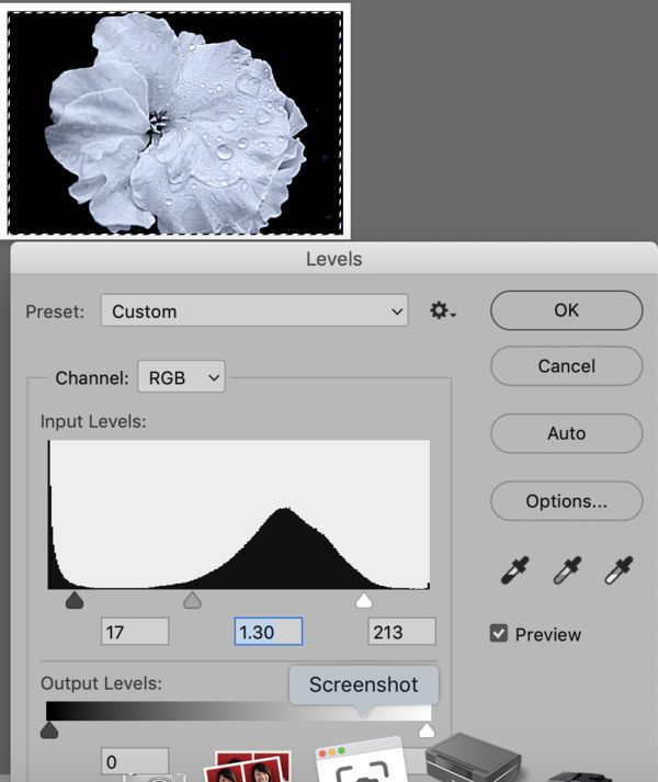
I adjusted the values (lights and darks) for more contrast (range) using Levels, as shown in the attached. The screen capture of levels of photo #2 shows the light distribution and placement of black, gray, white (triangles at bottom of the graphic of the original).
The screen capture of levels of photo #3 shows the changed placement of black, gray, white. Some grays (big hump near middle) are now more white, while others are nearer black.
If you want to reply, then register here. Registration is free and your account is created instantly, so you can post right away.