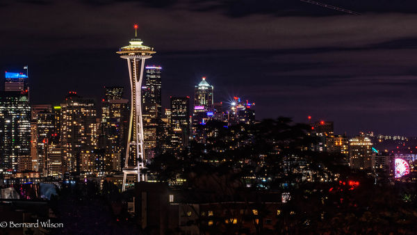
Seattle Skyline
Feb 17, 2019 19:58:52 #

I have been struggling with the edit of this shot and present, for your commentary, two versions. In one, I kept the foreground, as it was shot, which does draw the eye to it, hopefully, before going on the the central figure of the tower. In the second version, I darkened as well as changes the aspect, so all the focus goes to the tower. I would like to hear responses and explanations, so I can learn from this. Thanks all!

Feb 17, 2019 20:18:17 #
It's great to see pictures of my town! My best friend's dad worked on that roof!
The second one is better because it gives the feel that the Needle is in the middle of a busy city.
The second one is better because it gives the feel that the Needle is in the middle of a busy city.
Feb 17, 2019 20:27:53 #

I also prefer the second, and for the reason Bill gives. Also, anyone not familiar with the location will likely be confused by the empty black space and try to figure it out - taking away from enjoyment of the gorgeous skyline and colors of the lights.
Since the trail of airplane lights is relatively small in upper right corner, you might consider removing. For me it doesn't add to the feeling of bustling and vibrant city.
Since the trail of airplane lights is relatively small in upper right corner, you might consider removing. For me it doesn't add to the feeling of bustling and vibrant city.
Feb 17, 2019 20:39:19 #
Einreb92 wrote:
I have been struggling with the edit of this shot and present, for your commentary, two versions. In one, I kept the foreground, as it was shot, which does draw the eye to it, hopefully, before going on the the central figure of the tower. In the second version, I darkened as well as changes the aspect, so all the focus goes to the tower. I would like to hear responses and explanations, so I can learn from this. Thanks all!
The cropped image is a better composition. All that black in the foreground adds nothing to the image, and only draws the viewer's eye away from the skyline. If there was recoverable hidden detail from opening up shadows, yes. But given the way it was shot, #2 is better.
Great composition.
Feb 18, 2019 06:48:21 #

I like the second better. In the first it looks like there is just nothing in the foreground, it might look better if the sky was black. The second is much better with foreground detail and there is slightly more light in the sky showing detail of the clouds. I do agree with Linda about the plane lights..Very good shot though..
Feb 18, 2019 07:58:09 #

My vote goes to the second one, and I’d kill the brightness of the pink thing in the lower right corner--my eye keeps being distracted by it.
Feb 18, 2019 08:23:34 #

I’m with the crowd here, that foreground in #1 does nothing for the image.
Feb 18, 2019 09:16:53 #

As with most everything there's going to be differing opinions. But I do think in the case of the first image cropping out part of the dark foreground to bring attention to the Space Needle would be the way to go with it. That being said, I'm with the majority in thinking the second image is the better of the two.
Feb 18, 2019 09:56:08 #
bsprague wrote:
It's great to see pictures of my town! My best friend's dad worked on that roof!
The second one is better because it gives the feel that the Needle is in the middle of a busy city.
The second one is better because it gives the feel that the Needle is in the middle of a busy city.
Well your town was beautiful and loved being photographed. These were taken in Kerry Park. Thanks for your opinion.
Feb 18, 2019 10:06:56 #
Linda From Maine wrote:
I also prefer the second, and for the reason Bill gives. Also, anyone not familiar with the location will likely be confused by the empty black space and try to figure it out - taking away from enjoyment of the gorgeous skyline and colors of the lights.
Since the trail of airplane lights is relatively small in upper right corner, you might consider removing. For me it doesn't add to the feeling of bustling and vibrant city.
Since the trail of airplane lights is relatively small in upper right corner, you might consider removing. For me it doesn't add to the feeling of bustling and vibrant city.
Thanks, Linda. That was an easy fix. Stay tuned for a wrinkle I will post in a few minutes.
Feb 18, 2019 10:08:33 #
rgrenaderphoto wrote:
The cropped image is a better composition. All that black in the foreground adds nothing to the image, and only draws the viewer's eye away from the skyline. If there was recoverable hidden detail from opening up shadows, yes. But given the way it was shot, #2 is better.
Great composition.
Great composition.
Thanks for the input, rg. I am going to introduce another aspect in a moment that directly references your observation about the foreground..
Feb 18, 2019 10:10:26 #
nanaval wrote:
I like the second better. In the first it looks like there is just nothing in the foreground, it might look better if the sky was black. The second is much better with foreground detail and there is slightly more light in the sky showing detail of the clouds. I do agree with Linda about the plane lights..Very good shot though..
I appreciate your input. I find it difficult to edit images in the personal vacuum of my own brain. That adds much value to my experience here! Stay tuned!
Feb 18, 2019 10:13:59 #
jaymatt wrote:
My vote goes to the second one, and I’d kill the brightness of the pink thing in the lower right corner--my eye keeps being distracted by it.
Hi John. The pink thing is the giant ferris wheel down by the waterfront. I had a difficult time with the long exposure and highlights (much as I mentioned in my boathouse shot). I think I have learned to try and expose for them and bring up the balance in pp. Please stay subscribed. I have another version I would like you all to consider.
Feb 18, 2019 10:14:26 #
magnetoman wrote:
I’m with the crowd here, that foreground in #1 does nothing for the image.
Thanks, mate, for your input.
Feb 18, 2019 10:16:30 #
DaveC1 wrote:
As with most everything there's going to be differing opinions. But I do think in the case of the first image cropping out part of the dark foreground to bring attention to the Space Needle would be the way to go with it. That being said, I'm with the majority in thinking the second image is the better of the two.
Hi Dave. I appreciate your reply and love having the opinion of others. It makes me consider aspect I might not have and gives me the motivation to create different edits from which to choose. I will address the dark foreground with the addition of another shot.
If you want to reply, then register here. Registration is free and your account is created instantly, so you can post right away.