Thoughts on these
Jan 20, 2019 11:17:19 #
JRD3
Loc: Richmond, VA
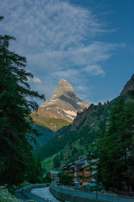
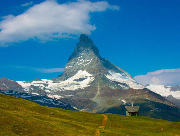
These are two photos of Matterhorn taken June, 2017. These were early days for me as far as digital photography.This weekend I went back to these and made some PP changes.
First, has had shadows brought out. Is this too much? I think this is closer to what my "eye" saw.
Second, some exposure adustment and cropping. I think this is a good image.
Please give me feedback.
Thanks,
Jay
First, has had shadows brought out. Is this too much? I think this is closer to what my "eye" saw.
Second, some exposure adustment and cropping. I think this is a good image.
Please give me feedback.
Thanks,
Jay
Jan 20, 2019 11:35:55 #
These are very nice captures. IMO cropping off 25% of the top and lightening at least the buildings in #1 would help.
Jan 20, 2019 12:00:42 #

I saw the movie 3rd man on the mountain when I was pretty young, and have always thought of the Matterhorn as unique and special. The first image feels a little crowded by the tree on the left. The second, the colors look a tad saturated to my eye. It feels a little unbalanced. Were it mine, I would crop a little from the left so that the path is more centered, rather than the peak. The contrast between the blue and white at the top pulls my eye upward. A little crop from the top keeps that from happening, and my eye settles in to enjoy the hill side. You said you did some cropping. Don't know if it was just in the horizontal. When you post an image be sure to check the box store original so we can see it a little bigger.
Jan 20, 2019 12:59:03 #
Both are excellent shots. I especially like the second one.
Andy
Andy
Jan 20, 2019 13:48:03 #

I agree about doing a little more lightening within the village, maybe the river also. Does the posted photo show your edits as well as on your monitor? UHH compresses images to just 600 pixels wide when you don't click "store original." (a download won't be generated unless the pic is more than 600 px - wide or tall, only needs one)
Interestingly, #2 makes a very interesting square IMO. See recent discussion:
https://www.uglyhedgehog.com/t-574276-1.html
I've pm'd you my edit
Interestingly, #2 makes a very interesting square IMO. See recent discussion:
https://www.uglyhedgehog.com/t-574276-1.html
I've pm'd you my edit
Jan 20, 2019 14:22:31 #

Too much sky in #1. I think there's a picture within the picture in #2. If you cropped in quite close to make the shot just about the building with the mountain towering in the background it would tell a different story but I think it might work quite well.
Jan 20, 2019 19:09:02 #
Jan 20, 2019 21:28:19 #

I disagree with some of what has been said. I don't think there's too much sky. That delightful cloud is really nice and is a nice balance to the darkness of the valley below. And normally scenes like this have a lot of difference between light and shadow. I think this is a very nice representation of what you likely saw. Of course, you could lighten the shadows more and offer more elements if interest to the image. But the mountain is clearly hero and the presence of a village simply tells us there are people around to appreciate it. The village can nicely remain more of a hint because we don't need its detail, just its presence.
Jan 20, 2019 22:43:06 #
Jan 21, 2019 09:47:41 #

The first one needs some more light, especially in the shadow areas. I would not crop the sky which in my opinion is a positive contribution to the whole scene.
Color correction is in order.
Color correction is in order.
Jan 22, 2019 13:22:14 #
AzPicLady wrote:
I disagree with some of what has been said. I don'... (show quote)
I am with you. I have considered the cropping suggested by others and think the shot would become ordinary without the sky. The portrait orientation is the right choice. To cut down the sky would make the image less. Right now it makes my eye soar upwards to the peak of mountain. A lower ceiling and my eye would stop below the peak. In fact, my eye would stop in the green area near the bottom of the mountain where the light first hits above the town.
Jan 22, 2019 13:53:03 #
JRD3
Loc: Richmond, VA
dsmeltz, thanks for the confirmation. I think the idea is to move the viewer's eye to the mountain. It only has grandeur if it is not confined to a low space.
Jan 22, 2019 13:57:51 #
dsmeltz wrote:
......A lower ceiling and my eye would stop below the peak. In fact, my eye would stop in the green area near the bottom of the mountain.....
Have you tried it? If it was true it would make you unusual. It's all a question of proportions. The way it is just now, the preponderance of sky reduces the mountain's presence (its prominence within the shot). For most people, if you reduced the amount of sky it would increase the mountain's presence because the mountain would then constitute a larger proportion of the scene.
It's a well-observed fact - if you crop in or zoom in on a subject it increases the subject's prominence in the image (and doing the opposite has the opposite effect - it diminishes the subject's presence).
You wouldn't want to have the top edge of the frame so low that it crowded the mountain's peak, but typically it doesn't take large amounts of sky to create a sufficient sense of space above a subject and to give it sufficient clearance. Large amounts of negative space should be used only if you're willing to accept the consequence of having the subject's prominence diminished. Typically the only time that won't happen is when there's very little in the shot except the subject. When that's the case, the subject will be more resistant to having its prominence diminished, and a preponderance of negative space will enhance the minimalist look of the image.
Jan 22, 2019 14:08:20 #
R.G. wrote:
Have you tried it? If it was true it would make y... (show quote)
Yes I tried it before I commented. The more square shape of the result affects the eye movement in the photo. Aspect ratio does have an effect on eye movement. This shot calls for movement up. Cropping off the top seems to have the effect of slowing eye movement up.
Jan 22, 2019 14:29:19 #
dsmeltz wrote:
Yes I tried it before I commented. The more square shape of the result affects the eye movement in the photo. Aspect ratio does have an effect on eye movement. This shot calls for movement up. Cropping off the top seems to have the effect of slowing eye movement up.
A valid point. But I would say that if your aspect ratio was close to square you've removed more sky than is necessary. My suggestion would be to lower the top edge to the point where you have almost halved the distance from the top edge to the top of the mountain. I agree that a vertical framing is what's required.
If you want to reply, then register here. Registration is free and your account is created instantly, so you can post right away.