Flower Abstractions
Jan 5, 2019 13:04:20 #

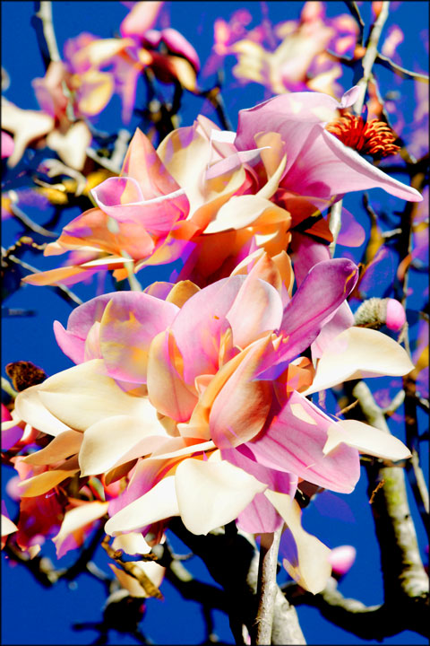
This is a body of work I started about 20 years ago, and recently went back to as part of a project to print my best photos. They are composites of two or three photos of flowers. The first two were from the early '00s, which I tweaked some more to print. That inspired me to try to create some more, and I just made the third one from two old flower photos. I was looking for a subject with very colorful organic forms to combine, and flowers fit the bill perfectly. I'm looking for a balance of realism and abstraction. I feel like when it works the images have more "flowerness" than single shots. Also, it's just a great way to get more flowers in the image. I generally combine the images in "lighten" mode so the brightest parts of each layer show through. Then I can further control it by lightening or darkening portions of each layer to determine what shows through.


Jan 5, 2019 13:35:04 #
Jan 5, 2019 18:00:56 #

JohnSwanda wrote:
....I'm looking for a balance of realism and abstraction.......
It would be hard to think of anything that said "flowery" more than these. I'm wondering if you've tried taking the PP more into the abstraction side - for instance softening the images detail-wise without weakening the colours.
Jan 5, 2019 19:55:13 #
R.G. wrote:
It would be hard to think of anything that said "flowery" more than these. I'm wondering if you've tried taking the PP more into the abstraction side - for instance softening the images detail-wise without weakening the colours.
I like to keep the detail so they are recognizable as a photographic vision, just a little scrambled.
Jan 6, 2019 13:21:56 #
I don't usually comment of flower images, but I find these to be particularly beautiful and unusual. Good work.
If you want to reply, then register here. Registration is free and your account is created instantly, so you can post right away.