Check out Close Up Photography section of our forum.
book cover photo
Dec 26, 2018 16:02:34 #
Los-Angeles-Shooter
Loc: Los Angeles
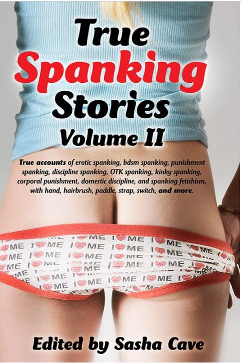
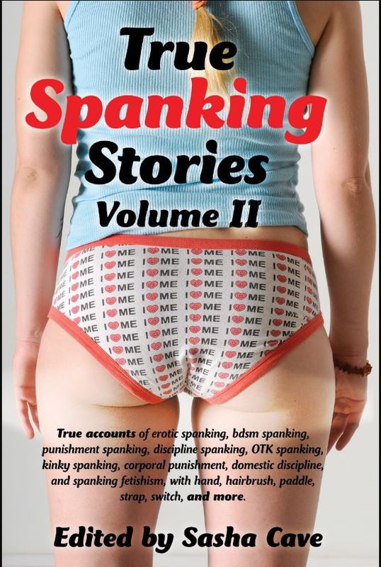
another in the series of books. this one needed more Photoshop work, in connection w/ the text, then i like to do. as usual, two versions, to meet needs of different standards at different vendors. The tame version was used on the paperback; both versions were used on various e-books. The butt belonged to a talented musician/composer.
Dec 27, 2018 06:09:19 #

Dec 27, 2018 11:09:25 #
I like #2 better. I like the blond wisp of hair at the top in # 1 but the image is not centered well. #2 has a residue of an adjustment layer near the butt.
Check out Traditional Street and Architectural Photography section of our forum.
Dec 27, 2018 11:47:00 #
Fotoartist wrote:
I like #2 better. I like the blond wisp of hair at the top in # 1 but the image is not centered well. #2 has a residue of an adjustment layer near the butt.
Good pickup on #2... I used to do hand lettering (before personal computers) so I was more concerned with the lettering (tee hee) that I didn't even notice the Butt. But, now I do :) :) good or bad PP, still a nice Butt.
Dec 27, 2018 13:45:09 #
Los-Angeles-Shooter
Loc: Los Angeles
OnDSnap wrote:
You do know the title and sub text is off center right? LOL :)
Don't know if it is that way on the original books, or just a little Kentucky windage in making and reducing the scan of the cover. But I confess that the cute butt kept me from noticing...
Dec 27, 2018 17:19:54 #
Los-Angeles-Shooter wrote:
Don't know if it is that way on the original books, or just a little Kentucky windage in making and reducing the scan of the cover. But I confess that the cute butt kept me from noticing...
I don't doubt it, I was only busting...ya know, butt, what butt? :)
If you want to reply, then register here. Registration is free and your account is created instantly, so you can post right away.
Check out Drone Video and Photography Forum section of our forum.