Check out Sports Photography section of our forum.
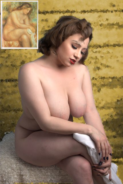
Renoir - "Bather Sitting, Drying her Legs" - Little Miss Lolita
Oct 29, 2018 01:03:08 #

The latest in my continuing series of re-created paintings. I recently had four of them in a gallery show: https://artfrontgalleries.com/artfront-galleries-10th-show-of-2018-dishabille/
Oct 29, 2018 01:05:27 #
Oct 29, 2018 02:04:35 #

JamesCurran wrote:
The latest in my continuing series of re-created paintings. I recently had four of them in a gallery show: https://artfrontgalleries.com/artfront-galleries-10th-show-of-2018-dishabille/
Very nice image, Lovely young lady. However keeping in style of Renoir, I think the models make-up is a bit to bright "heavy" and the lighting is a tad harsh and bright. I also have mixed thoughts on the fabric the mode is sitting on being to heavy and coarse weave. Still a great image!!!!
Frank
Check out Street Photography section of our forum.
Oct 29, 2018 07:18:51 #
Oct 29, 2018 07:21:28 #
Manglesphoto wrote:
Very nice image, Lovely young lady. However keeping in style of Renoir, I think the models make-up is a bit to bright "heavy" and the lighting is a tad harsh and bright. I also have mixed thoughts on the fabric the mode is sitting on being to heavy and coarse weave. Still a great image!!!!
Frank
Frank
I agree about the make-up. She had just done a group photo shoot (pin-up themed), and this set up was put together, spur of the moment when I realized she'd fit the painting well.
Oct 29, 2018 12:40:55 #

I concur with the comments of the make-up being a bit strong, but I understand the circumstances. So I can overlook that easier than I can a few of the other elements that might have been easier for you to control: fabric texture on the seat cover, position of her right arm (needs to be a bit higher over the breast), more forward lean (which will help with the arm position), and position of her left hand (lower and a bit farther back to reveal more of the fabric).
But don't get me wrong -- I think what you are doing is fabulous, and you are doing it very well!!! I am being nit-picky in my critique.
But don't get me wrong -- I think what you are doing is fabulous, and you are doing it very well!!! I am being nit-picky in my critique.
Oct 29, 2018 16:30:21 #
Manglesphoto wrote:
Very nice image, Lovely young lady. However keeping in style of Renoir, I think the models make-up is a bit to bright "heavy" and the lighting is a tad harsh and bright. I also have mixed thoughts on the fabric the mode is sitting on being to heavy and coarse weave. Still a great image!!!!
Frank
Frank
And the hair is too short!


Seriously, I do agree about the fabric. In the painting, it looks like a fine weave fabric. Something a Lady would have.
And I also second "Still a great image".

Check out The Pampered Pets Corner section of our forum.
Oct 29, 2018 21:59:35 #
Stephan G wrote:
And the hair is too short!
Heck... In the original photo, she's blond.
Oct 30, 2018 06:21:26 #

Very good shot for running thru an art program to better simulate the Renoir ...she is a very womanly woman ... soft for abundant.
Oct 30, 2018 06:31:07 #
Stephan G wrote:
And the hair is too short! br br img src="htt... (show quote)
The OP said the image was to be "In the style of) not an exact copy.
Oct 30, 2018 07:33:19 #
I don't know that the make-u is too strong or rather that the red overall is too strong - I think the red overall. Also think the wall of whatever is should have been a bit subdued. I do like the image.
Check out Bridge Camera Show Case section of our forum.
Oct 30, 2018 07:46:56 #

Very nice, James.
--Bob
--Bob
JamesCurran wrote:
The latest in my continuing series of re-created paintings. I recently had four of them in a gallery show: https://artfrontgalleries.com/artfront-galleries-10th-show-of-2018-dishabille/
Oct 30, 2018 08:00:57 #
Manglesphoto wrote:
The OP said the image was to be "In the style of) not an exact copy.
I was just ribbing you.
The OP would have to look far and wide to find a model who is proportioned like the woman in the painting. Actually, there have been a few "artistic licenses" taken by the painter. In a sense, the OP brought the concept to a more realistic (and modern) view.
Oct 30, 2018 08:01:14 #
JohnFrim wrote:
the other elements that might have been easier for you to control: fabric texture on the seat cover, position of her right arm (needs to be a bit higher over the breast), more forward lean (which will help with the arm position), and position of her left hand (lower and a bit farther back to reveal more of the fabric).
The fabric of the seat cover was just whatever we were able to find in the studio (It was a commercial studio that had just held a group shooting event, so it had a lot of generic props, but I had nothing specific for this shot). I blurred it a bit in GIMP (as I did with th ebackground --- which was originally blue) I'll try playing a bit more on that, and see if I can tone down her lipstick. (Heck, I changed her hair color!)
THe positioning is more an issue that I cast for curvy, without realizing that the woman in the painting is actually rather tall. Plus a bit of that fact that I always feel I such rush through the shooting. I feel guilty nit-picky exact placement of body parts when working with a naked woman. This is just my neurosis --- I've never had a complaint from a model.
I also had 14 different shots --- with slightly different leans and armplacements, as we tried to get it right. I picked the one that looked overall the best, which may not have been the most accurate.
Oct 30, 2018 08:35:06 #

If you want to reply, then register here. Registration is free and your account is created instantly, so you can post right away.
Check out Travel Photography - Tips and More section of our forum.