Center sign
Sep 7, 2018 14:33:10 #
Chicflat
Loc: Tulsa, Ok,
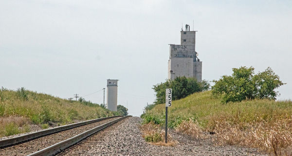
This photo is cropped. I think the flatness of the light in the scene and in the sky is detrimental, but it was shot at 11:00 a,m, on a cloudless day with no filter. Regardless, when I was exploring crop options I chose this as the best. My thinking is that the sign, "355," directs the eye to the elevator that is my real interest. The sign also moves the direction of vision along the tracks to the paired towers. It also seems to me that by so anchoring the vision of the shot that it obscures to some extent the lack of interesting elements in the broader canvass. Is my own analysis wrong? How do you see this or do you see another better fix?
Sep 7, 2018 15:10:26 #

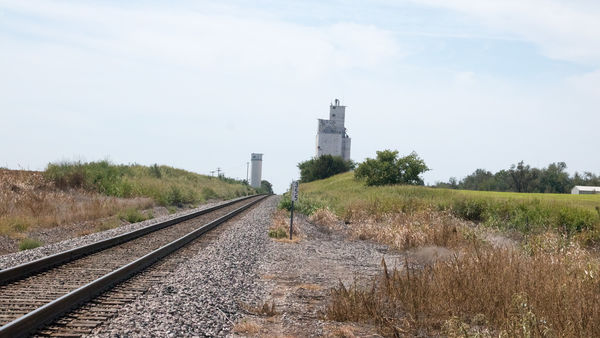
I like the first one's composition better too. However, there are a few problems with this shot: 1. Noisy - I tried to darken and put texture in the sky but the noise is too great. Maybe a lower ISO? 2. Dust on your sensor - 3 pretty good sized spots show up when the sky is darkened.
3. Strange thin vertical line just left of the elevator??? 4. Overall shot is kinda flat - could use some added contrast or saturation. Basically a good shot but needs a little work in and out of camera. Keep trying!
3. Strange thin vertical line just left of the elevator??? 4. Overall shot is kinda flat - could use some added contrast or saturation. Basically a good shot but needs a little work in and out of camera. Keep trying!
Sep 7, 2018 15:10:27 #
Sep 7, 2018 15:39:41 #
Sep 7, 2018 16:45:30 #

Why was shutter speed 1/2500 second in the first (and also very fast in #2, 1/1600)? I see aperture priority; did you set the ISO or did the camera? ISO of 200 instead of 800 would have given you shutter speed of 1/625 sec in #1 and 1/400 sec in #2.
I'm interested in how large a crop this is because the noise or something you did in editing is highly evident. Was the air heavy with humidity? The image doesn't seem very sharp at all.
OK, technical issues aside...I find the sign intrusive. I think you have a wonderful curve to the rails that lead us right to the buildings and you made a good choice to position its beginning in the lower left corner. I would probably look first at the building on the right anyway, because it's so large in the frame.
Have you considered black & white? As you said, the light was working against you, so we are left with strong lines, interesting buildings and textures in the grass and gravel. Do you have experience with b&w conversion? Some editors have the virtual filters so you could make that grass either a darker tone or a lighter tone, depending on how you edit.
In fact, I'm going to send you a b&w via pm just because it's so much fun to explore the possibilities
Sep 8, 2018 13:53:19 #
Chicflat
Loc: Tulsa, Ok,
Thank you for your help. I don't know why the iso is so high. I usually set it at 300 to 400. I only remember ever using so an iso for low light, but that was not the case here. We always have high humidity in August and September in oklahoma and there was a chance of rain, but we got near to nothing that day where I was. I have tried some conversions to black and whitr not often with effective results - part of my learning curve. I am going to go to the pm's now. Thank you again.
If you want to reply, then register here. Registration is free and your account is created instantly, so you can post right away.