Your opinion, please.
Aug 24, 2018 23:19:53 #

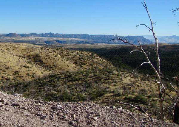
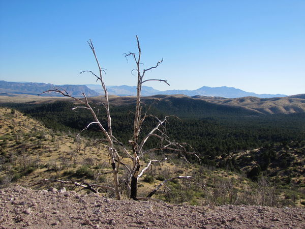
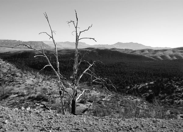
Which do you prefer, color or black and white? Or do any of them have any interest?

Aug 24, 2018 23:22:06 #

The colored picture in both case. The valley in the background is too dark to make the B&W photos interesting.
Aug 24, 2018 23:23:58 #
Aug 24, 2018 23:26:17 #
TBerwick
Loc: Houston, Texas
Luen, in this case I think the color shots win. Since there is no cloud structure to add drama, the b&W's just lack "punch."
Aug 24, 2018 23:26:54 #
amfoto1
Loc: San Jose, Calif. USA
Personally I find the B&W versions much more interesting... especially after downloading the larger version.
Of the two, I prefer the second image with the tree in the foreground more prominent.
It would be an interesting site to shoot at different times of the day to see how it changes with the light.
Of the two, I prefer the second image with the tree in the foreground more prominent.
It would be an interesting site to shoot at different times of the day to see how it changes with the light.
Aug 24, 2018 23:38:20 #
Aug 25, 2018 01:28:56 #
Luen wrote:
Which do you prefer, color or black and white? Or do any of them have any interest?
I prefer, out of all 4, the last 2, specifically the B&W. With a little work in post, you could bring out hidden details in the shadows.
Aug 25, 2018 06:28:13 #

Aug 25, 2018 07:41:56 #

Aug 25, 2018 08:49:28 #

Black and white--I think the layers show up better than in the color shots.
Aug 25, 2018 08:56:48 #
In my opinion B&W makes only sense for architecture and colorless art (statues for instance).
I did not like your B&W images.
I did not like your B&W images.
Aug 25, 2018 09:19:11 #

The composition is much stronger in the second pair IMO. In the first, there is no clear point of interest, just a lot of small details and mostly distant. As regrender suggests, there is much more that could be brought out in pp with #4, but also #3 has potential, I think. I'm going to send you some ideas via pm 
Aug 25, 2018 10:31:16 #
This is exciting to get all your opinions and comments and I thank you for sharing them. This is a great forum for learning. I once entered a photo of "human interest" in a contest and received the lowest points possible. I still liked it and entered it in the State Fair where it won Best of Show. I know these photos aren't that quality, but this is a great place for good advice. I appreciate all the advice. Luen
Aug 25, 2018 11:16:43 #
Aug 25, 2018 19:46:39 #

If you want to reply, then register here. Registration is free and your account is created instantly, so you can post right away.