Should these Photos be B&W?
Aug 23, 2018 13:04:02 #
Aug 23, 2018 13:22:54 #
No they all look fine as black and white, color may dampen the effect. I would say though, that in my opinion, some seem to be underexposed, but that is to each individuals eye and taste. Nice set of photos.
Aug 23, 2018 13:27:27 #

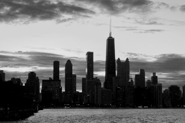
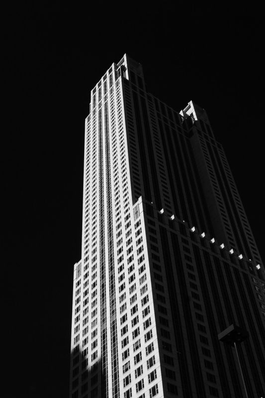
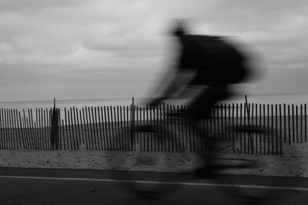
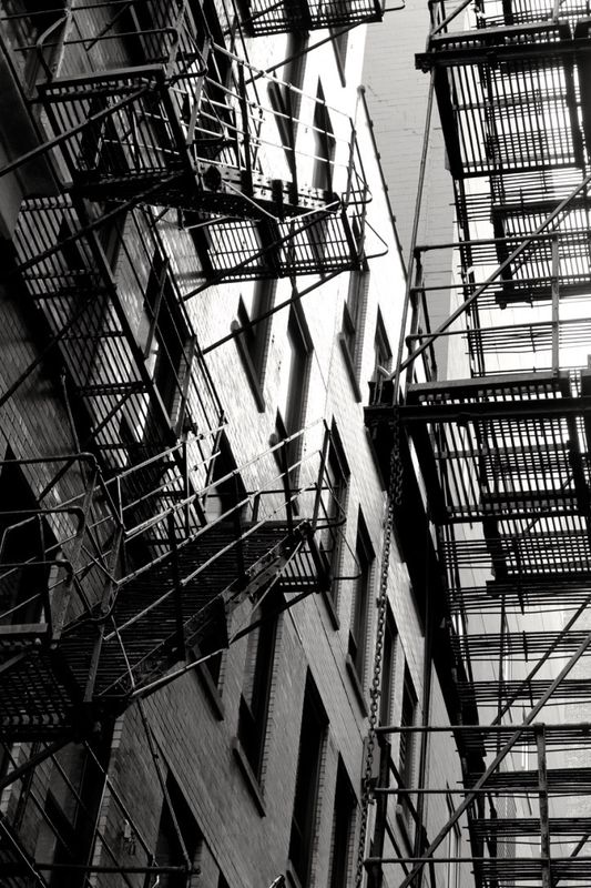
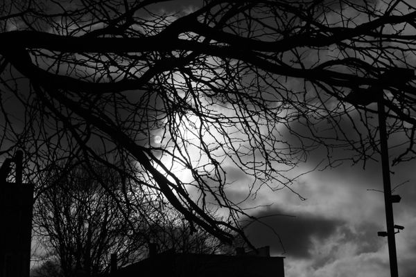
My opinion: the strongest as b&w are #3 for the geometry and fabulous contrast of light and dark, #4 for the ghost-like silhouette (racing to where or what? We can use our imagination here to fill in) and #6 for the simplicity of design (the thumbnail appears a little too dark, though. If it is foggy, seems like you could keep that mood while lightening a little).
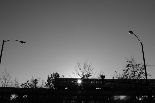
I think both the first and last would benefit from cropping; right now I'm not sure what they are supposed to be about. #2 doesn't seem very crisp in detail. It would be interesting to see this with more tonal range, too: bringing out whiter whites for more contrast with both sky and water + some grays in the sides of the buildings reflecting the sunset.
I think both the first and last would benefit from cropping; right now I'm not sure what they are supposed to be about. #2 doesn't seem very crisp in detail. It would be interesting to see this with more tonal range, too: bringing out whiter whites for more contrast with both sky and water + some grays in the sides of the buildings reflecting the sunset.
Aug 23, 2018 13:37:16 #
LA
Loc: Little Rock, AR
I am much better at that judgment is going the other way, i.e., answering the question of whether a color photo would be better as BW, because I can visualize the BW somewhat, but for your photos I would want to see the color version. When I make this judgment personally, I look at both.
Aug 23, 2018 13:41:46 #
Thank you both for the comments.
Yes, I tend to underexpose B&W, and think the moody sky photo looks better lightened up.
I'll try messing around with the skyscrapers and see what I get.
Thanks again
Yes, I tend to underexpose B&W, and think the moody sky photo looks better lightened up.
I'll try messing around with the skyscrapers and see what I get.
Thanks again
Aug 23, 2018 13:43:15 #
Old Timer
Loc: Greenfield, In.
No 3 and 5 both can stand on their merits for B W but the others I would have to see the colored ones as well. Some photos should be rated according their merits and that is to you to decide. I personally like a high contrast for black and white. But that usually takes some pp.
craig.j.tucker wrote:
Do you think any of these photos would serve the eye better with a palette of color?
Aug 23, 2018 13:45:35 #
Thanks for looking, LA. All the photos were taken in Mono.
I know most people take color photos, then change to B&W in post processing. I have begun doing that
I know most people take color photos, then change to B&W in post processing. I have begun doing that
Aug 23, 2018 14:01:08 #

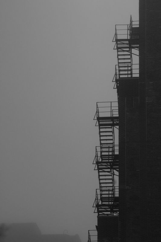
The skyscraper and the two fire escape photos have a nice noir-ish look to them.
Aug 23, 2018 14:15:58 #
If you want to reply, then register here. Registration is free and your account is created instantly, so you can post right away.