Considering the Aspects of Light: Part 3 - Color
May 30, 2018 07:12:45 #

This project is the result of a collaborative effort among several members. We greatly appreciate the response and participation shown in the first two chapters.
Previous discussions of the series:
Part 1 Direction
Part 2 Qualities of Harsh and Soft
----
In today's topic we will explore the colors of light. A basic way to describe the color of light is it is either cool or warm. Cool colors include green, blue, and purple. Warm colors are red, orange, and yellow.
What moods are most often associated with a particular color? How does the color of light affect a viewer's response to your photo? Which color is appropriate for your subject and the story you want to tell? A few examples:
- Orange and yellow are associated with happiness and well being (sunshine), green represents gentle nature (spring time) as well as greed (money) and jealousy, blue can be felt as cold and distant or as tranquil (ocean, sky). Red is emotional (both anger and love - Valentine's Day) and high energy.
- Mixing a warm foreground color with a cool background color creates depth because to our eye, warm colors advance and cool colors recede. With landscapes, long vistas at mid-day will often provide this combination.
The same scene can have completely different looks based on the time of day that it was shot. For example:
- White Light. Contains all the wavelengths of the visible spectrum at equal intensity and appears to be colorless. The standard is the sun at noon under a clear sky and during summer when it is directly overhead. Most electronic flashes simulate white light.
- Blue Hour. During morning and evening twilight, when the sun is below the horizon, the light appears predominantly blue.
- Golden Hour. When the sun is low on the horizon, the light is often yellow/orange and softer than at mid-day. The actual duration and effect depends on your distance from the equator and the season.
The white balance settings of your camera are designed to remove unrealistic color casts. For example, if you shoot indoors without a flash and the light source is your standard tungsten bulb, your image will have a dull orange look. Set your WB to "tungsten" and the result is whites will look white. If you shoot in raw, WB changes in-camera are unnecessary as adjustments are easily made when editing.
For further reading, click here
Please share a photo and discuss the conditions that caused the color of light you captured and how the color or colors affect the mood and story. Comparative images, including those created in post-processing, are encouraged.
Thanks for participating!
May 30, 2018 07:13:23 #
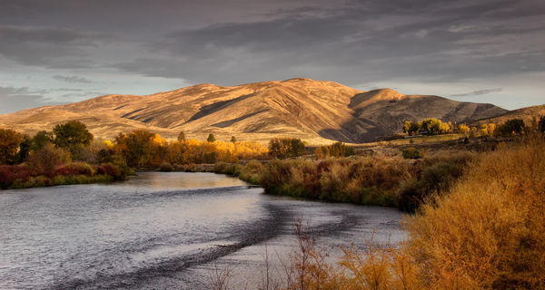
Morning Golden Hour in Autumn. Depending on your monitor, you may see variations of blue/orange or purple/yellow, both of which are complementary color combinations. Why do complementary colors often seem more pleasing and vibrant when shown together? The two articles below explain much better than I can 
https://northrup.photo/complementary-colors-and-photography
https://digital-photography-school.com/add-contrast-to-your-images-by-using-complementary-colors/
Along with the general appeal of complementary colors, the subjects here are usually represented by these color moods: a cool river, warm yellow autumn foliage and sunlit hillside. For me, the "rightness" of the scene creates harmony and serenity. There is no discord or tension.
May 30, 2018 08:40:08 #

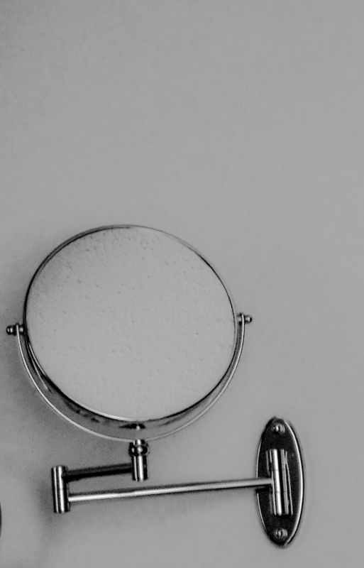
These shots were taken to see the effects of different light on an idea. I noticed that my bathroom shaving mirror had been pushed into a position where it seemed to be questioning. (OK, to ME it seemed as if it were questioning.) I shot it once with available outside window light, somewhat bluish, and once with the bathroom light on, warmish. Although a subtle difference, there does seem to be a different emotion in each.

May 30, 2018 08:47:08 #

Linda From Maine wrote:
Morning Golden Hour in Autumn. Depending on your m... (show quote)
What attracted me to taking this shot was that even in deep shade, the mini glacier seemed to be providing a glowing light. I further like it for the contrast between warm and cool colors.

May 30, 2018 08:47:35 #
Hi Linda, I have only been pursuing photography for a couple of years and will admit I am quite taken by it. I now know without an eye for and the understanding of light, color and how it relates to photography knowledge of equipment means nothing. I am following your new topic and learning as I go. Your way of communicating is intelligent, succinct, and easy for me to understand. Just wanted you to know you have a great fan and I greatly appreciate your kindly approach to teaching about the wonderful world of light. Good shooting to you.
May 30, 2018 08:49:04 #
artBob wrote:
You come up with the most unique subjects for discussion, Bob! #1 - It's blue, but the color feels neutral to me, so I see this as a story about geometry and sleek form. With #2 being sunlight-warm, I am getting a "rise and shine, it's morning!" message from within the mirror These shots were taken to see the effects of different light on an idea...

Thanks very much!
May 30, 2018 08:54:40 #
fergmark wrote:
This is a fascinating photo! Often cool colors recede and warm advance, but here the brightness - and mesmerizing glow - hold my attention while the surroundings are there only to define the sharp edges of ice. I also love the contrast in textures between lichen-covered rocks and sleek ice. Thanks for posting!What attracted me to taking this shot was that even in deep shade, the mini glacier seemed to be providing a glowing light. I further like it for the contrast between warm and cool colors.
May 30, 2018 08:56:39 #
d3200prime wrote:
Many folks have been involved in the production and success of this series, and your lovely comments are greatly appreciated. So glad to know you have been bitten by the photography bug. It is a joyous hobby!Hi Linda, I have only been pursuing photography fo... (show quote)
May 30, 2018 09:25:52 #
Linda, your kind nature, artistic sensibilities and gift for expressing yourself succinctly, are an inspiration.
May 30, 2018 09:49:14 #

Warm versus cooler illumination:
Two similar subjects with similar plumage viewed against two similar backgrounds:
First light of sun just risen to peek above the horizon; its rays pass horizontally (most obliquely) through the maximum amount of atmosphere and its long (“warmer”) wavelengths are least refracted from their direct path and bathe the subject in light rich in reds and oranges.
Later in the morning the sky is overcast and the sun is higher and passing more perpendicularly (less obliquely) through a lesser thickness of atmosphere. Its shorter (“cooler”) wavelengths are less refracted from their direct path and can thus contribute more equally with the warm wavelengths to more neutrally illuminate the subject and background.
Dave
warm,low, horizontal early sunlight
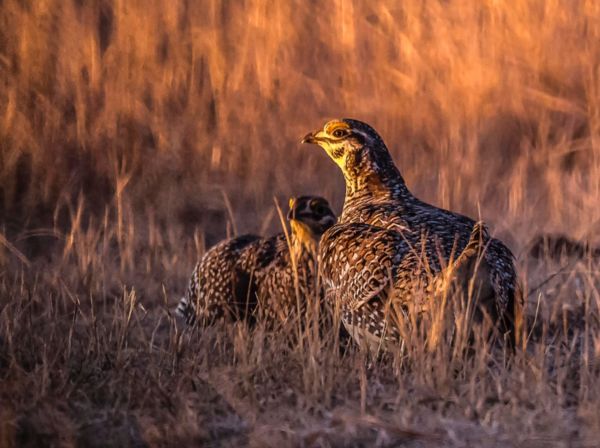
(Download)
more neutral illumination by higher sun with more equal contributions of warm and cool wavelengths; also softer, more diffuse lighting due to overcast.
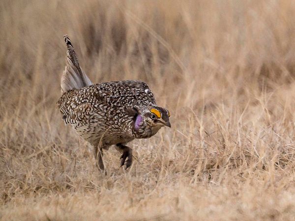
(Download)
May 30, 2018 09:52:48 #

Linda From Maine wrote:
Morning Golden Hour in Autumn. Depending on your m... (show quote)
Wonderful image. These images that combine cool and warm light have great appeal to me, and I seldom have them where I live because of our topography.
 A wonderful illustration of the color of light.
May 30, 2018 10:03:21 #
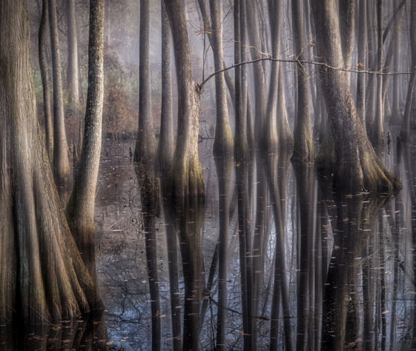
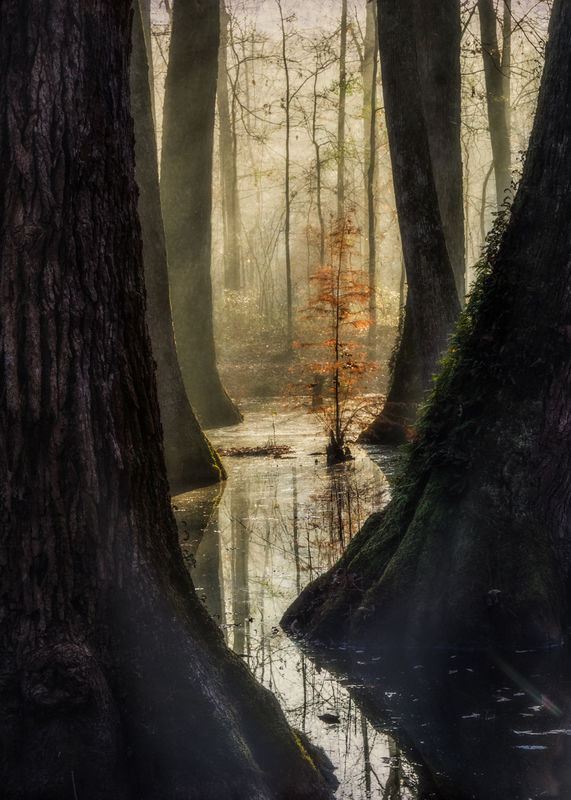
These two images were captured in the same location on a winter morning with a bit of fog that burned off after sunrise. The fog seems to enhance the color of the light, and is my favorite atmospheric to shoot in. The first was shot facing west just as the sun was rising behind the banks of this old river bed that has become a swamp, and the tones were decidely blue. Less than an hour later, the second one was shot facing east into the just-risen sun, which had painted the fog a soft golden yellow and enhanced the orange of the young cypress; still some blue tones clung to the shadowed sides of the old trees.
Some of my greatest challenges are trying to "fix" the color of light that has somehow either fooled my camera or my eye, to make it more like what I remembered. As time has gone on, I've become less insistent, though, on technical accuracy and more committed to making the image reflect what I felt moreso than what the camera made of it. So I will tinker with the color of light in PP, sometimes more than others, either to enhance what was already there, or to add color that seems to better suit the scene.
Some of my greatest challenges are trying to "fix" the color of light that has somehow either fooled my camera or my eye, to make it more like what I remembered. As time has gone on, I've become less insistent, though, on technical accuracy and more committed to making the image reflect what I felt moreso than what the camera made of it. So I will tinker with the color of light in PP, sometimes more than others, either to enhance what was already there, or to add color that seems to better suit the scene.
May 30, 2018 10:20:20 #
fergmark wrote:
Thank you. Often I struggle to say what I mean, and will edit my comments many times. Glad that's not obvious Linda, your kind nature, artistic sensibilities and gift for expressing yourself succinctly, are an inspiration.

Uuglypher wrote:
Thank you, Dave! Great comparison shots, and your venturing into the scientific aspects of light and color is much appreciated, as well.Warm versus cooler illumination...
minniev wrote:
Minnie, I hope that folks who have just begun their explorations with artistic processing will study your images. Inspiring fine art!... So I will tinker with the color of light in PP, sometimes more than others, either to enhance what was already there, or to add color that seems to better suit the scene.
Re your mention of my opening photo (thank you!) and the flat topography in your corner of the world: that is something I fear I may have started to take for granted here
Time for a road trip to the deep south!May 30, 2018 10:33:48 #
minniev wrote:
These two images were captured in the same locatio... (show quote)
Your photos are always intriguing. In the first one, the blue tones give me an eerie feel, probably because it is so hard to discern where is the water line. The second shot has that depth that Linda mentioned. It also has several compositional elements that really make it work.
May 30, 2018 10:59:44 #
Color temperature and saturation shifts:
Shifts in both color temperature and color saturation have long been used by artists as cues to depth in their images to enhance perception of the distance between foreground and deep background.
Color temperature shift (warm, closer / cool, more distant) and decreasing saturation with distance are more typically included under the rubric “atmospheric perspective” and are , thereby, subsumed under discussion of the incontrovertible consequences of haze.
These images illustrate, in one case, color temperature shift and saturation shift in expansively clear, dry desert air and in another case in a landscape viewed through more haze.
Dave

If you want to reply, then register here. Registration is free and your account is created instantly, so you can post right away.