Door Frame
May 25, 2018 15:17:25 #
Chicflat
Loc: Tulsa, Ok,
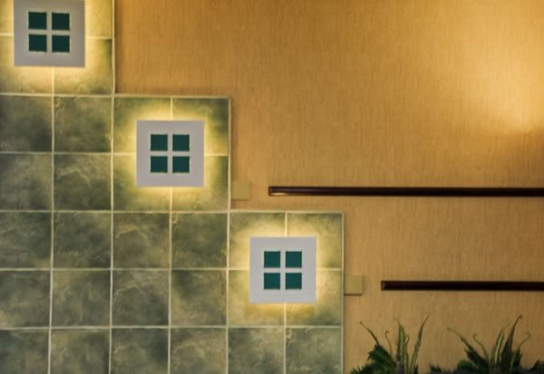
What are your thoughts concerning the door frame on the right? I wanted to include the light illumination on the wall as a sort of balance to the light illuminating the wall from behind the square fixtures. My sense is that the darkness of the frame may be a distraction.

May 25, 2018 15:36:09 #

Chicflat wrote:
What are your thoughts concerning the door frame on the right? I wanted to include the light illumination on the wall as a sort of balance to the light illuminating the wall from behind the square fixtures. My sense is that the darkness of the frame may be a distraction.
It didn't distract me. I think it is needed to avoid having the light look like it is leaving the scene.
Bud
May 25, 2018 16:15:30 #
May 25, 2018 16:29:07 #
Chicflat wrote:
What are your thoughts concerning the door frame on the right? I wanted to include the light illumination on the wall as a sort of balance to the light illuminating the wall from behind the square fixtures. My sense is that the darkness of the frame may be a distraction.
Crop it out. You still will get the flood of light on the wall, which is the effect you wanted.
May 25, 2018 16:43:39 #
May 25, 2018 17:36:10 #

May 25, 2018 18:14:24 #

...I want to see more of the door...the picture doesn’t pull me in...but what do I know...?
May 25, 2018 20:23:22 #

Without it, the shot is unbalanced, driving the eye to the right and right out of the photo with nothing to stop it. I think the strong geometry of the shot would be improved if you'd "warp" the corner and the frame to a perfect vertical.
May 25, 2018 20:27:36 #
May 25, 2018 22:14:12 #
May 26, 2018 08:49:52 #
IMHO, you could crop out the door frame as well as the light fixture and still have the light from the fixture on the wall to balance out the light on the left.
May 26, 2018 09:42:51 #

IMHO, you could crop out just the frame, but this leaves you with the brightest element at the edge pulling your eye out of the frame. Option two might be to crop to the left of the shade leaving a simple but dynamic image of shapes and lines. Less is more!
Chicflat wrote:
What are your thoughts concerning the door frame on the right? I wanted to include the light illumination on the wall as a sort of balance to the light illuminating the wall from behind the square fixtures. My sense is that the darkness of the frame may be a distraction.
May 26, 2018 14:40:01 #
Chicflat
Loc: Tulsa, Ok,
Pardon me if I respond to all at once; I hope I am not rude. So, this crop does not satisfy. What I need to thank you for are those suggestions which explain how i might better crop the image and the resulting benefits. thank you all. Self-confession: I think sometimes I am too controlled by my original thought on an image and so I don't see the places that I could go with it.
May 26, 2018 14:58:55 #
Chicflat
Loc: Tulsa, Ok,
Thanks again to all for your insight. I have some question about this crop, but it does reflect a better direction I think. Thanks again to all.
If you want to reply, then register here. Registration is free and your account is created instantly, so you can post right away.