Constructive Criticism please.
May 3, 2018 05:48:57 #

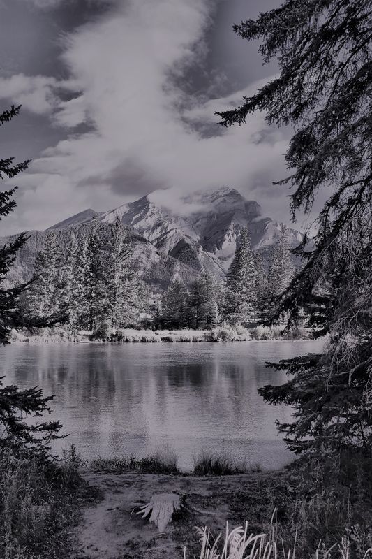
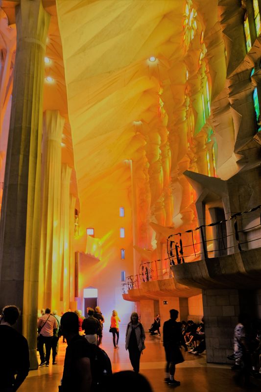
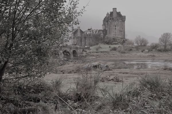
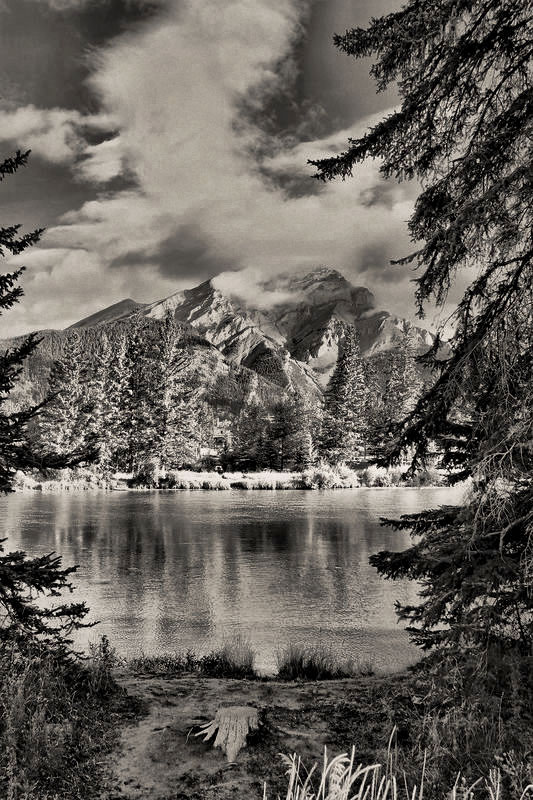
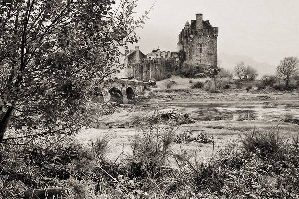
Too much Tree on the Banff mountain and the Castle? The Barcelona Cathederal one I like but not quite right somehow can't quite nail it down.
May 3, 2018 06:02:05 #
I would do a bit of pruning on the tree branch that sticks out above the mountain... As for the castle with the tree, I do think it is too much tree and I don't have the thoughts/knowledge to fix that one.
As for the cathedral, I did find my eyes keep going to the woman facing the camera, instead of being caught up more in that beautiful building.
None of the shots are "bad", but I understand why you're not quite satisfied with them.
As for the cathedral, I did find my eyes keep going to the woman facing the camera, instead of being caught up more in that beautiful building.
None of the shots are "bad", but I understand why you're not quite satisfied with them.
May 3, 2018 06:37:02 #

I actually really like the first one. I think the tree branches frame the photo nicely. The second one I don't like much I think because it feels like there is no real focal point, nothing that really draws you in. The third one I do think there is too much tree. The castle kind of just fades into the background.
May 3, 2018 06:38:12 #

Obviously, each one of us has a different vision and a different taste when it comes to photography. I will address with my vision and my taste only your b&w images.
When working with monochrome digital images , in my humble experience, there is the tendency the conversion will remove contrast from the image removing its punch. I can also see that there is a tint in the images that do not favor what I used to see with my darkroom prints and Agfa warm papers was what I used all the time. I tend to imitate the warmth by adding small amounts of red and yellow to the image.
I use Topaz B&W Effects 2 for the conversions. I simply manipulated the images with a digital red filter and curves adjustments. I think the images have been improves and I hope they will be what you wanted the originals to be.
May 3, 2018 06:39:39 #

In photo #1, it would have been great if you had moved towards the lake more to get past the branches. Tree limbs can be great for creating a frame around the main subject but in this photo, they are jutting into the photo. You might try cropping much tighter to eliminate some branches.
It's a gorgeous cathedral and a well composed photo, but all of the tourists have ruined it. The only way it would be good with all of the people is if they were well lite and part of the photo. If you have a RAW file of it you could bring the single image into Photomatix Pro HDR and lift the people out of the shadows to make them an integral part of the photo.
It would have been a fantastic photo if there was only the one women in the center, furthest away from the camera who is wearing the orange top and black pants.
In photo #3, there is too much tree. I would try cropping away the left side of the photo all the way to where the bridge starts. The branches that are remaining actually make a nice frame on the left side.
May 3, 2018 07:19:44 #
Interesting shot of the Eilean Donan castle - I think the tree on the left should be cropped a bit to give more emphasis on the castle and also the whole thing needs a bit more contrast. However, you can't go wrong with a Scottish castle!
May 3, 2018 16:36:06 #
May 4, 2018 13:53:19 #

I like them all and the black and whites set a special mood. I don't think I would like to spend the night in the castle though...it looks like it could be haunted..!
May 4, 2018 15:08:22 #
sippyjug104 wrote:
I like them all and the black and whites set a special mood. I don't think I would like to spend the night in the castle though...it looks like it could be haunted..!

May 4, 2018 15:15:48 #
sippyjug104 wrote:
I don't think I would like to spend the night in the castle though...it looks like it could be haunted..!
It's the most photographed castle in Scotland - it was rebuilt in the '30's from the ruins of a much earlier structure so I think the chances of it being haunted are minimal.

May 4, 2018 23:55:42 #
Guyserman
Loc: Benton, AR
In #1 I think the tree limbs framing it are OK but something keeps pulling my eyes to the foreground and away from the mountain and lake. I would crop the bottom edge and leave just a thin enough strip of land to define the lake. Maybe then my eyes would stay more on the opposite side of the lake and the mountain.
May 5, 2018 04:17:53 #
Guyserman wrote:
In #1 I think the tree limbs framing it are OK but something keeps pulling my eyes to the foreground and away from the mountain and lake. I would crop the bottom edge and leave just a thin enough strip of land to define the lake. Maybe then my eyes would stay more on the opposite side of the lake and the mountain.
If you want to reply, then register here. Registration is free and your account is created instantly, so you can post right away.