Veteran Project Continues
May 3, 2018 00:42:59 #

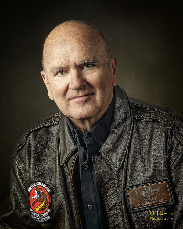
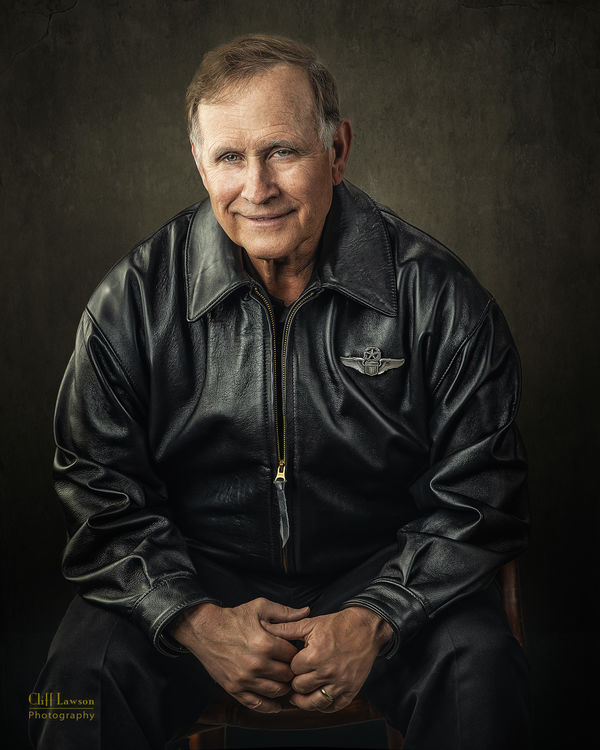
Here are some images from yesterday's session. Nikon D850, Nikon 105mm F/1.4E.
Lighting is one Einstein in a 2x3 Gridded Softbox for the main - camera left. A 3x5 (approx.) silver reflector VERY close on camera right. and another Einstein light in a 3x1 gridded softbox on a boom overhead for a hair light. The hair light was turned off for the guy in the first two images for obvious reasons!
Lighting is one Einstein in a 2x3 Gridded Softbox for the main - camera left. A 3x5 (approx.) silver reflector VERY close on camera right. and another Einstein light in a 3x1 gridded softbox on a boom overhead for a hair light. The hair light was turned off for the guy in the first two images for obvious reasons!

May 3, 2018 11:40:33 #

Cliff!
Great images of theses men!
I especially like the "flag" treatment in the background. Could you tell us more about the background technique. Nice texture in the faces and the jackets.
Great images of theses men!
I especially like the "flag" treatment in the background. Could you tell us more about the background technique. Nice texture in the faces and the jackets.
May 3, 2018 12:20:49 #
E.L.. Shapiro wrote:
Cliff!
Great images of theses men!
I especially like the "flag" treatment in the background. Could you tell us more about the background technique. Nice texture in the faces and the jackets.
Great images of theses men!
I especially like the "flag" treatment in the background. Could you tell us more about the background technique. Nice texture in the faces and the jackets.
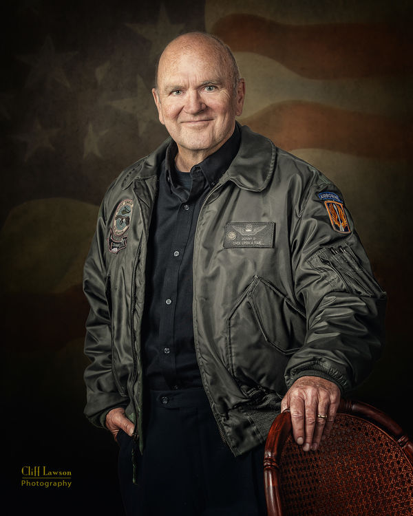
Sure. The background (not the flag) is a Photoshop file made up of 8 layers of various textures I have collected over the years. To meet the low-key look, they are all darker tones of brown/gray/green. I shoot against a plain backdrop and then extract the subject using Topaz Remask (although the new Select Subject tool in the latest Photoshop is pretty fantastic). Then I drag my background file onto the subject image an place that behind him or her. Then I go through the layers adjusting blend modes, opacity, and the HSL tool to give each image the look I want—some a bit more to the gray, green or brown, or darker or lighter. Sometimes I use all 8 layers, sometimes just one or two. Some with a bit more texture, some a bit smoother. That background file is big - just under 1GB, so once I get the look I want, I flatten it!
I think my background file gives me the same look as some of the really expensive canvas BGs from Gravity Backdrops.
The flag treatment is a graphic I made from scratch in Photoshop. I have some "real" flag image but that was the problem—they look too real and I wanted a more abstract—but recognizable—appearance.
The detail/texture on the faces is a combination of Adding some clarity in ACR (I do not use LR), a cleanup of transient blemishes and a gentle lightening of some of the deeper wrinkles. I sharpen the eyes with the Creative Sharpener from Pixel Genius. I add some "grit" using Clarity plug-in from Topaz, the standard dodge and burn (I have an action I wrote to set that up using two curves adjustment layers). On some images, a layer of localized High Pass sharpening is used.
To pull the texture and detail out of the leather, I use Topaz Adjust with a pre-set I made specifically for that purpose.
OH yeah - for the color grading of the images, I use several Color Lookup Adjustment Layers. Those require individual adjustment of the opacity of each individual layer as well as making a group of those and then adjusting opacity of the group . There is no formula or specific colors—each image is a one-off. I have an action that sets up my favorites, but your need to play around and get the look YOU want.
This is not a formulaic process. Each image takes a good 35-45 minutes. Sometimes longer.
And as you know, it all starts with getting the lighting right. If that is wrong, none of the rest works.
I hope this answers your questions.
May 3, 2018 12:32:19 #
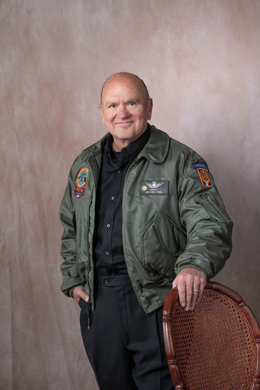
I thought it might be instructive to see the original SOOC file of one of the images along with the finished product.
May 3, 2018 14:29:09 #
Superior post-processing work-seamless! I envisioned a huge flag in your studio!
I do love TOPAZ, especially some of the textures. I used to be a big fan of Mortensen screens in the old color darkroom.
Years ago, I used quite a bit of front projection and amassed quite a collection of 6x6 super slides to use in the system. Now I am going to stock up on new images for post -processing and convert some of my old slides to digital media.
Thanks for the detailed procedures.
Incredibly nice, what you are doing for the Vets. I would love a portrait in my old uniform jacket- problem is, it doesn't fit anymore and it did NOT shrink at the dry cleaners. All I have left is a shoulder flash. Somewhere I have my old stripes- made it to. SP/5 and since found out that my rank no longer exists- I guess now they are WOs . I'm just too old
Thanks again!
May 3, 2018 16:06:40 #
Cliff's posts also go to prove something I have been advocating for a long time, here in the forum, and drawing allot of flack for. I always maintain that post-process,when done correctly, is a modern day version of fine custom printing and that the BEST results always starts with good camerawork as opposed to sloppy shooting and remedial processing. Some folks insist I am against post-process, but that ain't the case.
If you look at Cliff's unprocessed image, you will notice that everything is in order- the lighting is spot on, the exposure is correct, the composition is there there is good separation between the subject and the background and of course the pose and expression are fine and natural for the subject. In other words all the necessary INFORMATION is already in the file- the detail, the texture, and just waiting to be maximized and precisely enhanced in what I like to call CUSTOM-processing. The craftsmanship makes it seamless and realistic and the artistry turns a good "bread and butter" portrait into a exhibition quality image.
If you look at Cliff's unprocessed image, you will notice that everything is in order- the lighting is spot on, the exposure is correct, the composition is there there is good separation between the subject and the background and of course the pose and expression are fine and natural for the subject. In other words all the necessary INFORMATION is already in the file- the detail, the texture, and just waiting to be maximized and precisely enhanced in what I like to call CUSTOM-processing. The craftsmanship makes it seamless and realistic and the artistry turns a good "bread and butter" portrait into a exhibition quality image.
May 3, 2018 17:00:08 #
CaptainC wrote:
I thought it might be instructive to see the original SOOC file of one of the images along with the finished product.
Mr Shapiro - Thanks for the kind words!
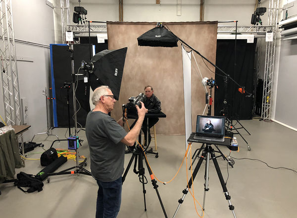
OK - In the spirit of this particular forum—since it is to be part instructional—here is a pull-back of the setup my assistant took.
The reflector is a 4x6 Larson silver (I previously said 3x5, but I just measured it). That background I use has some texture to it, so sometimes i just desaturate it to get rid of that pink, and add another texture or two over it.
For the tethering, I shoot to Capture One and that cool little table is from Tether Tools (does not include the tripod!).
I think this image may help with the light setup rather than just a description of it.
May 3, 2018 17:45:07 #
May 4, 2018 11:00:32 #

May 4, 2018 14:34:14 #

I can't add anything at all to the conversation, except that you continually give us goals to shoot for.
I agree with Ed. Too many people want to take an average photo, and somehow make it outstanding with one click. Nobody can come close to your work with the newfangled "do it all" filters or actions. The entire process is an artform, and you've clearly mastered it.
I agree with Ed. Too many people want to take an average photo, and somehow make it outstanding with one click. Nobody can come close to your work with the newfangled "do it all" filters or actions. The entire process is an artform, and you've clearly mastered it.
May 4, 2018 15:18:44 #
Thanks bkyser and cjc2. I think PLENTY of people can make great images. They just have not found this forum yet!
May 4, 2018 16:13:36 #
Funny story- When I first started out in professional studio work, all the rookies started in the darkroom. We felt were were being cast into the dungeon- relegated to some kind of punishment or harsh kinda hazing initiation to the profession. At least a year in the "cellar" was prerequisite to being handed a camera and allowed to go out shooting major jobs.
The boss explained that when printing we will soon learn the value of good camera technique and how well exposed and composed images, proper negative-making is the fast track to artful printing. It gets to the point that as you shoot, you always consider the entire process and very seldom can you do EVERYTHING you envision in one click but there is a balance. There is an old expression, "you can't make a silk purse out of a sow's ear". In portraiture, you can't fix really poor lighting, bad expression or totally out of whack composition in post processing but you can enhance a good image IF you know what you are doing! It takes time, patience and a willingness to study, learn, practice and work hard.
Cliff described a process that required half an hour to produce one image. It makes perfect sense. Back in the day, a good quality print did not come flying out of an automatic printer.
May 4, 2018 22:30:00 #

May 5, 2018 12:03:20 #
lowkick wrote:
Are you familiar with the work of Stacy Pearsall? https://en.m.wikipedia.org/wiki/Stacy_Pearsall
As a matter of fact her work and story was just featured in last month's issue of the PPA magazine "Professional Photographer" That is the first I have heard of her. Obviously, her project is much more extensive than mine and has an entirely different look. Two different approaches. I love her images.
If you want to reply, then register here. Registration is free and your account is created instantly, so you can post right away.